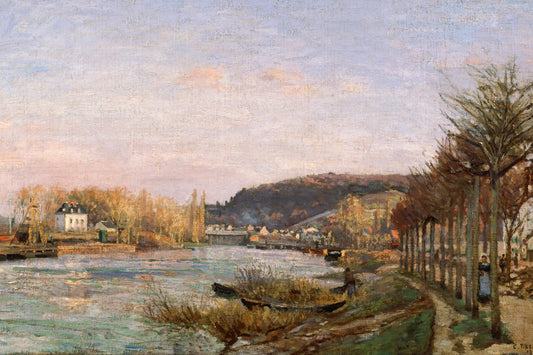
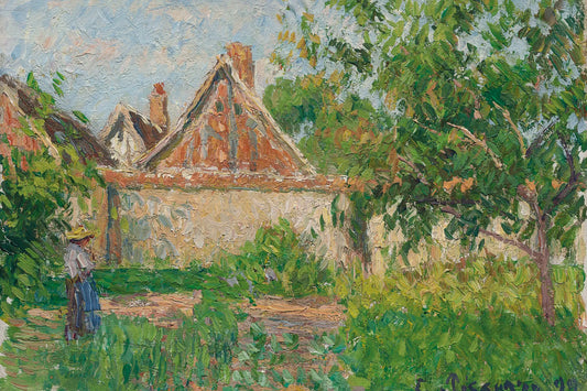
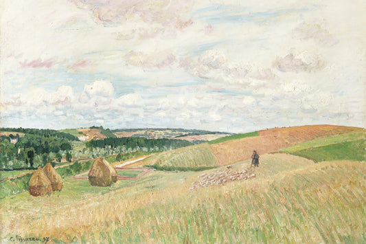
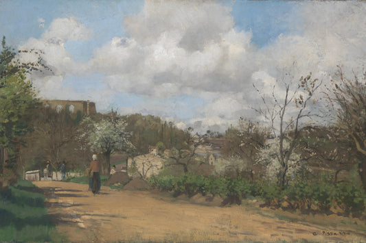
Three Pissarro landscapes, three kinds of light
Tall trees, a winter road and an open river view provide different points of reference. These examples help you compare the tones and lines that will guide the eye in your room.
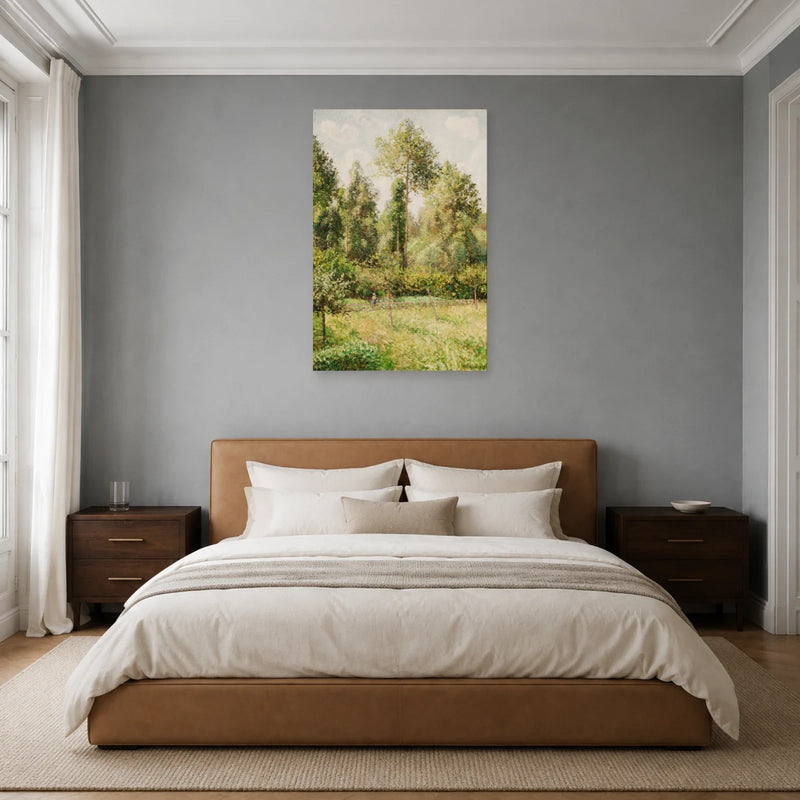
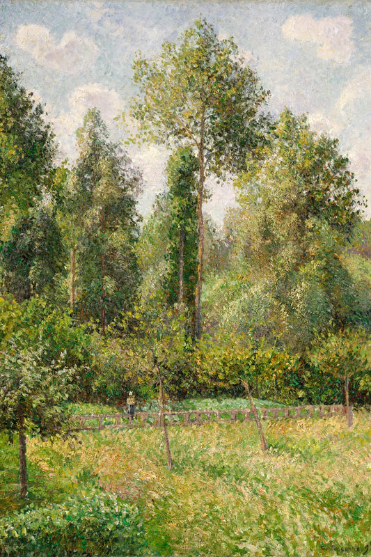
Poplars at Éragny: a leafy presence
Trees rise through a vertical composition dominated by green, with lighter touches in the foliage. This reproduction can fill a narrow wall or accompany a reading corner. Up close, the range of tones reveals more than the overall outline of the trees.
View this canvas print ↗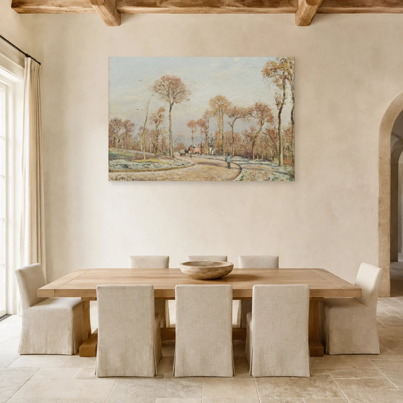
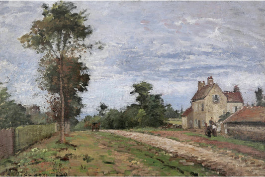
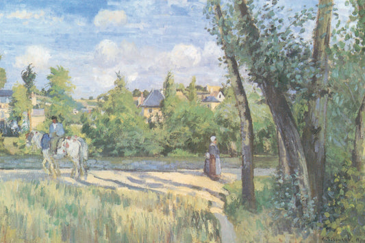
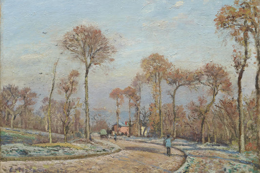
The Road to Versailles: winter light
The road and bare trees organise a horizontal landscape of pale and ochre tones. This Louveciennes scene offers an alternative to lush green gardens. It can complement light wood and cream textiles, while the road gives the eye a clear path through the image.
View this canvas print ↗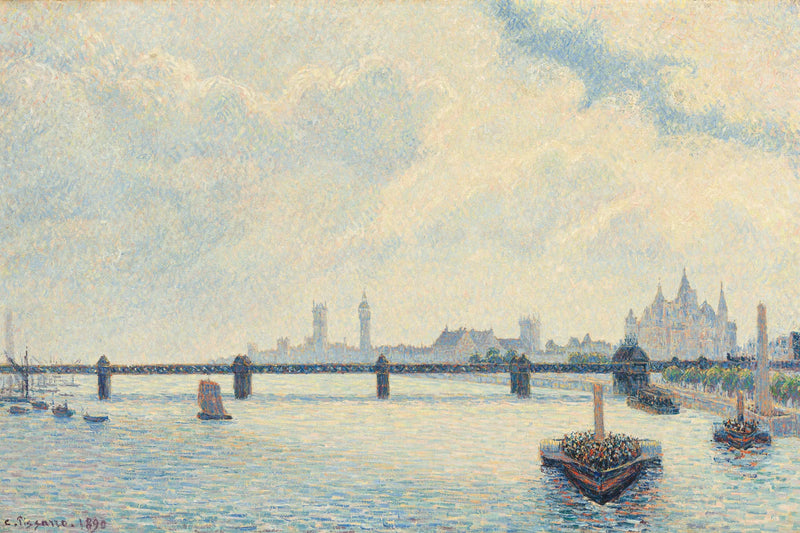
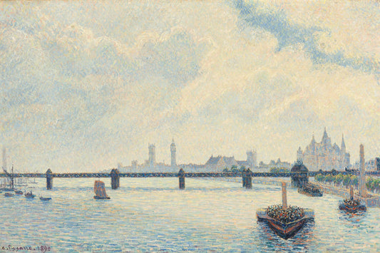
Charing Cross Bridge: a view across the river
The bridge, boats and city skyline sit beneath a wide sky. Blues and pale tones bring an urban reading of the landscape. This horizontal composition can complement a sideboard and a room with cooler colours.
View this canvas print ↗Comparing places through their light
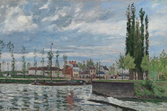
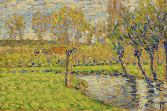
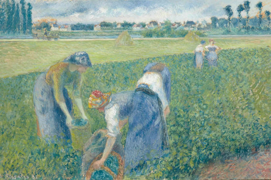
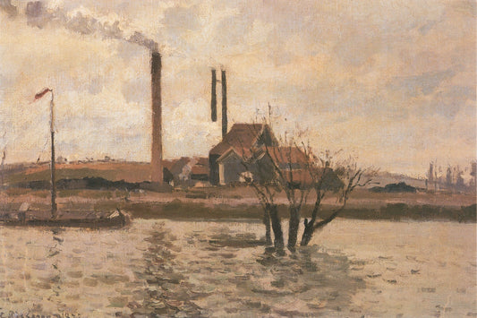
Pontoise, Louveciennes and Éragny feature prominently in the selection. Their names alone do not tell you the mood: a green garden, a cold road and a busy riverbank have different palettes. Compare the amount of sky and density of vegetation in each image. A light landscape can make a wall feel more open; closely spaced trees create a more enveloping presence.
An inhabited landscape, not just nature
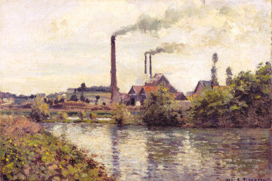
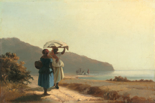
Houses, roads, bridges, factories and people appear across the selection. They give the landscape points of reference and activity. You might prefer a broad view for a living room, or a detailed scene for a study or reading corner. Compare the size of figures and buildings in the image before choosing the size of the reproduction.
Matching the season to the room’s colours
Éragny greens pair naturally with organic materials; Louveciennes ochres and greys suit a more mineral palette. A London view introduces blues without becoming a seascape. You need not match every accessory: pick one dominant tone to echo and let the others vary. Above all, keep enough contrast with the wall for the details of the reproduction to remain visible.
The canvas print you receive
The image is reproduced as a print on canvas. Any brushstroke or texture effect visible in the image is part of the printed design.
The textured canvas has a matte finish and is stretched over a wooden stretcher frame. The edges are printed and hanging hardware is included. The stretcher supports the canvas; it is different from an outer decorative frame.
The estimated delivery date appears on each product page. For details, see our shipping policy and our returns policy.
Your questions about this collection
Which Pissarro subjects are in this collection?
Gardens, rivers, roads and inhabited landscapes, notably around Pontoise, Éragny and Louveciennes, plus a view of Charing Cross Bridge in London. The works shown let you compare the subjects actually available.
Which Pissarro work suits a room with natural colours?
Poplars at Éragny and the countryside views offer greens and ochres to compare with wood and textiles. For a lighter palette, look at the winter scenes. The exact work matters more than a general rule about the artist.
Is this an original painting or a reproduction?
It is a reproduction printed on canvas. Visible strokes of colour belong to the image and are not repainted by hand on each copy. Consult the product page for the material and available sizes.