






An Art Deco-style elephant
An elephant’s face sits within a symmetrical gold-and-black design. The vertical crop gives the motif clear presence. Plain accessories nearby help keep its lines readable.
View this canvas print ↗
Multicoloured circles, luminous gradients and warm swirling forms: choose abstract canvas art...
Your cart
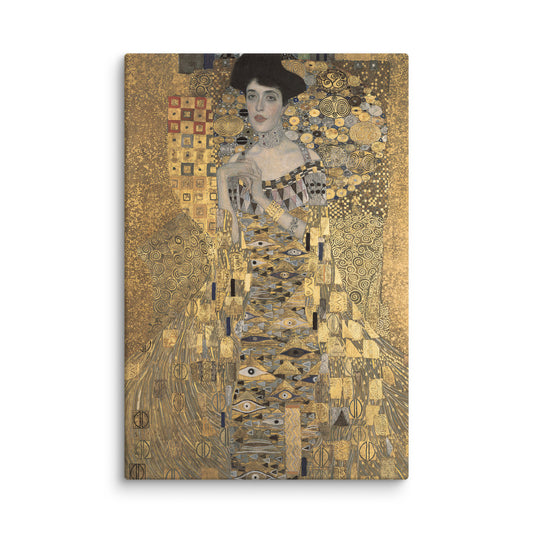
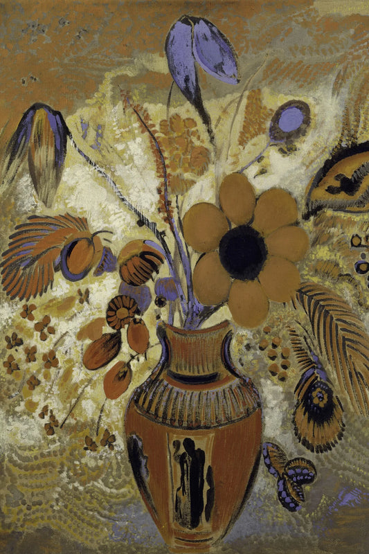
From gold tones against black to ochre and amber, these canvas prints bring warmth in different ways. Compare the printed motifs by contrast, subject and size.
Canvas print · Multiple sizes
Canvas print · Multiple sizes
Canvas print · Multiple sizes
Canvas print · Multiple sizes
Canvas print · Multiple sizes
Canvas print · Multiple sizes
Canvas print · Multiple sizes
Canvas print · Multiple sizes
Canvas print · Multiple sizes
A golden palette can be graphic, botanical or musical. These works show how dark areas and composition change its effect.
An elephant’s face sits within a symmetrical gold-and-black design. The vertical crop gives the motif clear presence. Plain accessories nearby help keep its lines readable.
View this canvas print ↗
Bright foliage contrasts with a darker trunk and ground. The imagined landscape can accompany wood or a neutral living room, with the image’s light as its focus.
View this canvas print ↗
A guitar appears amid yellow, brown and orange geometric shapes. This vertical musical scene is warmer than a monochrome image and can work with natural materials or dark furniture.
View this canvas print ↗Black sharpens gold-coloured outlines and creates strong contrast. Ochre, amber and brown blend more gradually. Compare the area of each tone: a mostly pale print will feel different from a bright subject against a large dark ground. Wall colour also matters.
One echo in a lamp, cushion or object can link the print to your room. Brown wood, beige and deep green offer other pairings. Keep nearby objects plain if the image is detailed. In a colourful room, its secondary shades may be easier to connect than its main hue.
Here “gold” refers to hues in a canvas print. Light or texture effects do not mean gold leaf or a reflective metal surface. Compare product photos and specifications. Subject, composition and contrast are the useful guides for your room.
A vertical subject can fit by a console or between furniture. On a large wall, compare actual print width with the furniture below. Room photos suggest an atmosphere; product measurements are the scale reference.
Example: Art Deco Elephant Canvas Print – Geometric Majesty.
Available sizes (width × height): 31 × 46 cm · 41 × 61 cm · 51 × 76 cm · 61 × 91 cm · 81 × 122 cm.
The image is reproduced as a print on canvas. Any brushstroke or texture effect visible in the image is part of the printed design.
The textured canvas has a matte finish and is stretched over a wooden stretcher frame. The edges are printed and hanging hardware is included. The stretcher supports the canvas; it is different from an outer decorative frame.
The estimated delivery date appears on each product page. For details, see our shipping policy and our returns policy.
No. Golden hues and light effects are reproduced in the printed canvas image. Each product page states its finish.
Yes. A print can provide the main colour accent among simple furniture. Leave clear space around it and avoid many competing contrasts on the same wall.
Yes, especially with a coherent wider palette. Compare warm and cool shades and decide which should dominate; accessories need not match exactly.
For a cooler palette or a mix of warm and cool tones, compare silver-toned canvas prints.