
Wall art by color and mood
Choose a palette to explore our canvas prints: beige, terracotta, blue, green, black and white, or multicolored compositions. Compare shades, contrasts and the way color is used in the image to connect it with your decor.
Which palette would you like to explore?
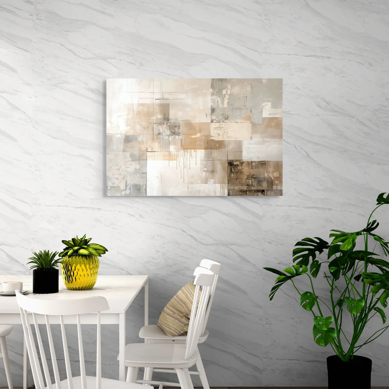
Each collection brings together prints around a shade or group of colors. The images give you a preview; open a collection to compare its compositions.
Beige
Explore the collection →
Blue
Explore the collection →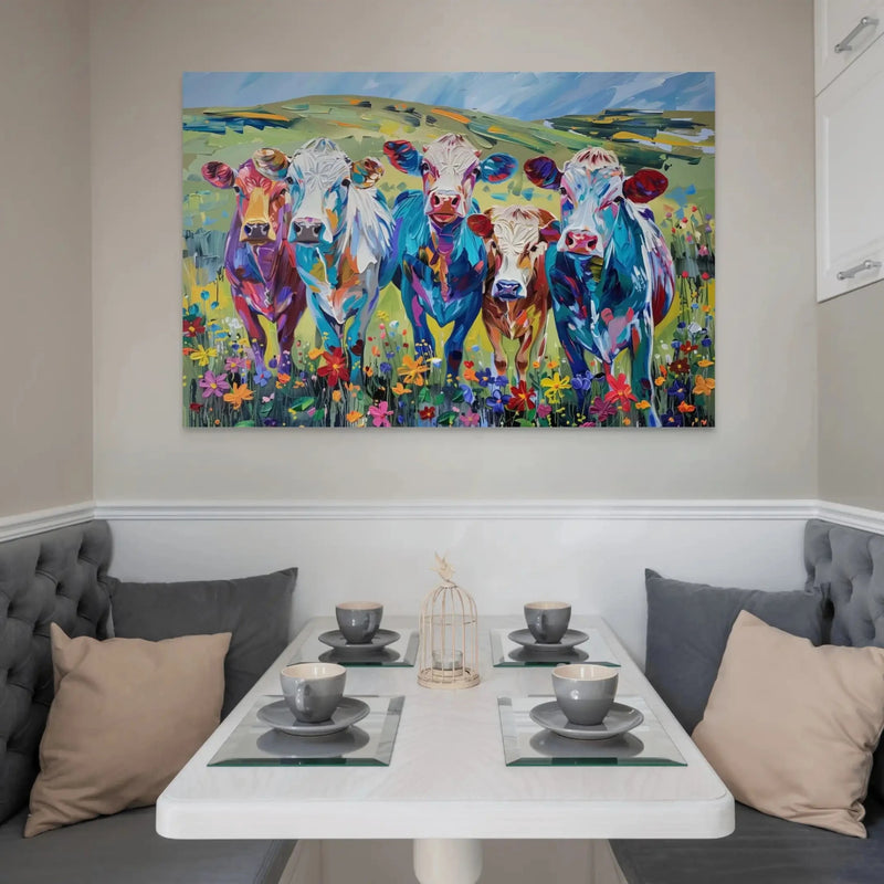
Multicolored
Explore the collection →
Gold
Explore the collection →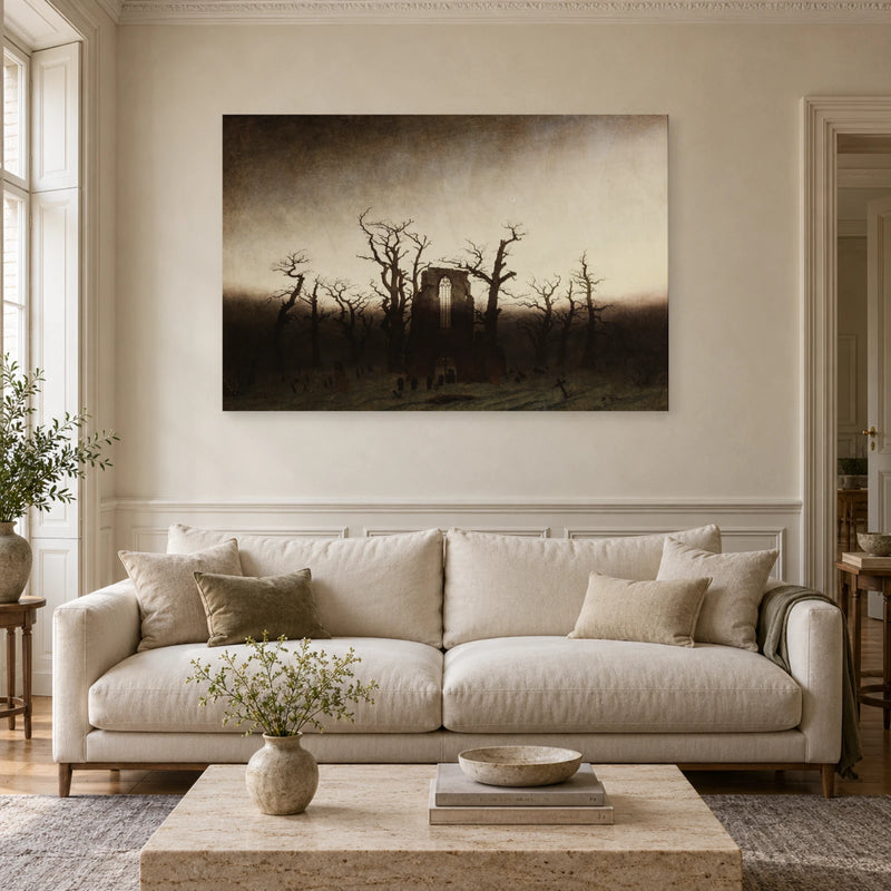
Gray
Explore the collection →
Yellow
Explore the collection →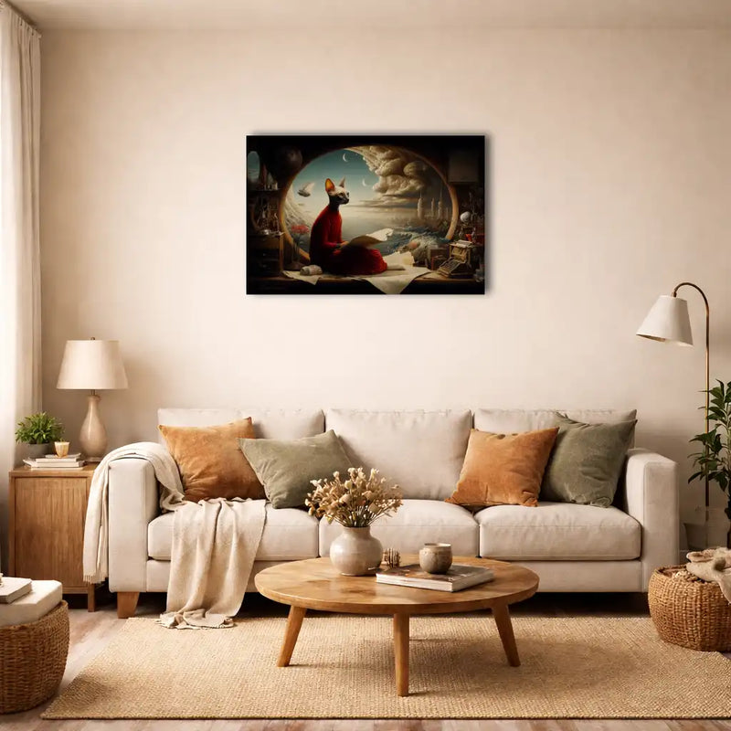
Brown
Explore the collection →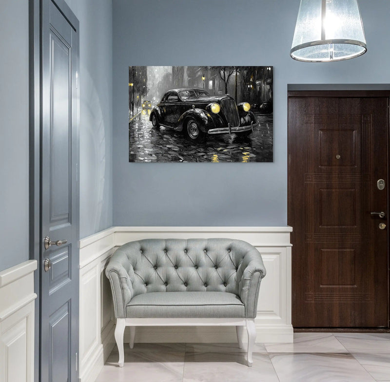
Black and white
Explore the collection →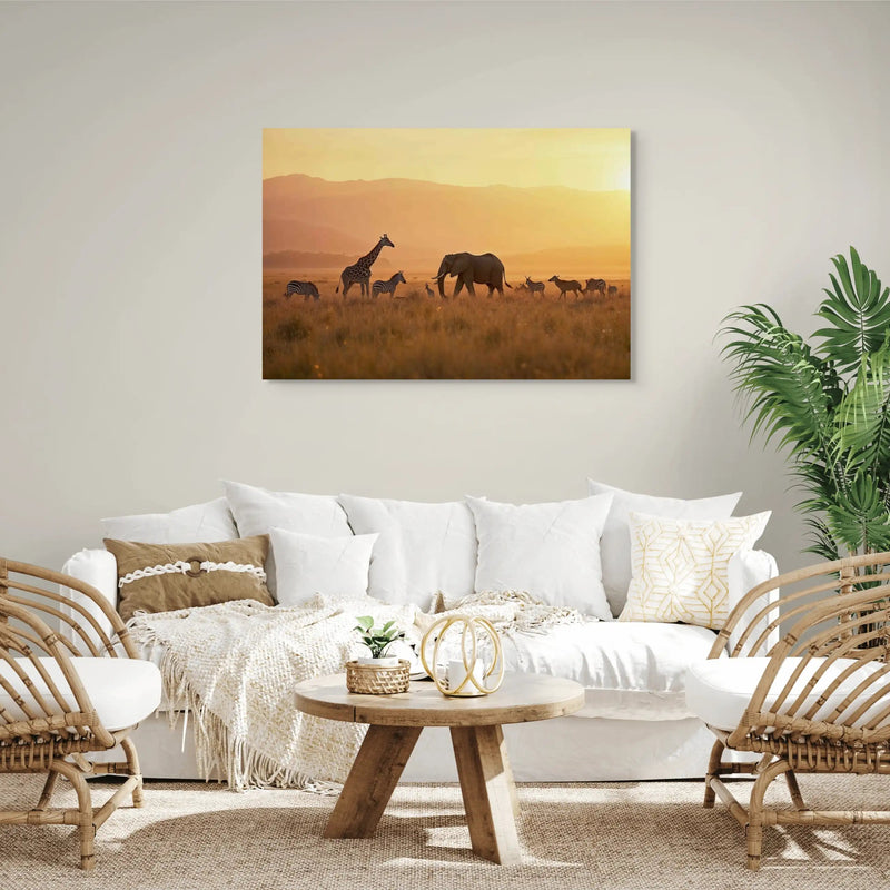
Orange
Explore the collection →
Pastel
Explore the collection →
Red
Explore the collection →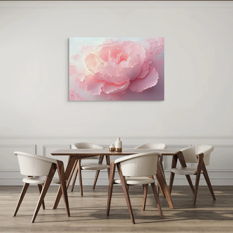
Pink
Explore the collection →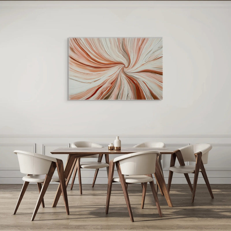
Terracotta
Explore the collection →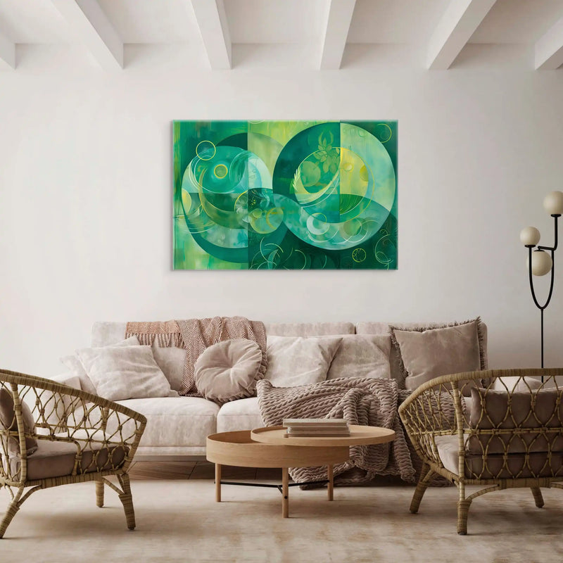
Green
Explore the collection →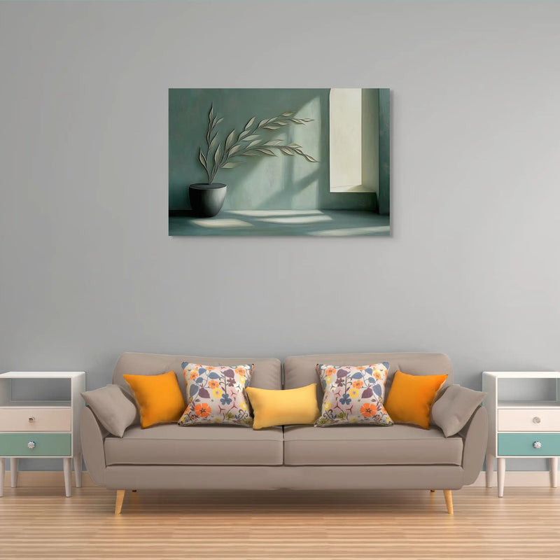
Sage green
Explore the collection →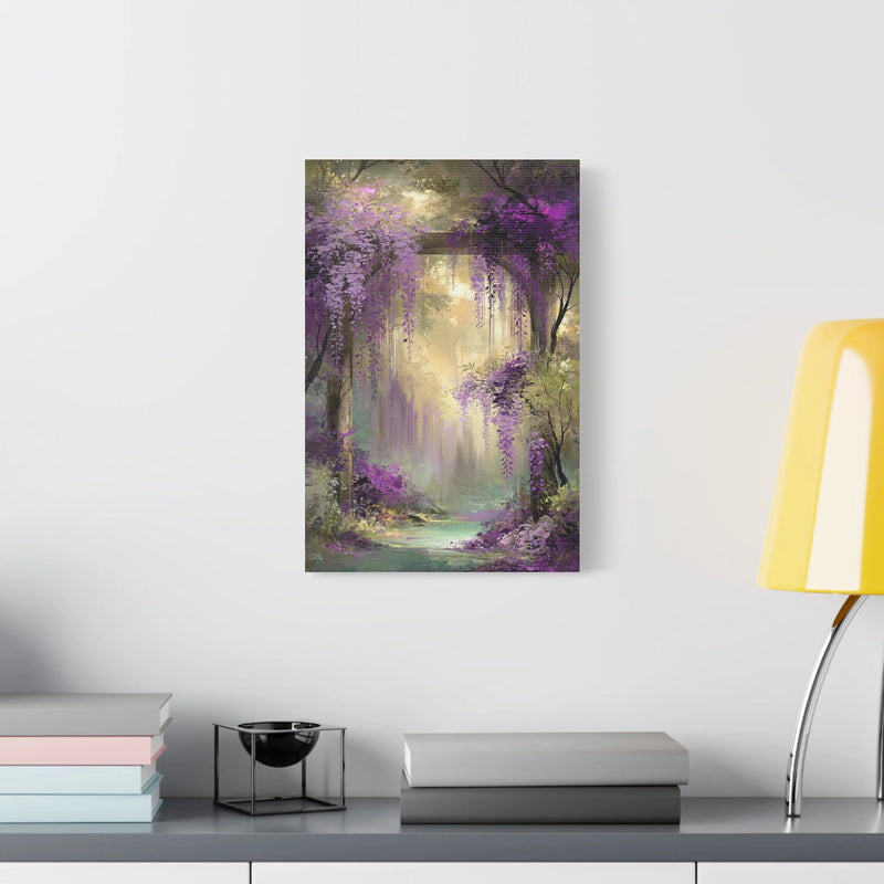
Purple
Explore the collection →Connect a print’s colors with your interior
A color can link the artwork to your decor or create contrast. Its visual effect also depends on how much of the image it covers, the colors around it and the room’s lighting.
Start with the colors already in your room
Look at the wall, sofa, floor and textiles. You can repeat an existing shade or choose a color that stands apart. Natural tones such as beige, brown and terracotta offer points of comparison; greens and blues can echo other details in the room.
An exact match is not necessary. Look for a link between the print and one or two elements in the room. Screens and lighting change how shades appear: images help you compare palettes rather than guarantee an exact match to a fabric.
Compare contrast and the amount of each color
A nearly monochrome print has a different presence from an image in which the same color appears only in a small detail. Look at the light areas, dark outlines and brighter accents as well as the palette’s name.
Black and white emphasizes shapes and contrasts. A multicolored composition can connect several shades in your room. If the decor already has many patterns, compare it with a simpler design before choosing.
Build a mood with more than color alone
Similar tones, subtle patterns and moderate contrast can create a visually gentle arrangement. Stronger contrasts and a dominant color create a bolder presence. These are decorating ideas to adapt to your own preferences.
To create your mood, also compare the subject, the drawing’s lines, the size and the available light. A soft palette can accompany rounded shapes; distinct lines can add rhythm to more neutral tones.
Distinguish color effects from the finish
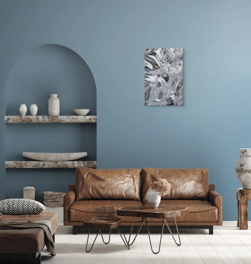
The gold and silver tones visible in some prints are part of the printed design. They do not mean that metal leaf or a reflective finish has been applied to the product. Relief and texture effects also belong to the image.
Check the exact specifications on the product page. If you are looking for an identified artwork, explore our reproductions of famous paintings and compare their palettes.
Questions to help you choose
Should the print match my sofa’s color?
You can pick up a shade from the sofa, choose a contrast or connect the artwork with another element in the room. Look at the whole design and its balance of colors rather than searching for a perfectly identical shade.
Can I combine several colors on one wall?
Yes. A shared shade, subject or group of shapes can connect several prints. Measure the whole arrangement, including the gaps between canvases. A multicolored print can be a starting point for choosing a few matching accents.
How do I choose a palette for a gentle mood?
Compare similar tones, moderate contrast and uncluttered compositions. Then consider how they work with the wall, textiles and room lighting. The subject and shapes matter as much as the color’s name.
Do gold and silver prints have a metallic finish?
Gold and silver tones belong to the printed image. They do not guarantee gold leaf, a metal coating or a reflective surface. The exact finishes are specified on each product page.
How do I continue choosing after selecting a color?
Open your palette’s collection to compare subjects and sizes, or browse wall art by room. You can also use the filters in the full catalog.
Compare the full decorative wall art catalog, the collections by room or reproductions of famous paintings.