Provence Posters
-
Affiche Roussillon Ruelles de couleurs
Vendor:Art VirtuosoRegular price From 39,90 €Regular priceUnit price per -
Affiche Luberon Forêt des Cèdres
Vendor:Art VirtuosoRegular price From 39,90 €Regular priceUnit price per -
Affiche Saint-Rémy-de-Provence Les Antiques
Vendor:Art VirtuosoRegular price From 39,90 €Regular priceUnit price per -
Affiche Alpilles Oliveraies et roches blanches
Vendor:Art VirtuosoRegular price From 39,90 €Regular priceUnit price per -
Affiche Fontvieille Moulin de Daudet
Vendor:Art VirtuosoRegular price From 39,90 €Regular priceUnit price per -
Affiche Fontaine-de-Vaucluse La source
Vendor:Art VirtuosoRegular price From 39,90 €Regular priceUnit price per -
Affiche L'Isle-sur-la-Sorgue Roue à eau
Vendor:Art VirtuosoRegular price From 39,90 €Regular priceUnit price per -
Affiche Lourmarin Château et jardin
Vendor:Art VirtuosoRegular price From 39,90 €Regular priceUnit price per -
Affiche Gordes Calade à l'ombre
Vendor:Art VirtuosoRegular price From 39,90 €Regular priceUnit price per -
Affiche Gordes Bories en pierre sèche
Vendor:Art VirtuosoRegular price From 39,90 €Regular priceUnit price per -
Affiche Roussillon Sentier des Ocres
Vendor:Art VirtuosoRegular price From 39,90 €Regular priceUnit price per -
Affiche Sainte-Victoire Oliveraie provençale
Vendor:Art VirtuosoRegular price From 39,90 €Regular priceUnit price per -
Affiche Sainte-Victoire Eaux de Bimont
Vendor:Art VirtuosoRegular price From 39,90 €Regular priceUnit price per -
Affiche Mont Ventoux Vignes du piémont
Vendor:Art VirtuosoRegular price From 39,90 €Regular priceUnit price per -
Affiche Mont Ventoux Route du sommet
Vendor:Art VirtuosoRegular price From 39,90 €Regular priceUnit price per -
Affiche Aix-en-Provence Pavillon de Vendôme
Vendor:Art VirtuosoRegular price From 39,90 €Regular priceUnit price per -
Affiche Aix-en-Provence Place de l'Hôtel de Ville
Vendor:Art VirtuosoRegular price From 39,90 €Regular priceUnit price per -
Affiche Avignon Palais des Papes
Vendor:Art VirtuosoRegular price From 39,90 €Regular priceUnit price per -
Affiche Avignon Rue des Teinturiers
Vendor:Art VirtuosoRegular price From 39,90 €Regular priceUnit price per -
Affiche Avignon Pont Saint-Bénézet
Vendor:Art VirtuosoRegular price From 39,90 €Regular priceUnit price per -
European Bee-eater in Provence Poster
Vendor:Art VirtuosoRegular price From 39,90 €Regular priceUnit price per -
Hoopoe in the Light of Provence Poster
Vendor:Art VirtuosoRegular price From 39,90 €Regular priceUnit price per -
Affiche Lavande – Été en Provence
Vendor:Art VirtuosoRegular price From 39,90 €Regular priceUnit price per -
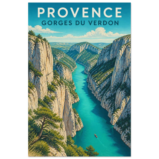
Affiche Provence – Gorges du Verdon
Vendor:Art VirtuosoRegular price From 39,90 €Regular priceUnit price per -
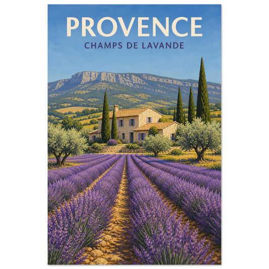
Affiche Provence – Champs de Lavande
Vendor:Art VirtuosoRegular price From 39,90 €Regular priceUnit price per -
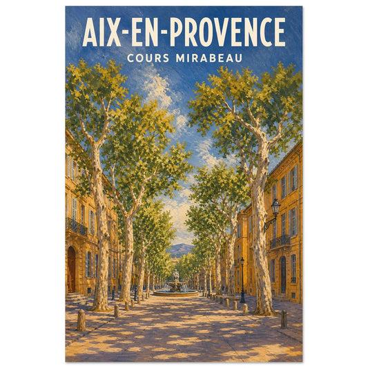
Affiche Aix-en-Provence – Cours Mirabeau
Vendor:Art VirtuosoRegular price From 39,90 €Regular priceUnit price per