
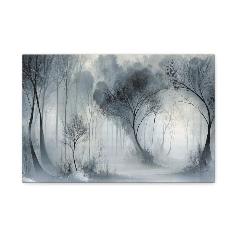
A grey-and-white landscape
Winter Woodland shows a misty forest in a horizontal format. Use it to compare a natural scene with an abstract print of the same orientation.
View this canvas print ↗
Multicoloured circles, luminous gradients and warm swirling forms: choose abstract canvas art...
Your cart
Pale grey, charcoal or grey with white: find a canvas print that explores shade without bringing in a bright dominant colour. Compare subjects, contrast and any colour accents, then choose a size for your wall.
A misty forest, an abstract motif and a mineral-looking image create different moods. Compare how much grey each uses and how it meets lighter or warmer tones.
Winter Woodland shows a misty forest in a horizontal format. Use it to compare a natural scene with an abstract print of the same orientation.
View this canvas print ↗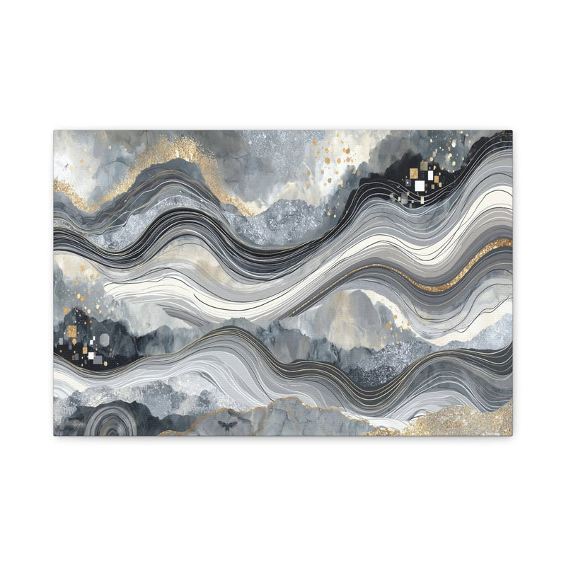
Golden Marbled Waves pairs grey with a printed golden-looking effect. Compare its accent with your furnishings; both marbling and gold tones belong to the printed image.
View this canvas print ↗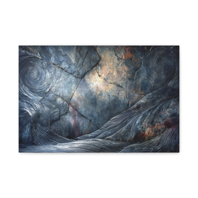
Cracked Stone and Burnt Gold has a charcoal-toned horizontal composition. Compare the presence of this dark image with a pale-grey landscape before choosing its place.
View this canvas print ↗Grey covers very different compositions. A mainly pale canvas can blend into a white wall; a strong charcoal shade has a clearer presence. Compare the distance between the lightest and darkest parts, not just the colour name. High-contrast grey and white feels different from a landscape with close-set shades.
A grey palette can show abstract shapes, a landscape or architectural lines. The subject often decides how you look at the picture: follow a perspective, recognise a forest or explore a pattern. With geometric furniture, either continue its lines or add a softer drawing. View prints from a distance to see which remains clear on your wall.
Grey can work with wood, beige textiles and black elements. To avoid a uniform effect, compare the tones of wall, sofa and canvas. A colour accent in the image can connect to a cushion or object. Some prints include red, blue or golden-looking details, so examine the picture if you want strictly grey-and-white art.
Subtle details change with viewing distance. Measure the available space and mark the proposed print size on the wall to check the balance. A dark print can appear more prominent than a pale one of the same size. Use the dimensions on the product page when ordering.
Example: Grey Forest in Mist Canvas Print — Winter Sylvan.
Available sizes (width × height): 46 × 31 cm · 61 × 41 cm · 76 × 51 cm · 91 × 61 cm · 122 × 81 cm.
The image is reproduced as a print on canvas. Any brushstroke or texture effect visible in the image is part of the printed design.
The textured canvas has a matte finish and is stretched over a wooden stretcher frame. The edges are printed and hanging hardware is included. The stretcher supports the canvas; it is different from an outer decorative frame.
The estimated delivery date appears on each product page. For details, see our shipping policy and our returns policy.
Compare the free width, wall colour and image contrast. A horizontal composition often accompanies long furniture; a darker print stands out more on a pale wall. Test the balance with a paper outline.
Yes. Compare the grey shades and secondary accents with your wood and textiles. The canvas need not exactly match the sofa colour.
No. They are part of the image printed on canvas. Marbling, cracks or gold-coloured accents in a title do not mean the product contains marble, metal or added relief.
For a stronger contrast, compare our black-and-white canvas prints.