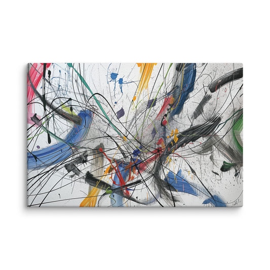
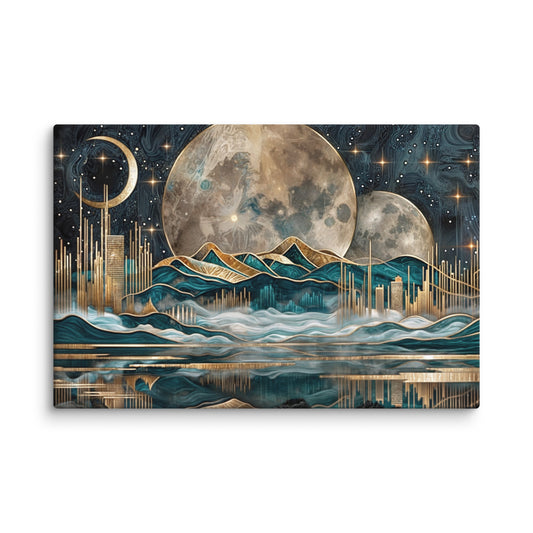
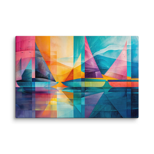
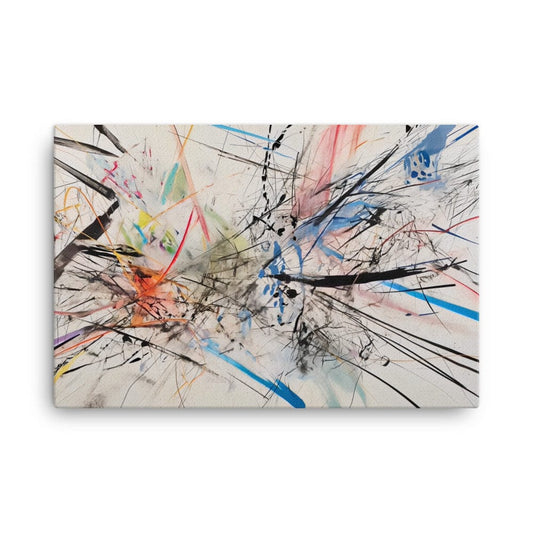
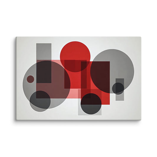
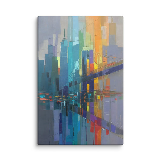
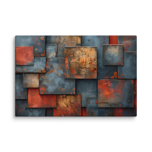
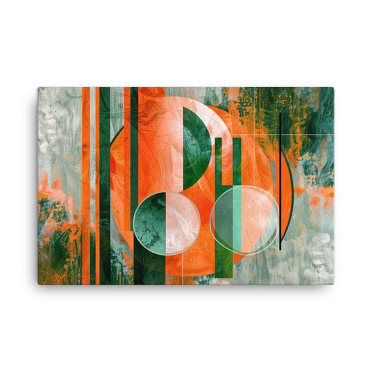
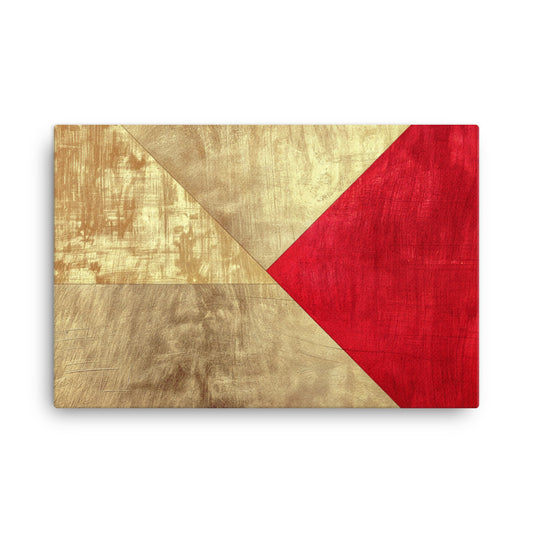
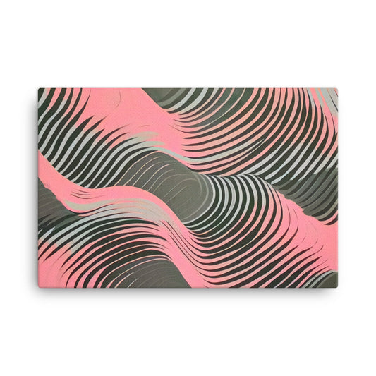
Three palettes, three ways to make an impression
A light design gives the room space to breathe, pastel movement softens transitions and opposing colours create a focal point. These examples help you compare contrast and the density of the design.
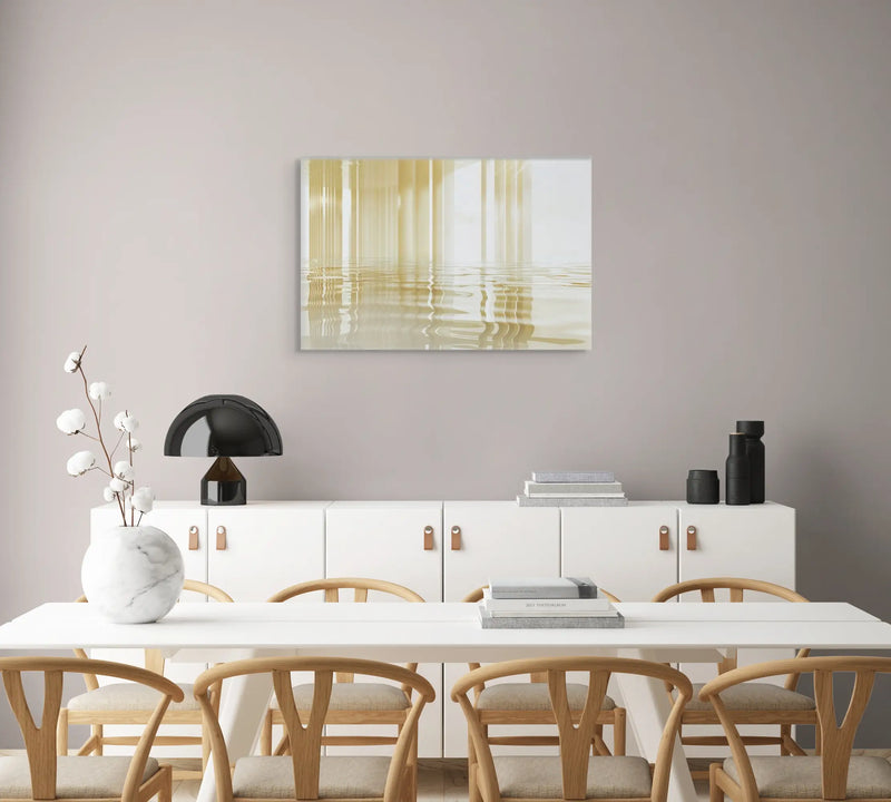
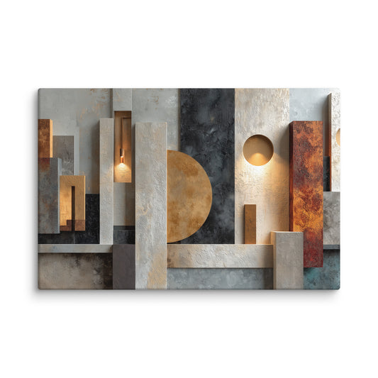
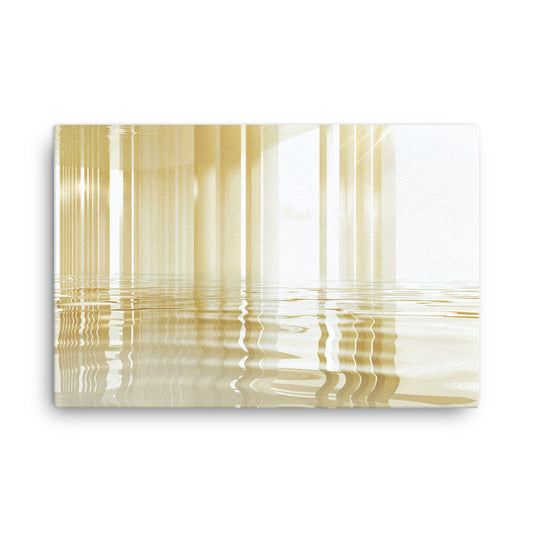
Golden lines on a pale background
Fine lines and depicted reflections run across a white and cream surface. The image brings a subtle presence to a dining room or bright living room; gold is a colour within the printed design.
View this canvas print ↗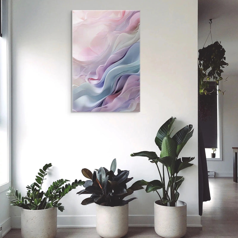
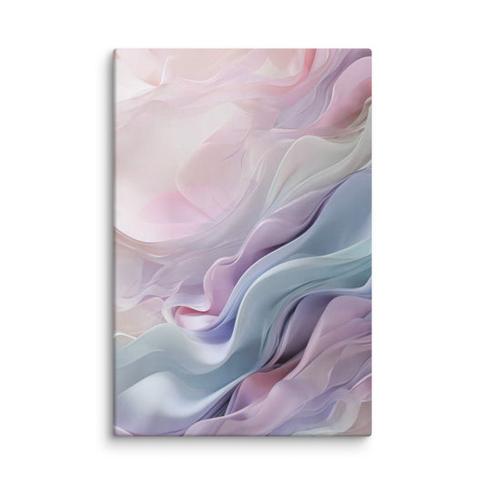
A flowing movement of pastel colours
Pink, mauve and bluish curves suggest overlapping folds. Their softness suits a restful space; the print preserves this sense of volume within a flat image.
View this canvas print ↗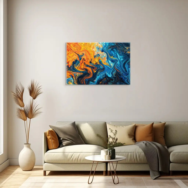
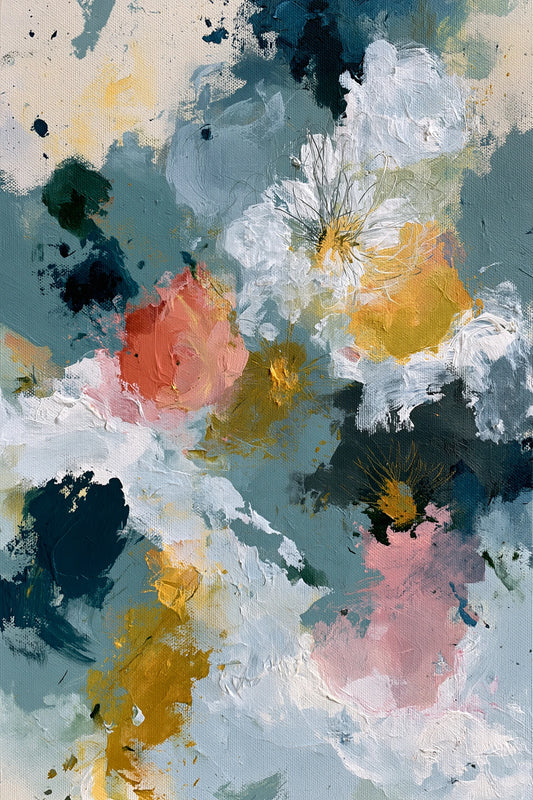
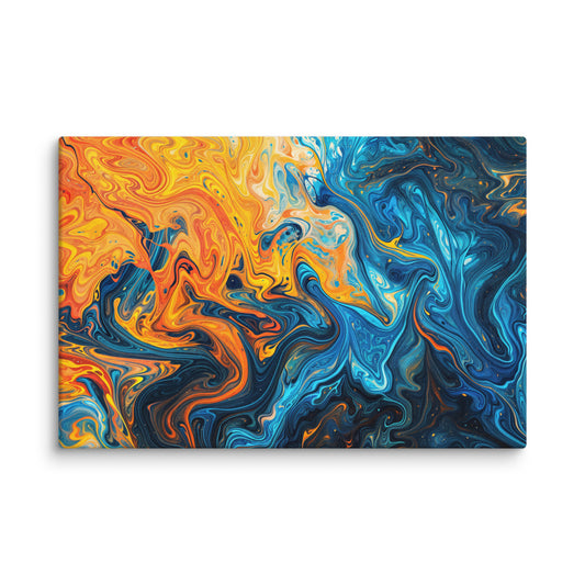
A contrast that draws the eye
Orange movement responds to deep blues in a dense composition. This canvas can become the main focus on a simple wall, with few other colourful accents around it.
View this canvas print ↗Choose intensity before colour
Two blue pictures need not have the same presence: the amount of white, the density of lines and the contrast between colours change their effect. For a subtle wall, look for gentle transitions and areas of open space. For a focal point, a strong contrast can work better than a collection of small objects.
Pair visual textures with your decor
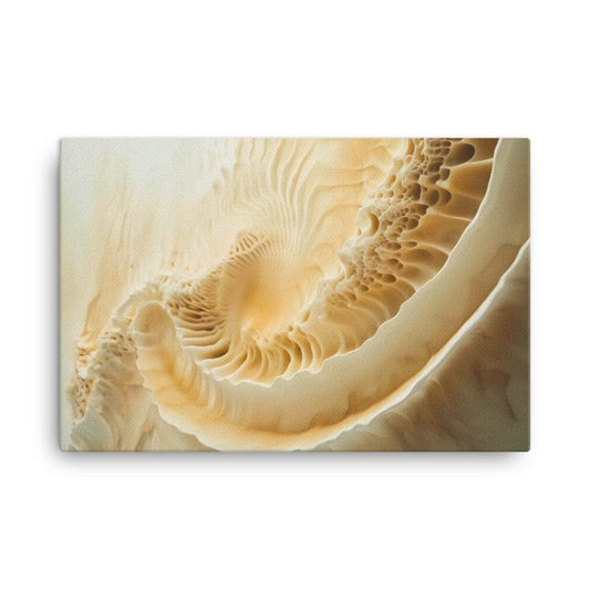
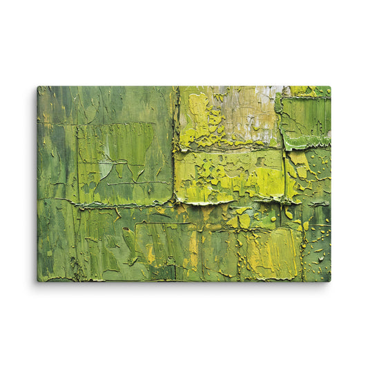
Drawn golden lines, flowing movement or a mineral effect can work with wood, fabrics and other surfaces in the room. Above all, compare the palette in the actual light of your home. These effects are visual: they do not mean that the product you receive has gold leaf, sculpted volume or a raised layer of paint.
Build a pair without repeating the same design
When pairing two canvases, you can keep a common colour while varying the density or movement. A lively composition benefits from being placed beside a calmer design. Modern and contemporary overlap here as decorative terms; the catalogue does not use them to assign each creation to a precise artistic period.
The canvas print you receive
The image is reproduced as a print on canvas. Any brushstroke or texture effect visible in the image is part of the printed design.
The textured canvas has a matte finish and is stretched over a wooden stretcher frame. The edges are printed and hanging hardware is included. The stretcher supports the canvas; it is different from an outer decorative frame.
The estimated delivery date appears on each product page. For details, see our shipping policy and our returns policy.
Your questions about this collection
Does the white-and-gold canvas contain gilding?
The golden tones are part of the printed design. They should not be confused with applied gold leaf or a metallic finish: consult the product specifications for its material and finish.
Which palette should I choose for a bedroom?
Pastel shades and moderate contrasts can complement a gentle mood. Compare them with your bedding and the light in the room. A vivid composition can also work if you want it to be the main focus on the wall.
Why do some designs also appear in the modern canvas collection?
These terms describe closely related decorative selections. Some products may belong to both collections. Choose according to the image, dimensions and specifications rather than treating the categories as a historical boundary.