Three ways to choose a beige canvas print
An abstract composition, mineral curves or a tree: neutral tones do not dictate a single subject. These examples show how drawing and contrast change a canvas print’s presence.
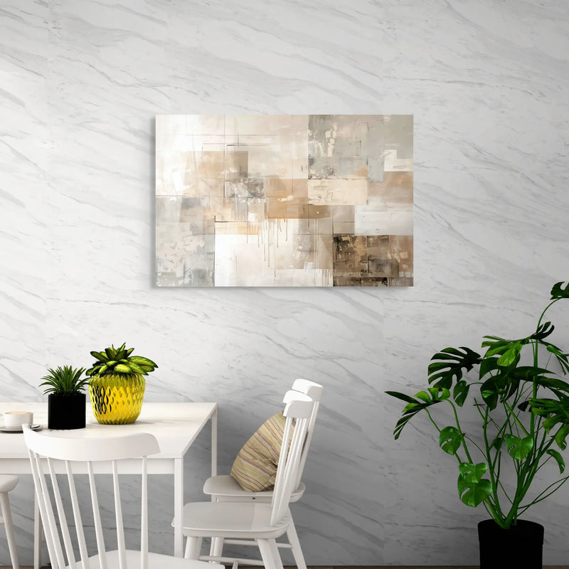
Beige and taupe abstraction: interplaying planes
Pale planes overlap taupe areas and more pronounced lines. The horizontal image suits low furniture, with a palette that pairs easily with wood and unbleached textiles. Look at the darkest passages: they give structure to a print that might otherwise blend into a pale wall.
View this canvas print ↗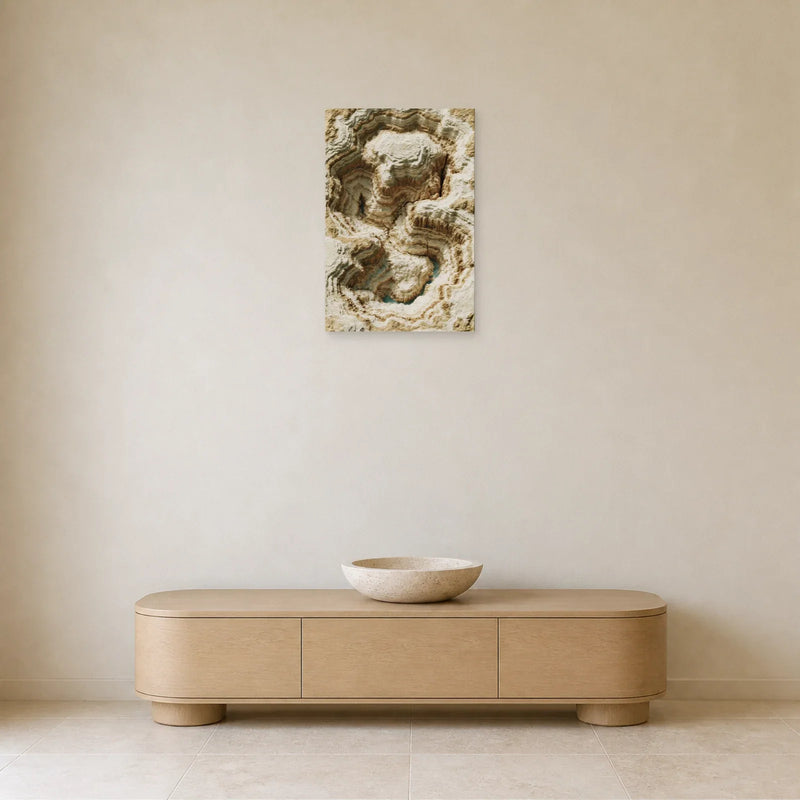
Mineral curves: a texture effect within the image
Curves and shadows suggest a sculpted mineral surface. Browns strengthen the contrast at the centre of the vertical composition. The relief is an effect within the printed motif, distinct from plaster or a thick material layer. A simple entrance or plain-coloured wall keeps the structure clearly visible.
View this canvas print ↗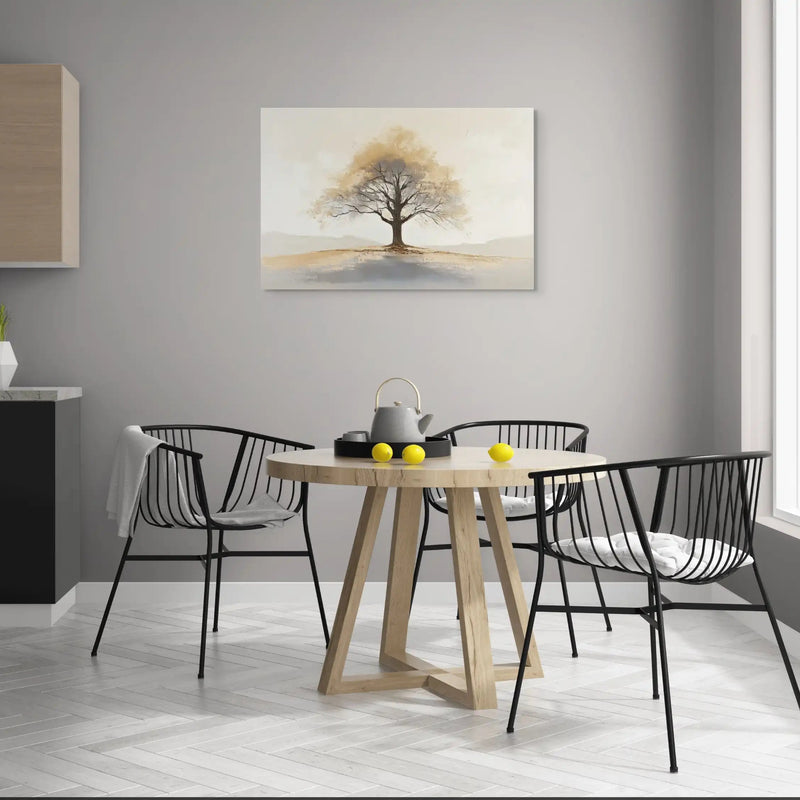
The tree: a recognisable subject in a soft palette
The tree stands out against a pale background and an uncluttered horizon. Its outline adds a figurative presence without multiplying the colours. Above a desk or table, it can echo natural wood and a few grey accents. Compare the fine branches at your usual viewing distance.
View this canvas print ↗Beige, cream, sand or taupe: comparing shades
A creamy beige looks lighter than a beige tending towards brown. Sand and ochre tones feel warmer; taupe introduces more grey. In the collection’s images, these shades may blend rather than form a uniform background.
Look at the print alongside the room’s large surfaces: wall, sofa and floor. On a white wall, beiges may provide the main contrast. On a beige wall, a dark outline or clearer differences in lightness help distinguish the work. Screens and lighting can change colour perception: use the images to compare palettes without expecting an exact match with your wall paint.
A beige abstract canvas print or a natural motif?
Abstract compositions are chosen for their lines, curves and distribution of colour. They can suit contemporary, minimalist or Japandi-inspired interiors. The collection also includes trees, landscapes, animals and figures: beige is not an artistic style in itself.
A natural subject gives you an immediately recognisable focus. An abstraction leaves more room for the rhythm of shapes. For a bedroom or reading space, compare above all the amount of detail you want to see each day. A motif that is discreet at a small scale can become very prominent in a large format.
Pairing beige with white, wood or a stronger colour
White and ecru continue a canvas print’s light areas. Wood and natural textiles can echo its sand or brown tones. A few black accents strengthen the outlines; a grey-blue or subtle green can pick up a shade already present in the image.
A successful combination does not require every shade to match. Instead, look for a connection between the canvas print and one element of the room. With a beige sofa, contrast may come from a dark tree or a taupe composition. With dark furniture, a lighter image can create visual separation.
Choose the position before the large format
A horizontal landscape can follow the width of a sofa or sideboard. A vertical composition fits a narrower wall near a door or bookcase. The words “large canvas print” do not replace checking the dimensions on the product page.
If you put together a pair or triptych, measure the prints and the spaces between them as one group. Check whether you are ordering several separate products or an explicitly listed multi-panel set. Interior photographs show arrangement ideas; they do not guarantee the scale on your own wall.
The canvas print you receive
The image is reproduced as a print on canvas. Any brushstroke or texture effect visible in the image is part of the printed design.
Each product page details the material, finish and accessories. Check its specifications before choosing your size.
The estimated delivery date appears on each product page. For details, see our shipping policy and our returns policy.
Your questions about this collection
How do you choose a beige canvas print for a beige wall?
Compare contrasts in the design: taupe, browns, dark branches or lighter shapes can separate the work from the wall. You do not need to find exactly the same beige. Consider the furniture and the room’s lighting too.
Which colours go with a beige canvas print?
White, ecru, natural wood, brown and black can extend or structure its palette. Green or grey-blue can also work if it echoes a shade in the motif. Choose a few colour echoes rather than trying to match every object.
Does a beige canvas print with a relief effect have a thick textured surface?
The pictures in this collection are printed on canvas. Relief, limewash, stone and textured paint effects belong to the reproduced motif. They do not mean that plaster, render or a raised layer of paint has been added.
Are beige canvas prints available horizontally and vertically?
Yes. Orientations and sizes vary by work. The filters and product pages help you choose a landscape for wide furniture or a vertical format for a narrower space. Dimensions are given as width × height.
How do you arrange several beige canvas prints on one wall?
Choose a shared palette or motif, then measure the total width including the gaps between canvases. Check each product to see whether it is a single print or a set: a room setting does not define the number of pieces sold.