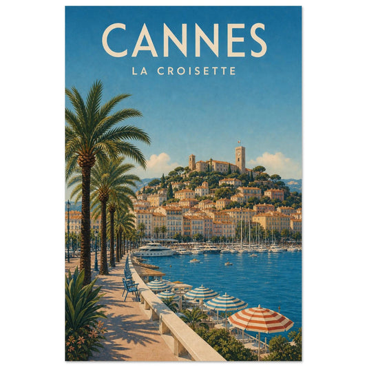
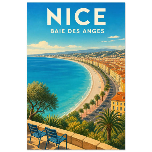
Between rocky headlands, pale villas and transparent water, the Côte d'Azur is distinguished by an almost graphic light. Umbrella pines cut into the sky, ports draw colourful touches and façades play with the Mediterranean's intense blues.
A coastline where the city meets the light
The eye can travel between palm-lined promenades, rocky headlands, marinas, pale façades and the coves of the Estérel. Transparent blues converse with pink façades, red rock and the graphic shadows of Mediterranean vegetation. This diversity forms a coherent ensemble without confining every work to the same visual formula.
The Côte d'Azur has a more specific urban and seaside dimension than the Provence, sea or Mediterranean collections, even if their landscapes can echo one another. It maintains a precise intention without presenting the same images under artificially interchangeable themes.
Choosing between seaside elegance and marine horizon
This visual territory brings sunlit energy without necessarily slipping into classic seaside imagery. Framing a cove creates breathing space in a living room; a coastal promenade or port animates an entrance hall. Azure, coral and cream tones pair particularly well with pale wood, white and metallic details in a contemporary interior. Strong shadows preserve depth despite the intensity of the light.
The Côte d'Azur theme can become a focal point or simply support the overall atmosphere. That decision depends on the free wall area, neighbouring colours and the role already played by furniture, textiles and other images.
A bay view adds depth to a living room, while a port or façade detail suits a more intimate space. To avoid an overly themed atmosphere, pair marine blue with sand, cream or terracotta tones already present. Before deciding, it is useful to observe the viewing distance, actual light and lines already present around the chosen position.