When Color Sculpts Your Emotions
Choosing a color canvas for your interior is far more than an aesthetic decision: it is an emotional act. The psychology of decorating colors reveals that each hue exerts a measurable power over our mood, our energy and our daily well-being. Blue soothes us, red energizes us, beige wraps us in softness, while black and white structures the space with elegance. Our collection of wall art by hue allows you to compose the perfect visual harmony to transform every room into an emotional sanctuary.
5 Key Facts to Remember
-
Scientifically proven impact: Colors measurably modify your heart rate, cortisol levels and state of alertness
-
Blue reduces stress: This hue lowers blood pressure and promotes concentration, ideal for bedrooms and workspaces
-
Red stimulates action: The color of energy and passion, it increases alertness but must be dosed to avoid agitation
-
Beige enlarges space: Soft and versatile, it brings warmth and balance while visually amplifying your room
-
Each room has its color: Living room (warm tones), bedroom (soothing shades), home office (blue or green for productivity)
The Psychology of Colors: Your Emotional Palette Every Day
Imagine your interior as a musical score where each color canvas plays a precise emotional note. This is not poetry, it is science! The psychology of decorating colors studies how hues affect our perceptions, behaviors and mental well-being. Research by Kwallek (1996) demonstrated that blue environments increased employee satisfaction and productivity, while Mehta & Zhu (2009) proved that green stimulated creativity in brainstorming sessions.
As I often say: "Choosing a color is choosing the emotion you will experience every day". Each morning, as you open your eyes to your wall art by hue, you are literally programming your state of mind for the day. A blue canvas in your bedroom envelops you in serenity, while a touch of red in your workspace triggers your creative energy.
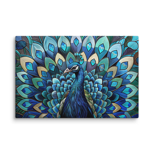
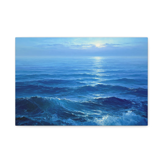
Blue: The Architect of Calm and Concentration
Blue is the undisputed champion of soothing. This color has measurable properties: it lowers blood pressure, reduces tension and promotes a state of tranquility conducive to reflection. Think of the vastness of a summer sky or the depth of an ocean – that is exactly what your brain feels when faced with this hue.
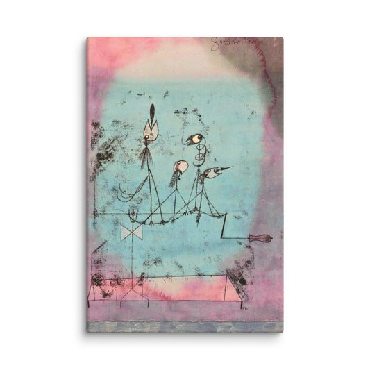
Our blue canvas collection draws on this psychology of decorating colors to create spaces where serenity and concentration reign. From soft sky blue to deep midnight blue, each shade offers a different emotional experience: the first evokes light escapism, the second brings refinement and depth. As Kandinsky theorized, blue evokes spirituality and depth, creating that famous visual harmony that transforms a simple wall into a portal toward inner peace.
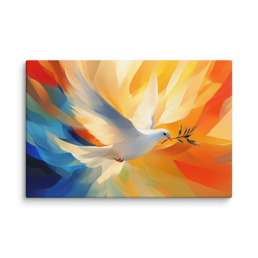
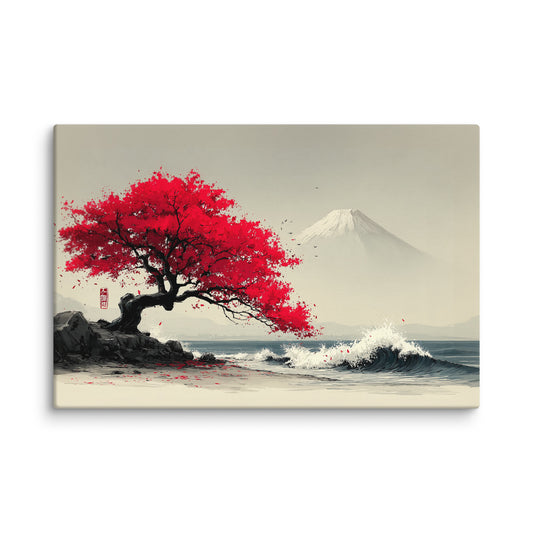
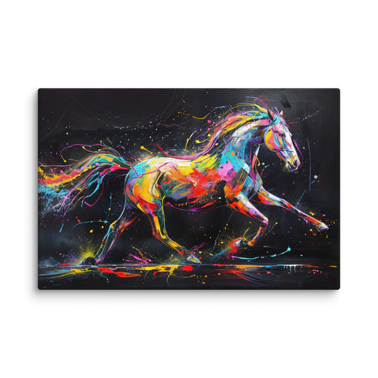
Red: The Injection of Energy and Passion
If blue soothes, red electrifies! This warm color literally activates your nervous system, accelerates your heart rate and draws attention like an emotional magnet. Studies by Elliot & Maier revealed that red increases alertness and performance on precise cognitive tasks. A symbol of energy, passion and sometimes urgency, it is the hue of bold decision-makers and creatives.
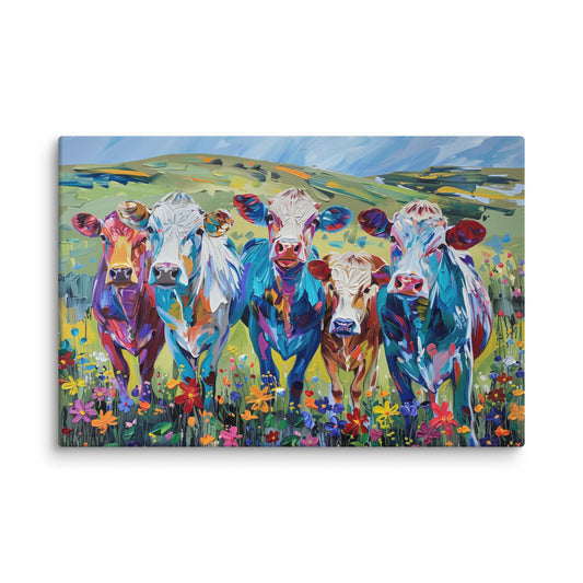
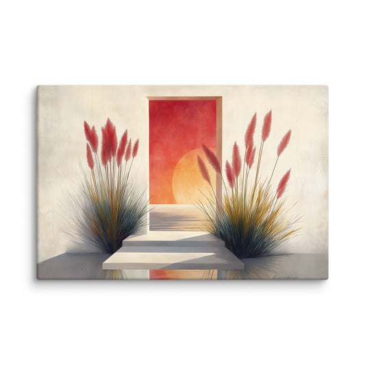
Be careful though: like a good espresso, red is best used in moderation. Over large surfaces, it can provoke agitation, but used as strategic touches in a color canvas, it becomes the perfect visual kick-start for your living room or creative space. It is the secret ingredient of our multicolor collection, where red engages with other hues to create dynamic compositions without ever tipping into excess.
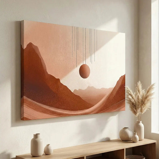
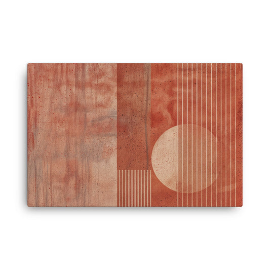
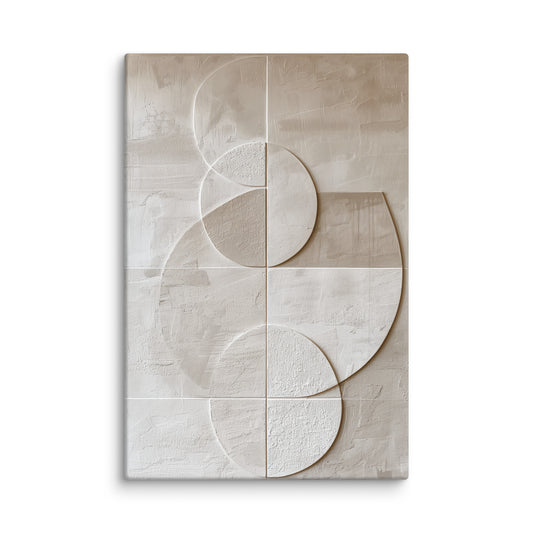
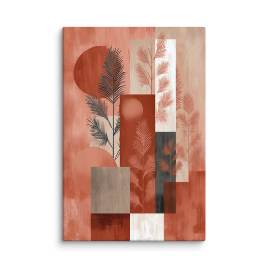
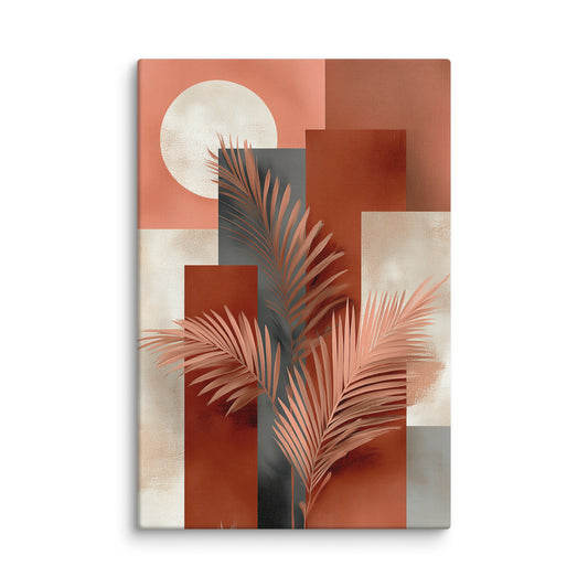
Beige: The Sophisticated Softness That Enlarges Space
Beige is the discreet gentleman of the color palette. Soft, natural, evoking linen and organic elements, it brings an enveloping warmth without ever being overwhelming. Unlike white, which can sometimes feel too cold, beige possesses that rare versatility that makes it compatible with virtually every interior style.
But here is its superpower: beige visually enlarges the space and acts on the light of the room. Our beige canvas collection exploits this optical property to create soft and spacious atmospheres. Paired with other colors in a wall art by hue composition, beige perfectly balances the freshness of blue or tempers the intensity of red. It is the perfect foundation for building your visual harmony without constraint.
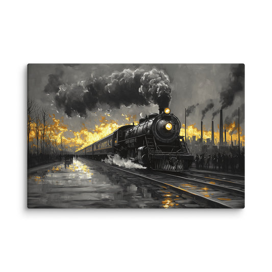
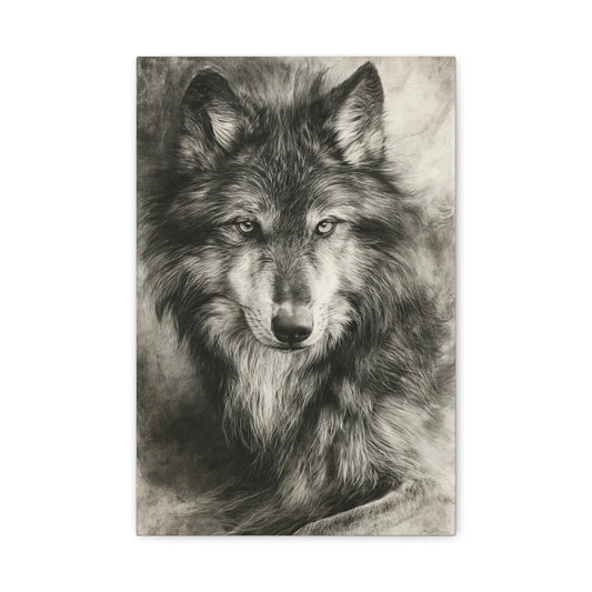
Black and White: The Timeless Elegance That Structures
The black and white duo transcends trends and eras. This combination creates a powerful visual harmony based on absolute contrast, structuring the space with incomparable graphic elegance. Black brings depth, sophistication and grounding, while white opens the space, diffuses light and inspires mental clarity.
Our black and white collection plays on this duality to create color canvases of striking modernity. These works complement all existing palettes – a valuable asset for harmonizing your décor. As in Piet Mondrian's compositions, black and white reveals the pure essence of forms and creates an immediate visual impact without relying on chromatic effects.
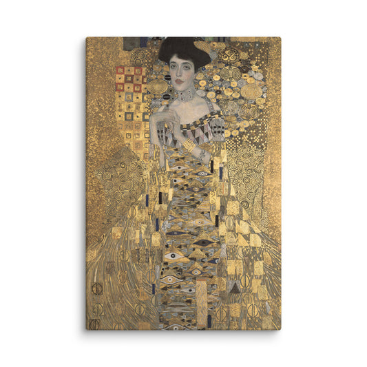
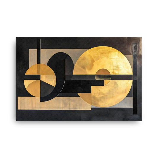
Gold: The Opulence That Warms and Inspires
Gold is not simply a color, it is a sensory experience. Evoking captured light, the warmth of the sun and refined opulence, gold instantly transforms a room into a precious space. Gustav Klimt masterfully demonstrated during his golden period how gold creates an opulent and striking visual effect, adding depth and texture to compositions.
Our gold canvas collection draws on this artistic tradition to offer wall art by hue that warms the atmosphere and captures light in a unique way. Gold works as a luminous accent within a neutral palette or as a focal point in a contemporary interior, creating that visual harmony between luxury and comfort.
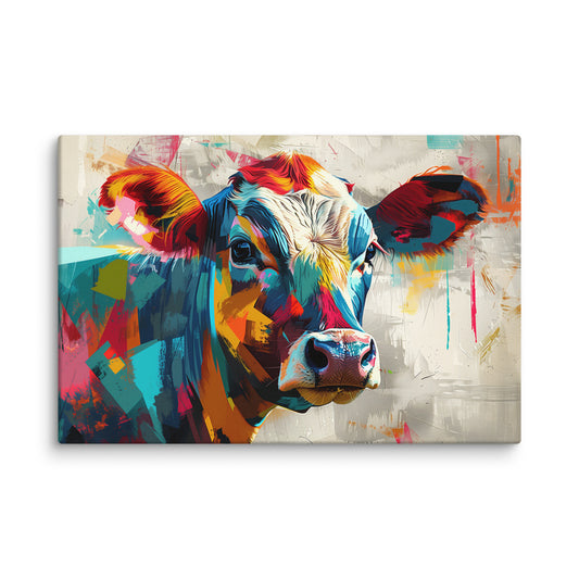
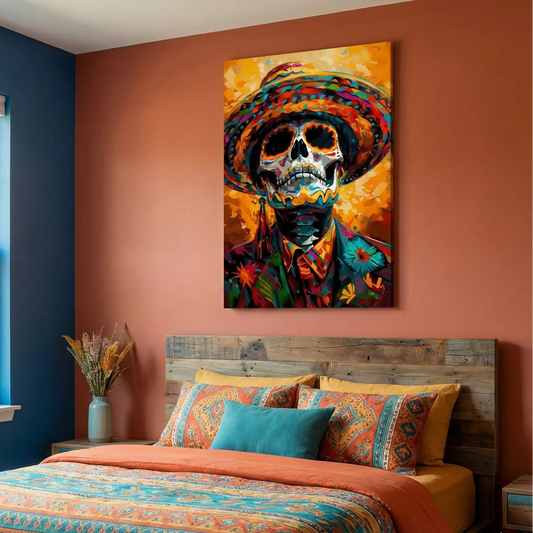
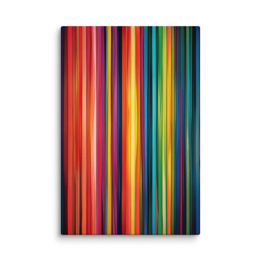
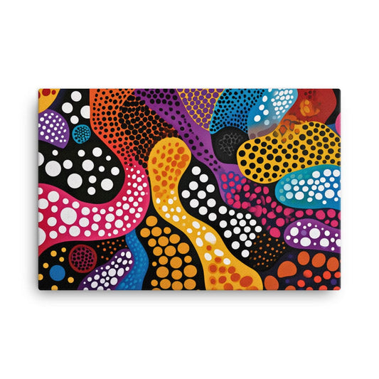
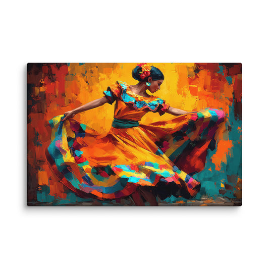
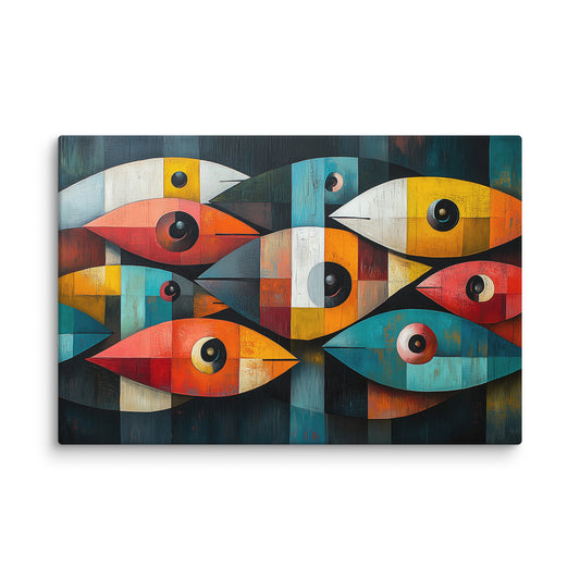
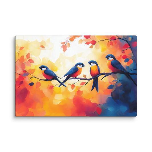
Multicolor: Creative Energy in Its Purest Form
Why choose a single emotion when you can compose a symphony? Multicolor canvases celebrate emotional diversity and overflowing creative energy. By combining multiple hues in a harmonious composition, these works offer a visual richness that stimulates the imagination and brings vitality to your space.
Our multicolor collection plays on contrasts and complementarities to create color canvases that tell complex visual stories. The key is to create harmony between the dominant color, the secondary colors and the accent touches. These colorful compositions evoke the spirit of abstract art, where colors dance freely to create pure emotions.
Composing Your Personal Emotional Palette
Now that you understand the psychology of decorating colors, how do you choose your ideal color canvas? Ask yourself these essential questions: What emotion do you want to feel in this space? Calm for a bedroom? Energy for a home office? Conviviality for a living room?
The golden rule: a single canvas with the right colors transforms an entire room more effectively than ten decorative accessories. Think functional and emotional above all. For a workspace, favor soft blue or light green for concentration and balance. For a bedroom, opt for soothing warm tones like beige or pastel blue. For a convivial living room, warm tones (beige, terracotta) or soothing ones (blue/gray) with an accent color (gold, black) visually structure the space.
Visual harmony arises from the balance between your emotional needs and the intrinsic properties of colors. That is exactly what our collection of wall art by hue allows you to create: spaces that are not only beautiful, but that nourish your daily well-being.
FAQ: Your Questions About Wall Art by Color
Do the colors of canvases really have a scientifically proven psychological impact?
Absolutely! Scientific research has proven that certain colors trigger measurable physiological reactions: heart rate, cortisol production, state of alertness. The impact of colors on our mood has been scientifically validated by numerous studies in environmental psychology.
What color canvas should I choose for a bedroom?
Favor blue for its calming properties that promote sleep, or beige for its enveloping softness. Soothing warm tones or dark purple/gray also create an intimate atmosphere conducive to rest.
Can you mix several colors in the same room?
Yes, it is even recommended! The key is to create harmony between the dominant color, the secondary colors and the accent touches. A multicolor canvas can serve as a focal point and inspire your entire decorative palette.
Is beige too neutral to create a strong atmosphere?
Not at all! Beige visually enlarges the space and makes it easy to pair with other deeper colors. It is a versatile base that brings softness and warmth, unlike white which can sometimes feel too cold.
How do you use red without creating an overly stimulating space?
Red must be used strategically. Use it as touches within a canvas rather than over large surfaces, or choose a multicolor canvas where red engages with more soothing hues to balance its intensity.