













Pink shades in a mineral-looking design
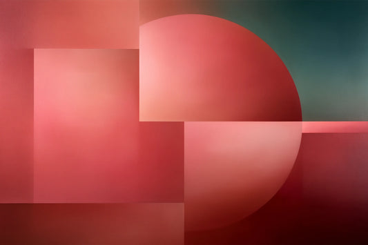
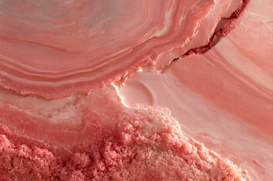
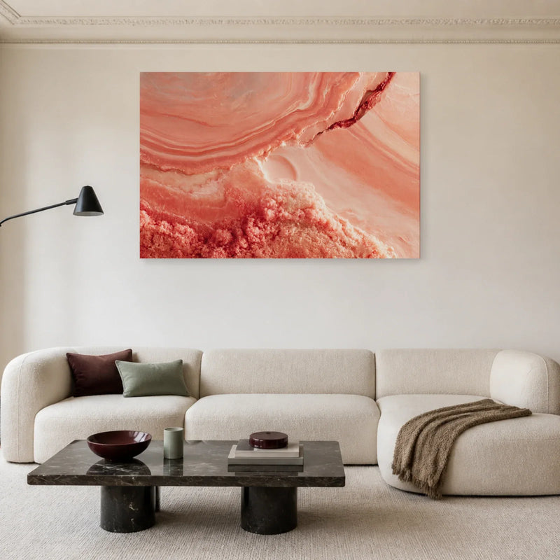
Mineral Dusty Rose combines curves, pale areas and warmer pink tones. The suggested texture belongs to the printed image; there is no stone attached to the canvas.
View this canvas print ↗
Multicoloured circles, luminous gradients and warm swirling forms: choose abstract canvas art...
Your cart
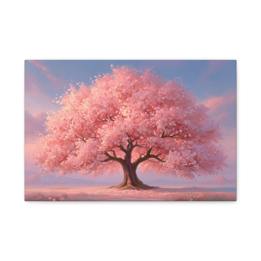
From pale blush to stronger shades, choose a canvas print for its colours as well as its subject. This colour-led collection includes abstract compositions, landscapes and figurative pictures in which pink has a prominent role. It is not limited to pictures of roses or bouquets.
Canvas print · Multiple sizes
Canvas print · Multiple sizes
Canvas print · Multiple sizes
Canvas print · Multiple sizes
Canvas print · Multiple sizes
Canvas print · Multiple sizes
Canvas print · Multiple sizes
Canvas print · Multiple sizes
Canvas print · Multiple sizes
Canvas print · Multiple sizes
Canvas print · Multiple sizes
Canvas print · Multiple sizes
Canvas print · Multiple sizes
Canvas print · Multiple sizes
Canvas print · Multiple sizes
Canvas print · Multiple sizes
Canvas print · Multiple sizes
Canvas print · Multiple sizes
Canvas print · Multiple sizes
Canvas print · Multiple sizes
Canvas print · Multiple sizes
Canvas print · Multiple sizes
Canvas print · Multiple sizes
Canvas print · Multiple sizes
Pink can cover most of a canvas or appear as an accent beside blue, turquoise or neutral tones. Compare the proportion of each colour before choosing a print for your room. A mineral-looking surface or painterly movement belongs to the image printed on canvas; it is not a raised material added to it. Look at the subject as well as the shade: an abstract image, a coastal view and a floral motif make different impressions even when all contain pink. Available dimensions depend on the product.
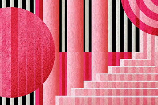
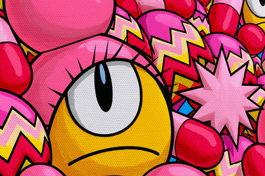
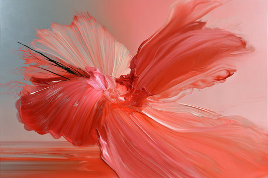
Mineral-looking forms, an expansive gesture and a coastal landscape show how pink pairs with other colours. Compare its share of each image and the space left for lighter areas.
Mineral Dusty Rose combines curves, pale areas and warmer pink tones. The suggested texture belongs to the printed image; there is no stone attached to the canvas.
View this canvas print ↗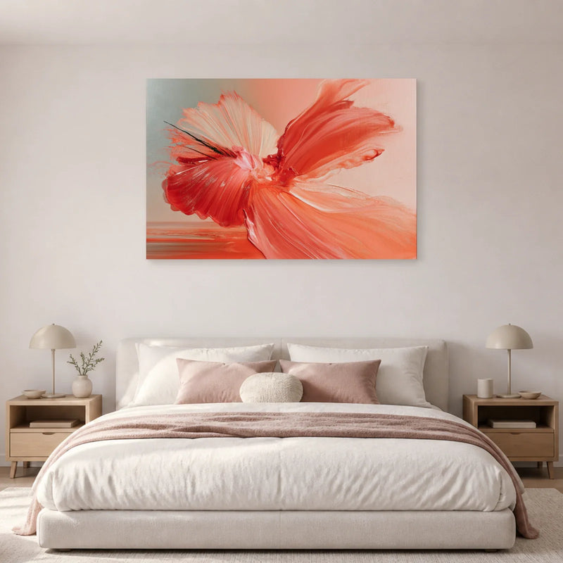
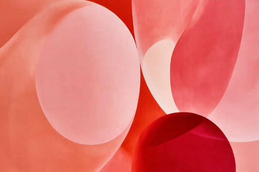
Gestural Fuchsia Pink centres the picture on a broad pink and coral gesture. A pale background sets off the motif. Compare the actual image rather than relying on the shade in its title.
View this canvas print ↗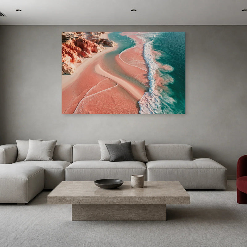
Pink Sea pairs a pink shoreline with turquoise water. This landscape shows the colour in a recognisable scene, with a contrast between beach and ocean.
View this canvas print ↗Pink can lean towards beige, salmon or cooler tones. When pairing a print with a sofa or curtains, look at the surrounding colours in the image too. A large pale area reads differently from a small saturated accent. Product names help you search, but the image is the best guide; room lighting and screens can alter how shades appear.
With pale wood and cream textiles, a matching background can create continuity. Green, blue or grey in some prints offer other combinations. If the room already has plenty of pink, a second colour can avoid a uniform effect. This palette need not be reserved for bedrooms: subject and crop can also give it graphic presence in a living room.
An abstract print draws attention to curves and contrasts. A landscape provides a horizon; a floral image adds a recognisable form. Their shared colour does not make them interchangeable. Decide what you would enjoy seeing every day before trying to match an accessory exactly. For several prints, keep one shade in common and vary the subjects if you wish.
A print that is almost entirely pink has more visual presence than one using pink as an accent. Outline the size on your wall to judge it above the furniture. Check the dimensions of the chosen product, then view the outline up close and from the doorway.
Example: Dusty Rose Mineral Canvas Print.
Available sizes (width × height): 46 × 31 cm · 61 × 41 cm · 76 × 51 cm · 91 × 61 cm · 122 × 81 cm.
The image is reproduced as a print on canvas. Any brushstroke or texture effect visible in the image is part of the printed design.
The textured canvas has a matte finish and is stretched over a wooden stretcher frame. The edges are printed and hanging hardware is included. The stretcher supports the canvas; it is different from an outer decorative frame.
The estimated delivery date appears on each product page. For details, see our shipping policy and our returns policy.
No. Pink describes the colour here. You will find abstract compositions and landscapes among other subjects. For a particular flower, check the motif on its product page.
Compare dusty rose with cream tones and a picture that pairs pink with a contrasting colour. Choose between gentle continuity and a more visible wall accent.
Look at the print’s secondary colours and neutral areas. You can echo a little pink in a textile while choosing a picture with blue, green or darker tones.
For other warm palettes, explore our orange canvas prints and brown canvas prints.