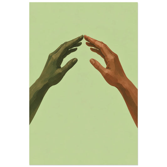
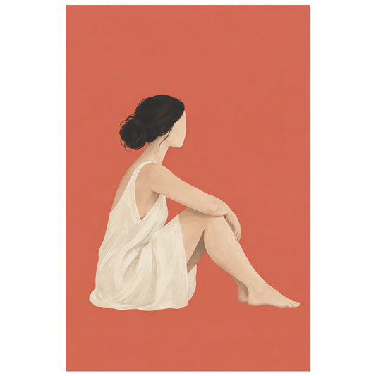
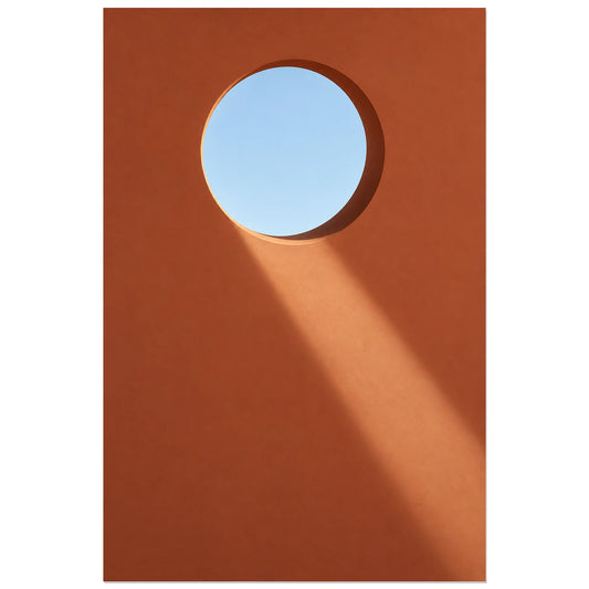
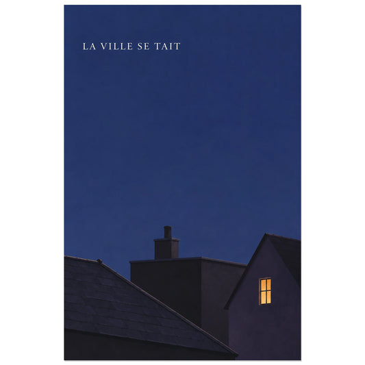
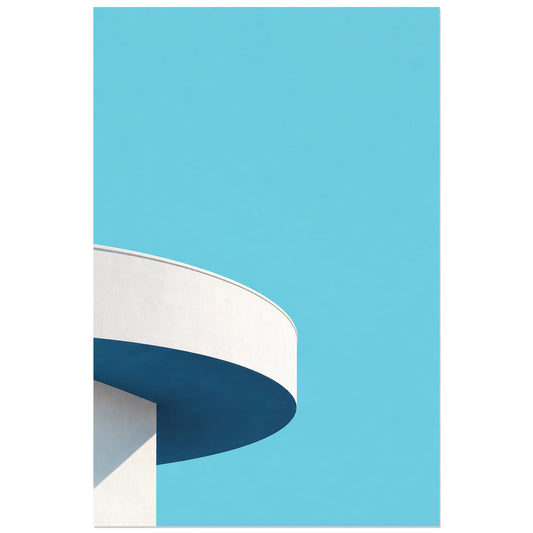
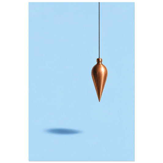
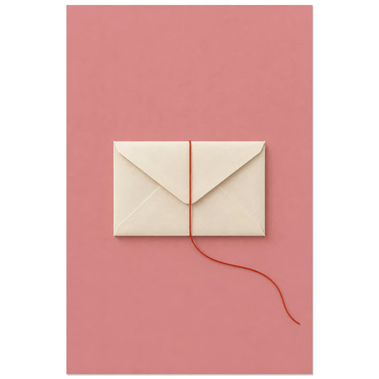
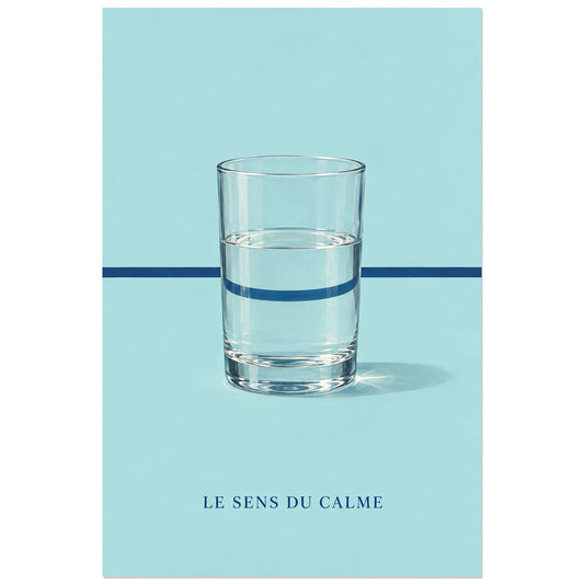
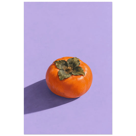
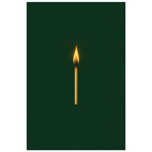
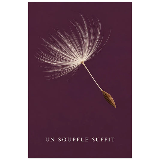
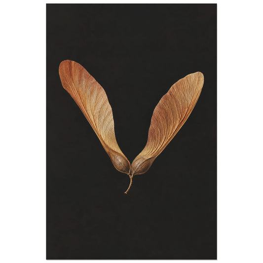
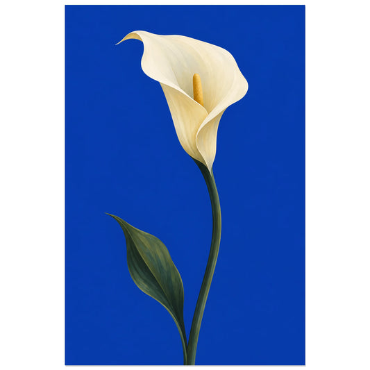
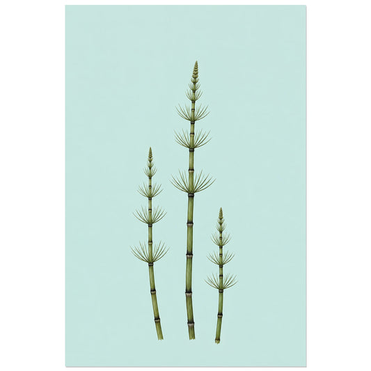
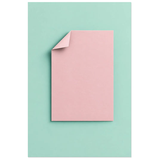
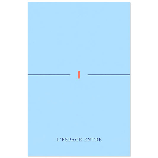
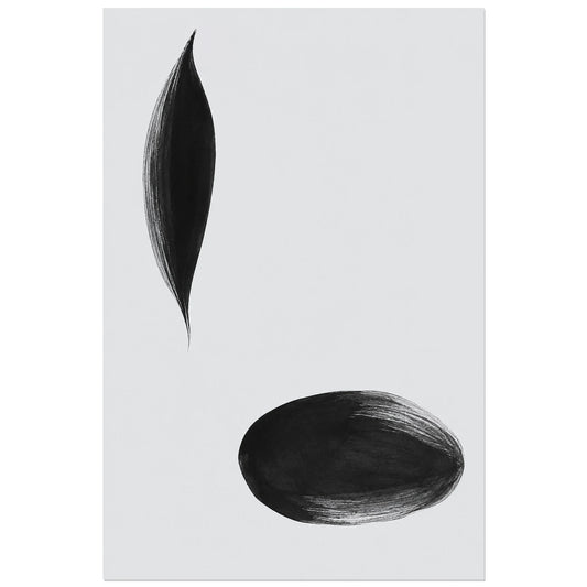
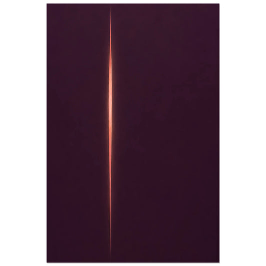
Minimalism seeks the right presence through few elements, a controlled palette and fully embraced negative space. A shape, a line or a relationship of proportions can be enough to establish lasting visual tension.
Reducing the image to strengthen its presence
There are several ways to explore isolated forms, restricted palettes, silhouettes, negative space and compositions based on a single gesture. Precision of proportion becomes essential when few elements are present; a slight shift can create the entire rhythm. These variations in light and material make it possible to choose a discreet or much more assertive presence.
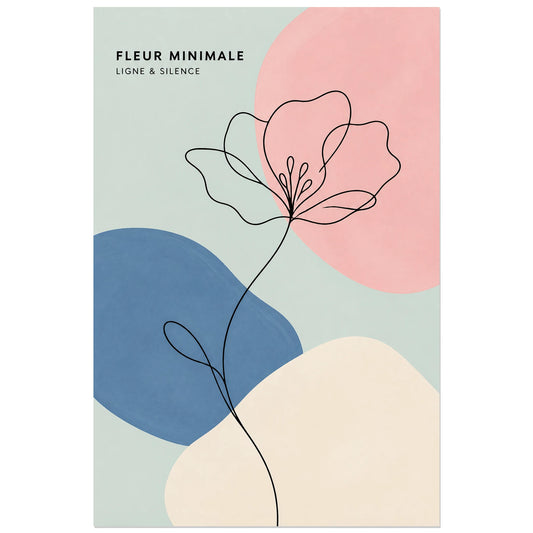
Minimalism is an approach of reduction, distinct from line drawing or Japandi even though it shares their restraint. These boundaries prevent neighbouring worlds from being confused and make the particular feeling sought here immediately recognisable.
Choosing what the wall should leave room to breathe
In a bright room, this kind of image extends the calm without disappearing. Above a desk or low piece of furniture, it provides a precise marker that lets the architecture breathe. Neutral colours are not essential: an intense accent can become all the stronger when it remains isolated. The key is to retain a clear hierarchy and avoid any gratuitous detail. A very subtle texture nevertheless prevents the image from becoming cold or impersonal.
A minimalist subject does not impose one palette or one style. It can relate to what is already there through a secondary hue, a line direction or a shared feeling, without seeking a literal decorative match.
A very airy image suits calm rooms and narrow walls. Its visual margin should be respected when hanging it. For a pair, it is better to contrast two complementary forms than place almost identical compositions side by side. Sufficient space around the image will preserve its presence and later make it easier to add a second work.