Black and White Posters
-
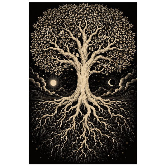
Affiche Arbre de vie – Racines d'ivoire
Vendor:Art VirtuosoRegular price From 39,90 €Regular priceUnit price per -
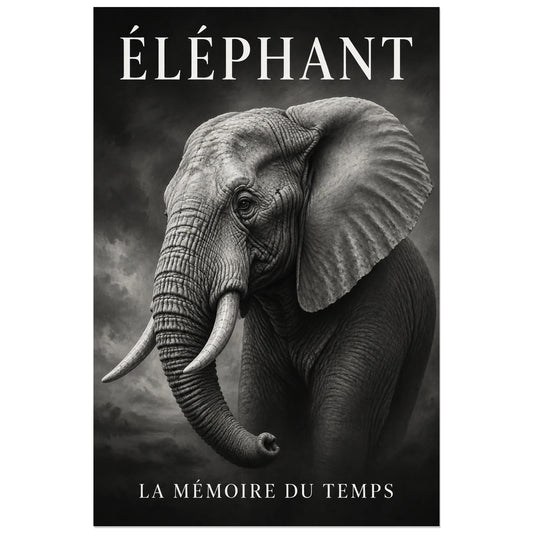
Affiche Éléphant noir et blanc, la mémoire du temps
Vendor:Art VirtuosoRegular price From 39,90 €Regular priceUnit price per -
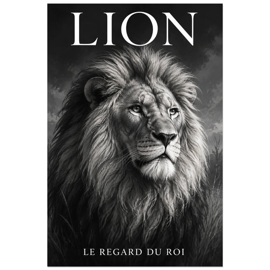
Affiche Lion noir et blanc, le regard du roi
Vendor:Art VirtuosoRegular price From 39,90 €Regular priceUnit price per -
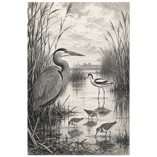
Black and White Birds and Reeds Poster
Vendor:Art VirtuosoRegular price From 39,90 €Regular priceUnit price per -
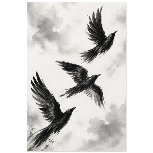
Black and White Birds in Flight Poster
Vendor:Art VirtuosoRegular price From 39,90 €Regular priceUnit price per -
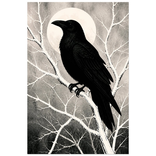
Black and White Raven Silhouette Poster
Vendor:Art VirtuosoRegular price From 39,90 €Regular priceUnit price per -
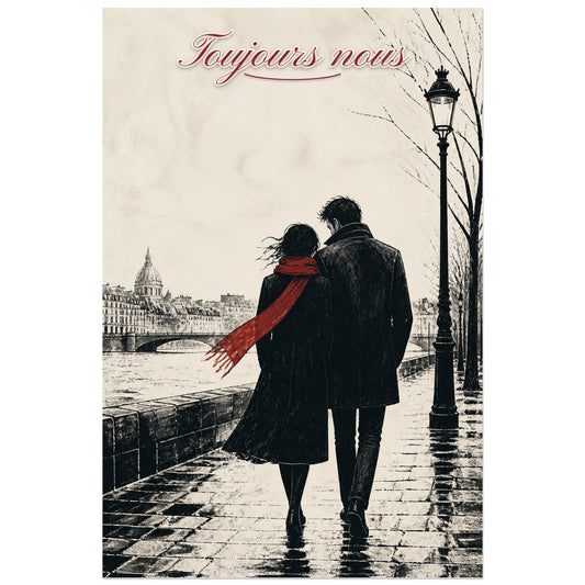
Affiche Toujours nous - Couple de dos
Vendor:Art VirtuosoRegular price From 39,90 €Regular priceUnit price per -
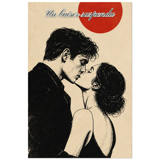
Affiche Un baiser suspendu - Couple en noir et blanc
Vendor:Art VirtuosoRegular price From 39,90 €Regular priceUnit price per -
Affiche Piano - Clair-obscur
Vendor:Art VirtuosoRegular price From 39,90 €Regular priceUnit price per -
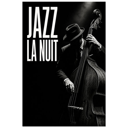
Affiche Jazz noir et blanc - La nuit
Vendor:Art VirtuosoRegular price From 39,90 €Regular priceUnit price per -
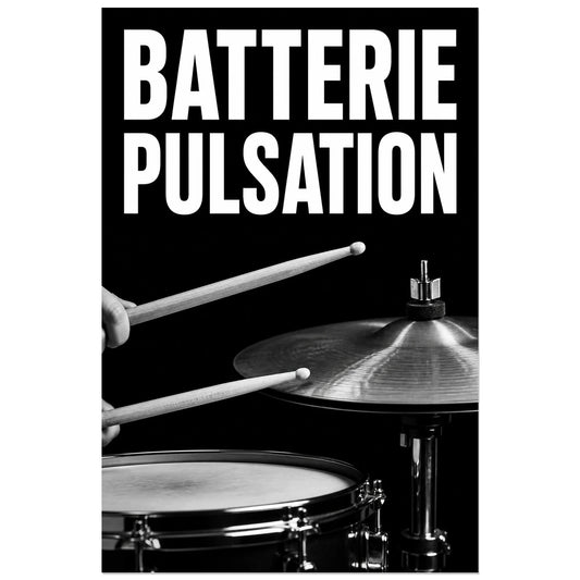
Affiche Batterie - Pulsation
Vendor:Art VirtuosoRegular price From 39,90 €Regular priceUnit price per -
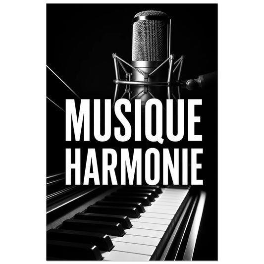
Affiche Musique noir et blanc – Harmonie
Vendor:Art VirtuosoRegular price From 39,90 €Regular priceUnit price per -
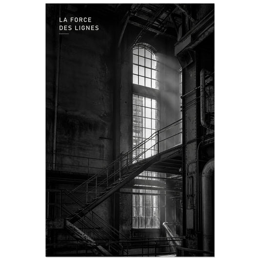
Affiche photo Architecture industrielle en noir et blanc - La force des lignes
Vendor:Art VirtuosoRegular price From 39,90 €Regular priceUnit price per -
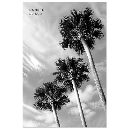
Affiche photo Palmiers en noir et blanc - L’ombre du Sud
Vendor:Art VirtuosoRegular price From 39,90 €Regular priceUnit price per -
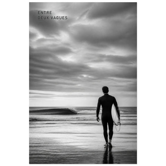
Affiche photo Surf en noir et blanc - Entre deux vagues
Vendor:Art VirtuosoRegular price From 39,90 €Regular priceUnit price per -
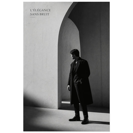
Affiche photo Élégance masculine en noir et blanc - Sans bruit
Vendor:Art VirtuosoRegular price From 39,90 €Regular priceUnit price per -
Affiche photo Cheval libre en noir et blanc - Libre par nature
Vendor:Art VirtuosoRegular price From 39,90 €Regular priceUnit price per -
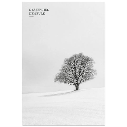
Affiche photo L’arbre essentiel - L’essentiel demeure
Vendor:Art VirtuosoRegular price From 39,90 €Regular priceUnit price per -
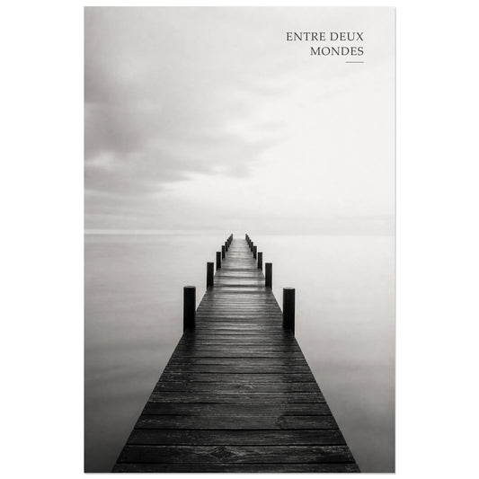
Affiche photo Ponton entre deux mondes - Entre deux mondes
Vendor:Art VirtuosoRegular price From 39,90 €Regular priceUnit price per -
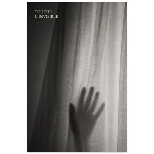
Affiche photo Main derrière le voile - Touche l’invisible
Vendor:Art VirtuosoRegular price From 39,90 €Regular priceUnit price per -
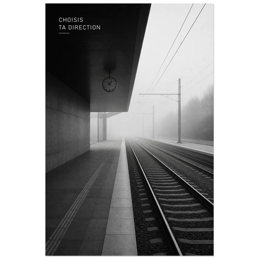
Affiche photo Lignes dans la brume - Choisis ta direction
Vendor:Art VirtuosoRegular price From 39,90 €Regular priceUnit price per -
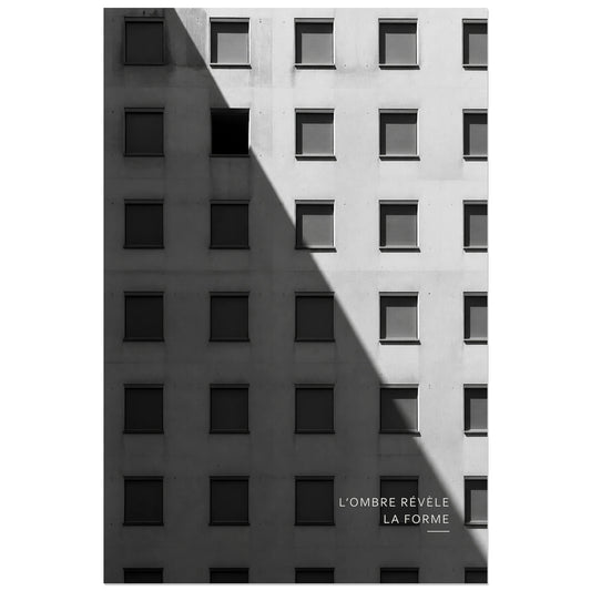
Affiche photo Façade noir et blanc - L’ombre révèle la forme
Vendor:Art VirtuosoRegular price From 39,90 €Regular priceUnit price per -
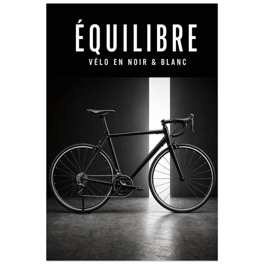
Affiche Vélo noir et blanc – Équilibre
Vendor:Art VirtuosoRegular price From 39,90 €Regular priceUnit price per -
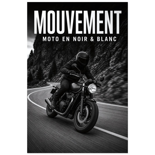
Affiche Moto noir et blanc – Mouvement
Vendor:Art VirtuosoRegular price From 39,90 €Regular priceUnit price per -
Affiche Voiture noir et blanc – La ligne
Vendor:Art VirtuosoRegular price From 39,90 €Regular priceUnit price per -
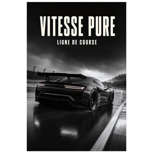
Affiche Voiture de course – Vitesse pure
Vendor:Art VirtuosoRegular price From 39,90 €Regular priceUnit price per -
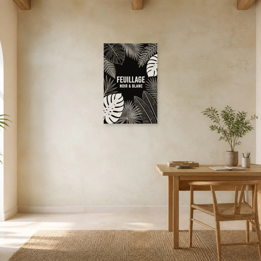
Affiche Feuillage – Noir et blanc
Vendor:Art VirtuosoRegular price From 39,90 €Regular priceUnit price per -
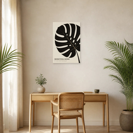
Affiche Monstera noire – Étude botanique
Vendor:Art VirtuosoRegular price From 39,90 €Regular priceUnit price per -
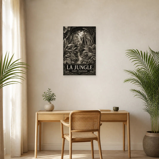
Affiche La jungle – Forêt profonde
Vendor:Art VirtuosoRegular price From 39,90 €Regular priceUnit price per -
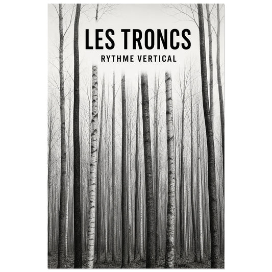
Affiche Les troncs – Rythme vertical
Vendor:Art VirtuosoRegular price From 39,90 €Regular priceUnit price per -
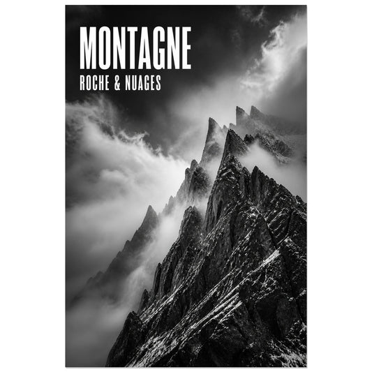
Affiche Montagne – Roche et nuages
Vendor:Art VirtuosoRegular price From 39,90 €Regular priceUnit price per -
Affiche Roches – Eau & Matière
Vendor:Art VirtuosoRegular price From 39,90 €Regular priceUnit price per -
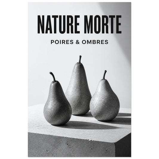
Affiche Nature Morte – Poires & Ombres
Vendor:Art VirtuosoRegular price From 39,90 €Regular priceUnit price per -
Affiche Chaise – Icône Moderne
Vendor:Art VirtuosoRegular price From 39,90 €Regular priceUnit price per -
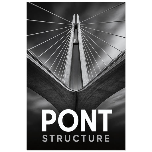
Affiche Pont – Structure
Vendor:Art VirtuosoRegular price From 39,90 €Regular priceUnit price per -
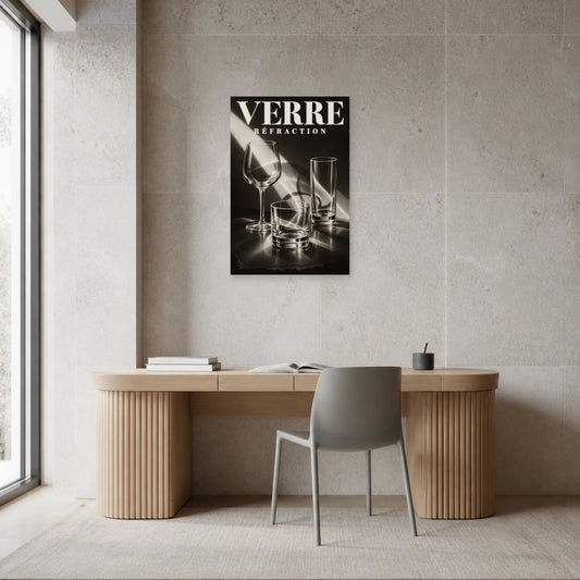
Affiche Verre – Réfraction
Vendor:Art VirtuosoRegular price From 39,90 €Regular priceUnit price per