Abstract Posters
-
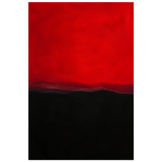
Abstract Poster - Red and Night
Vendor:Art VirtuosoRegular price From 39,90 €Regular priceUnit price per -
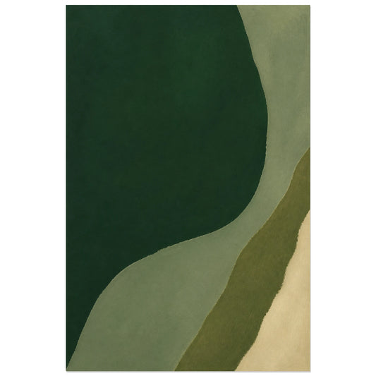
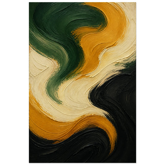
Abstract Poster - Green Silence
Vendor:Art VirtuosoRegular price From 39,90 €Regular priceUnit price per -
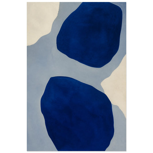
Abstract Poster - Blue Depth
Vendor:Art VirtuosoRegular price From 39,90 €Regular priceUnit price per -
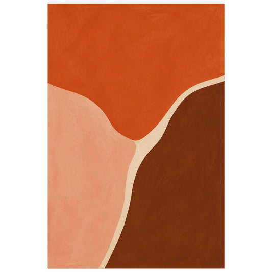
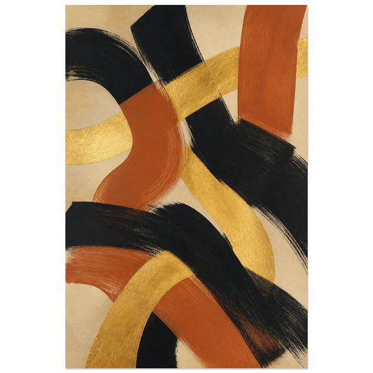
Abstract Poster - Terracotta Field
Vendor:Art VirtuosoRegular price From 39,90 €Regular priceUnit price per -
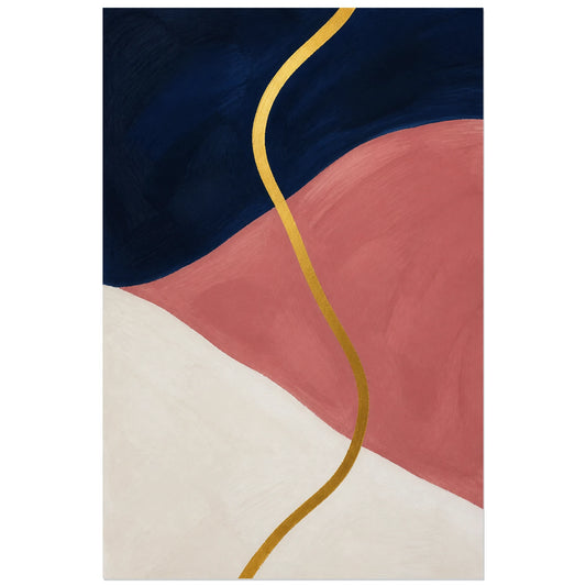
Abstract Poster - Precious Line
Vendor:Art VirtuosoRegular price From 39,90 €Regular priceUnit price per -
Abstract Poster - Light within Matter
Vendor:Art VirtuosoRegular price From 39,90 €Regular priceUnit price per -
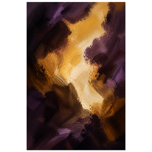
Abstract Poster - Golden Glow
Vendor:Art VirtuosoRegular price From 39,90 €Regular priceUnit price per -
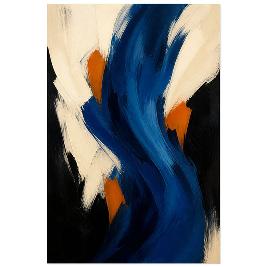
Abstract Poster - Deep Blue Rhythm
Vendor:Art VirtuosoRegular price From 39,90 €Regular priceUnit price per -
Abstract Poster - Oil in Motion
Vendor:Art VirtuosoRegular price From 39,90 €Regular priceUnit price per -
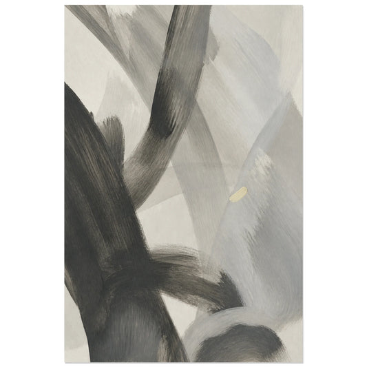
Abstract Poster - Living Graphite
Vendor:Art VirtuosoRegular price From 39,90 €Regular priceUnit price per -
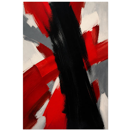
Abstract Poster - Red and Black Energy
Vendor:Art VirtuosoRegular price From 39,90 €Regular priceUnit price per -
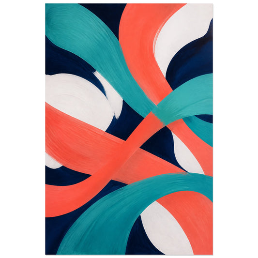
Abstract Poster - Coral and Turquoise
Vendor:Art VirtuosoRegular price From 39,90 €Regular priceUnit price per -
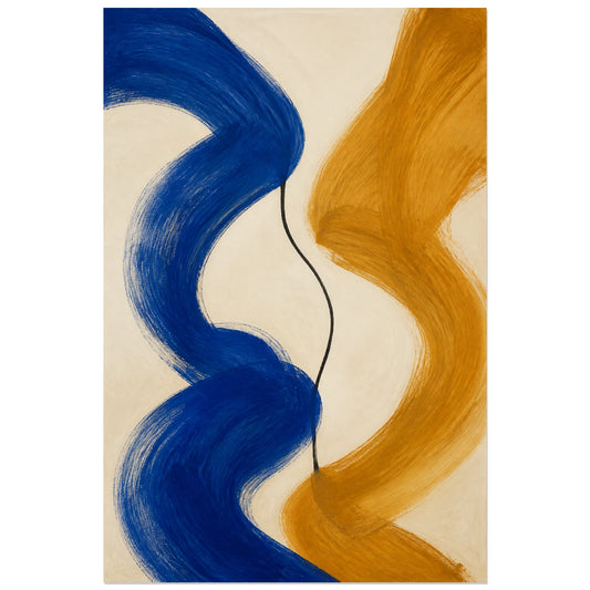
Abstract Poster - Cobalt and Ochre
Vendor:Art VirtuosoRegular price From 39,90 €Regular priceUnit price per -
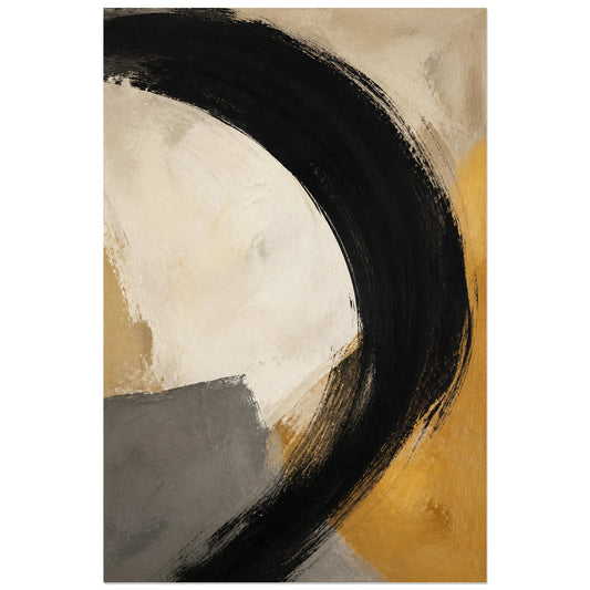
Abstract Poster - Grand Black Gesture
Vendor:Art VirtuosoRegular price From 39,90 €Regular priceUnit price per -
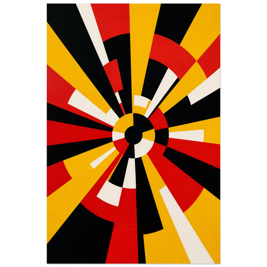
Abstract Poster - Abstract Signal
Vendor:Art VirtuosoRegular price From 39,90 €Regular priceUnit price per -
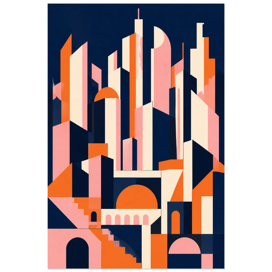
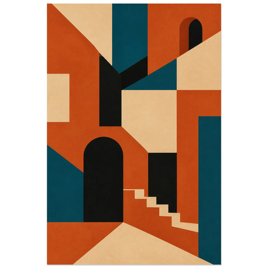
Abstract Poster - Geometric City
Vendor:Art VirtuosoRegular price From 39,90 €Regular priceUnit price per -
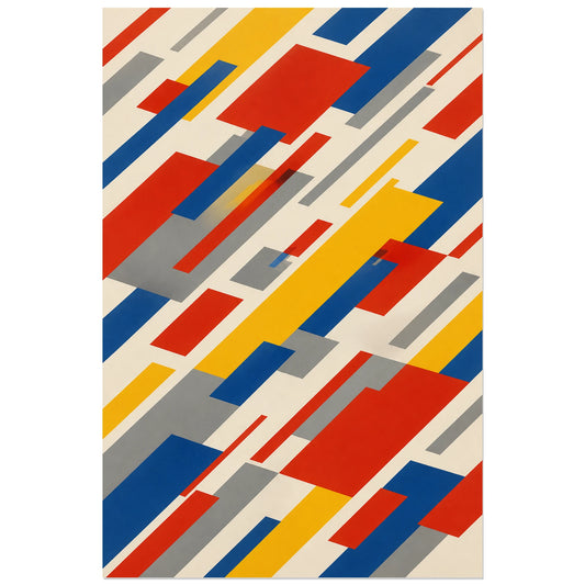
Abstract Poster - Blocks in Motion
Vendor:Art VirtuosoRegular price From 39,90 €Regular priceUnit price per -
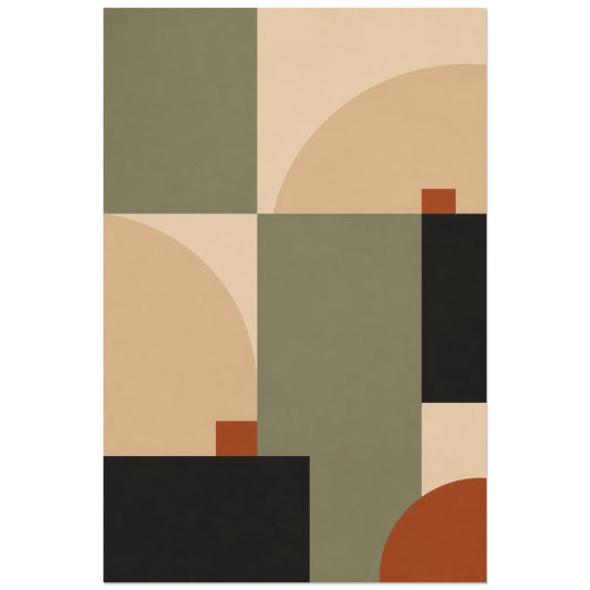
Abstract Poster - Scandinavian Geometry
Vendor:Art VirtuosoRegular price From 39,90 €Regular priceUnit price per -
Abstract Poster - Wall Structure
Vendor:Art VirtuosoRegular price From 39,90 €Regular priceUnit price per -
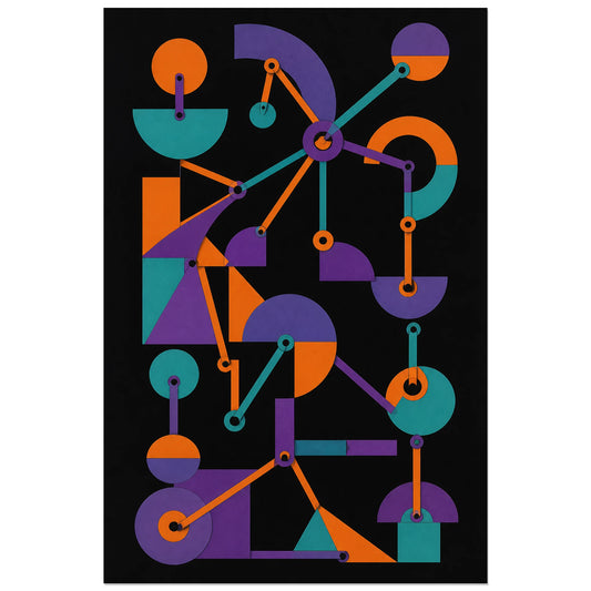
Abstract Poster - Articulated Forms
Vendor:Art VirtuosoRegular price From 39,90 €Regular priceUnit price per -
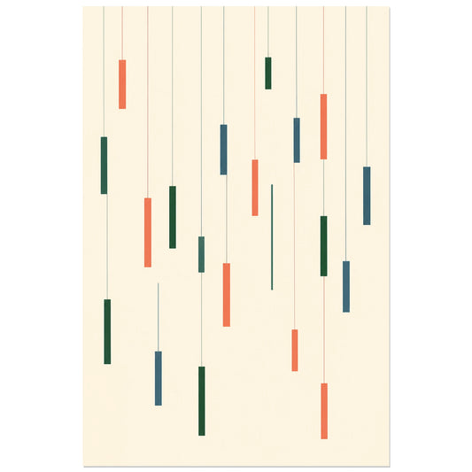
Abstract Poster - Floating Rectangles
Vendor:Art VirtuosoRegular price From 39,90 €Regular priceUnit price per -
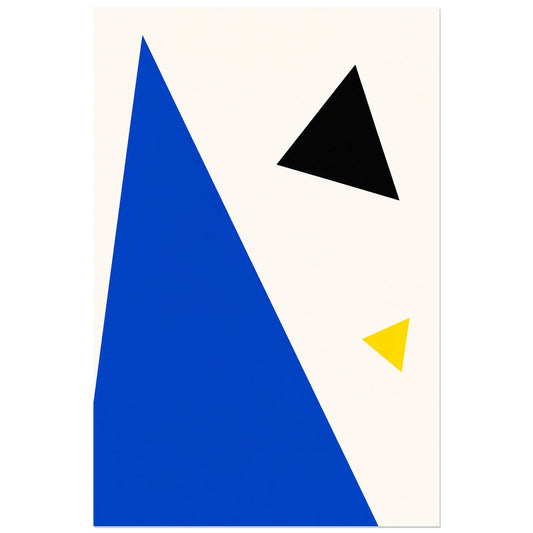
Abstract Poster - Triangular Tension
Vendor:Art VirtuosoRegular price From 39,90 €Regular priceUnit price per -
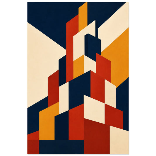
Abstract Poster - Ascending Construction
Vendor:Art VirtuosoRegular price From 39,90 €Regular priceUnit price per -
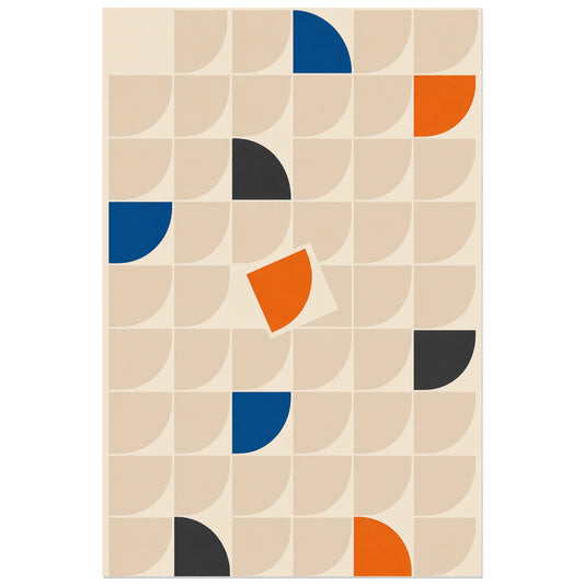
Abstract Poster - Modular Grid
Vendor:Art VirtuosoRegular price From 39,90 €Regular priceUnit price per -
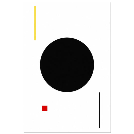
Abstract Poster - Black Circle
Vendor:Art VirtuosoRegular price From 39,90 €Regular priceUnit price per -
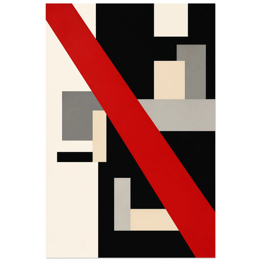
Abstract Poster - Red Diagonal
Vendor:Art VirtuosoRegular price From 39,90 €Regular priceUnit price per -
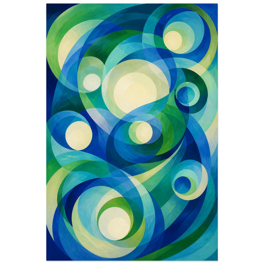
Abstract Poster - Blue-Green Orbits
Vendor:Art VirtuosoRegular price From 39,90 €Regular priceUnit price per -
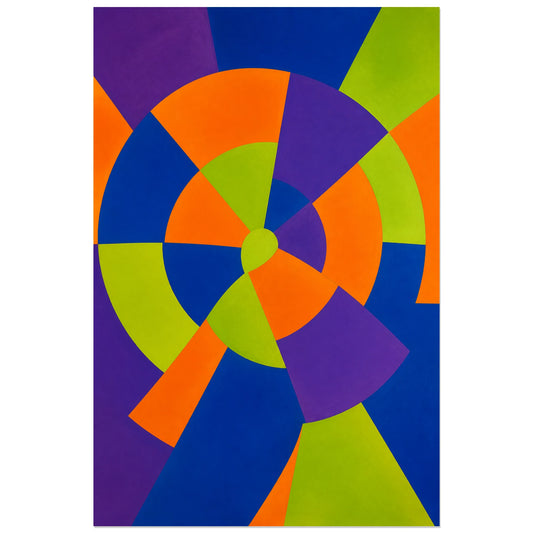
Abstract Poster - Luminous Wheel
Vendor:Art VirtuosoRegular price From 39,90 €Regular priceUnit price per -
Abstract Poster - Blue and Yellow Prism
Vendor:Art VirtuosoRegular price From 39,90 €Regular priceUnit price per -
Abstract Poster - Red Wave
Vendor:Art VirtuosoRegular price From 39,90 €Regular priceUnit price per -
Abstract Poster - Chromatic Bursts
Vendor:Art VirtuosoRegular price From 39,90 €Regular priceUnit price per -
Abstract Poster - Circular Cadence
Vendor:Art VirtuosoRegular price From 39,90 €Regular priceUnit price per -
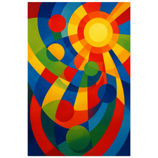
Abstract Poster - Solar Rhythm
Vendor:Art VirtuosoRegular price From 39,90 €Regular priceUnit price per -
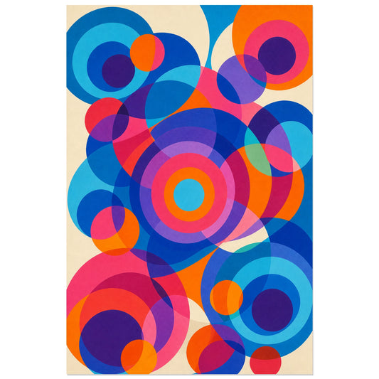
Abstract Poster - Simultaneous Circles
Vendor:Art VirtuosoRegular price From 39,90 €Regular priceUnit price per -
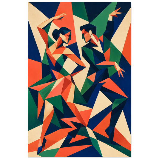
Abstract Poster - Fragmented Dance
Vendor:Art VirtuosoRegular price From 39,90 €Regular priceUnit price per -
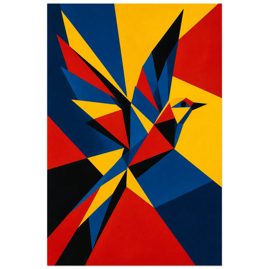
Abstract Poster - Prismatic Bird
Vendor:Art VirtuosoRegular price From 39,90 €Regular priceUnit price per