



Which Klimt Artwork Should You Choose for Your Interior?
Choosing Klimt is not simply choosing gold. The Kiss wraps its figures in ornament, the portraits set human presence against decorated surfaces, and the later works often become lighter and more chromatic. Those differences determine how a reproduction behaves in a room.
Klimt’s gold is not a neutral colour
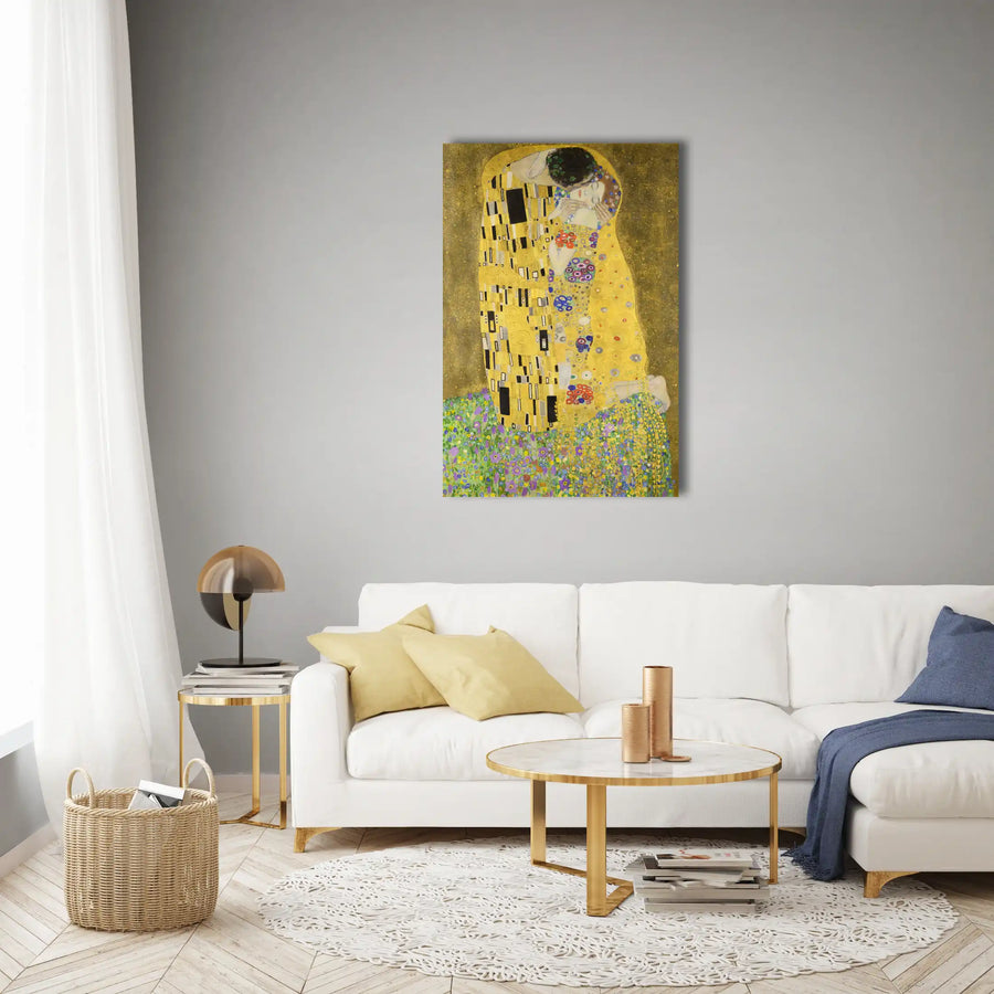
In The Kiss, painted in 1908 and completed in 1909 according to the Belvedere, gold and silver help create an almost continuous surface in which garments, ground and figures meet. Pattern is not added decoration; it builds the image and concentrates attention on faces and hands.
In a reproduction, that effect depends on ambient light and print rendering. A very warm room may make the whole surface feel heavier, while neutral light separates black, white and gold. Avoid clustering metallic objects around the work.

The Kiss, Adele or Mäda: three different presences
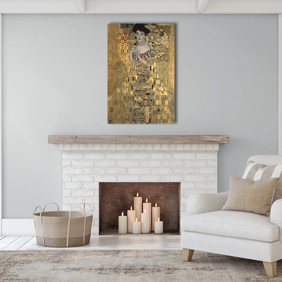
The Kiss creates an enveloping, immediately legible scene. Adele Bloch-Bauer I is more frontal and ceremonial, with the face emerging from a dense ornamental field. Mäda Primavesi, the 1912-13 portrait at The Met, instead offers a direct stance, pale ground and spring-like pattern.
Their decorative roles differ accordingly. The first establishes intimacy, the second grandeur, and the third more air and colour. Choose the desired effect before defaulting to the most famous title.

Match pattern density to the room
In a restrained living room, an ornate portrait can hold the main wall alone. In a bedroom, The Kiss benefits from quiet textiles. In a narrow hall, a vertical portrait reads quickly, though its detail needs even light.
A room already rich in pattern, velvet or marble often benefits from a lighter work. The link with Klimt can be a note of green, black or pink rather than a collection of gold accessories.

Begin with the mood: intimate, ceremonial, botanical or bright. Then assess the density of pattern and the effect of light before testing scale. Not every Klimt work asks for the same setting.
Read orientation and proportion
The Kiss is nearly square, while many Klimt portraits are vertical. A square centres a wall above low furniture; a portrait uses the height of a narrow section or accompanies a console.
Always compare the proposed crop with the reference image. A change of format can remove peripheral pattern or tighten the figure. A full-size paper template communicates that presence more honestly than an on-screen mock-up alone.

Create a contemporary setting without a Viennese pastiche
Klimt does not require Art Nouveau furniture or an entirely gold palette. Simple lines, dark timber, a plain textile and precise lighting are enough. The contrast between a rich image and a restrained room is often stronger than a period reconstruction.
Keep one connecting element: a curve, material or hue. Accessories that repeat every spiral and mosaic reduce the work to decoration, when its force comes from tension between figure and surface.

Check light and viewing distance
A detailed reproduction should work at two distances: far enough to grasp the silhouette and close enough to read pattern. If the work is mainly seen obliquely, choose a clearer composition or place it opposite the entrance.
Test evening light as well. Dark passages can close and warm tones merge. Diffuse illumination without direct glare preserves the hierarchy between face, garment and ground.

Sources and reference points
Checked references: Belvedere Vienna and The Metropolitan Museum of Art : Belvedere Klimt collection · Mäda Primavesi at The Met.
Frequently asked questions
Which Klimt works in a bedroom?
The Kiss suits an intimate mood with restrained textiles; a lighter portrait brings more air.
Does gold require a gold frame?
No. Black, brown or a discreet finish can separate the image from the wall and prevent excess.
What scale works above a sofa?
A well-centred square often works, but a full-size template should confirm enough wall around it.
Can several Klimt works be grouped?
Yes, if formats align and spacing stays regular; two strong works are often sufficient.
Choose with the actual wall in mind
The right Klimt is the one whose density, light and posture answer the room without turning it into a themed set. Choose a mood first, then verify crop and scale under real conditions. Gustav Klimt wall art collection.