Typographic Posters
-
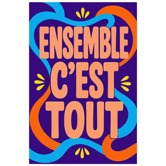
Affiche Ensemble c’est tout – Rubans liés
Vendor:Art VirtuosoRegular price From 39,90 €Regular priceUnit price per -
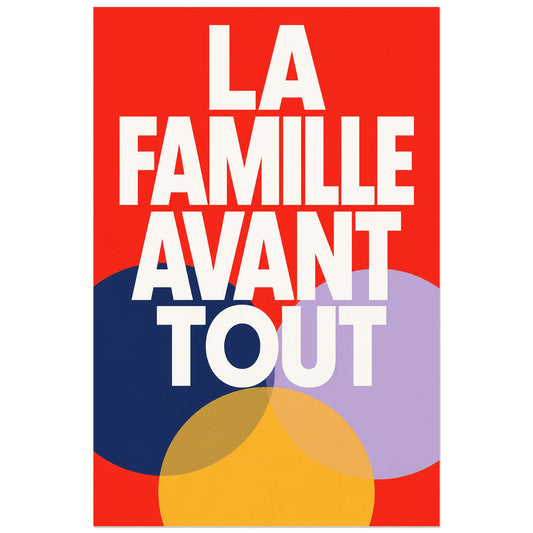
Affiche La famille avant tout – Cercles unis
Vendor:Art VirtuosoRegular price From 39,90 €Regular priceUnit price per -
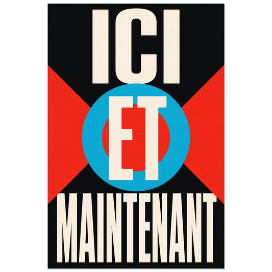
Affiche Ici et maintenant – Cible graphique
Vendor:Art VirtuosoRegular price From 39,90 €Regular priceUnit price per -
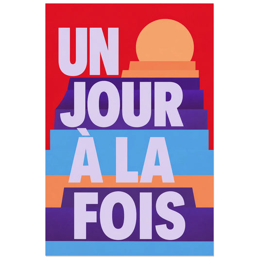
Affiche Un jour à la fois – Lever en gradins
Vendor:Art VirtuosoRegular price From 39,90 €Regular priceUnit price per -
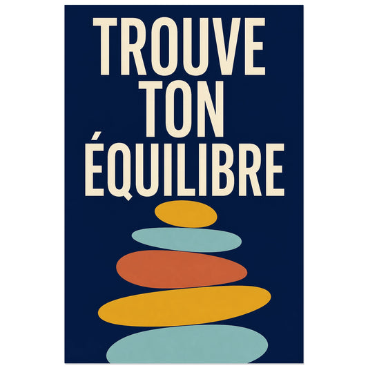
Affiche Trouve ton équilibre – Pierres modernes
Vendor:Art VirtuosoRegular price From 39,90 €Regular priceUnit price per -
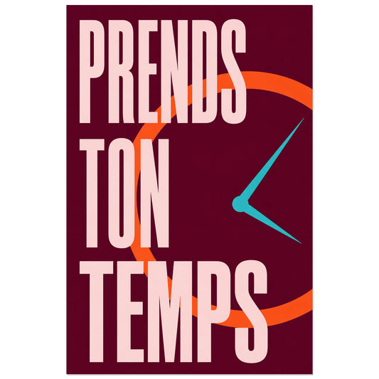
Affiche Prends ton temps – Horloge graphique
Vendor:Art VirtuosoRegular price From 39,90 €Regular priceUnit price per -
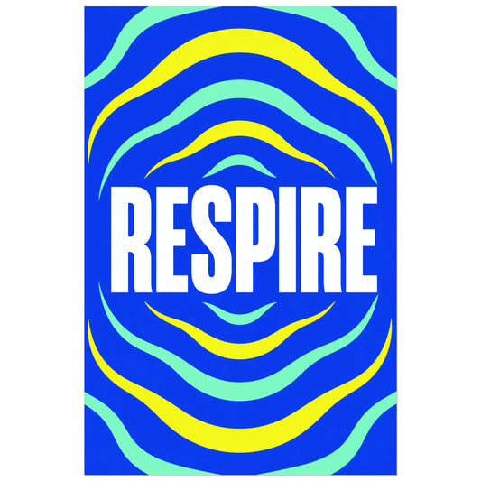
Affiche Respire – Ondes cobalt
Vendor:Art VirtuosoRegular price From 39,90 €Regular priceUnit price per -
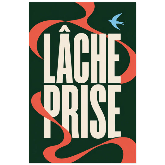
Affiche Lâche prise – Ruban libre
Vendor:Art VirtuosoRegular price From 39,90 €Regular priceUnit price per -
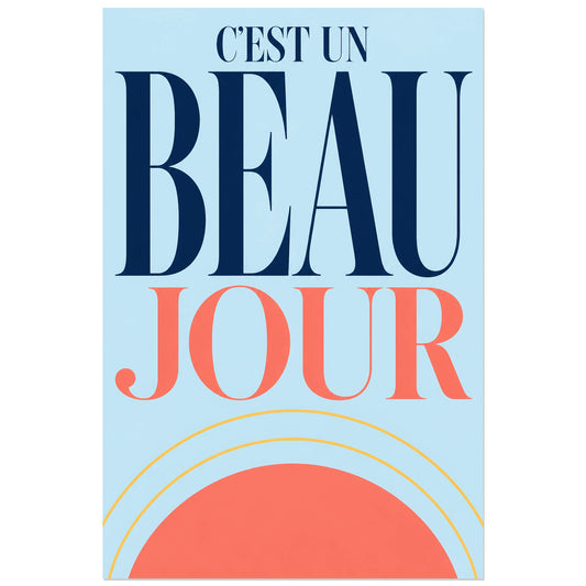
Affiche C’est un beau jour – Lever de soleil
Vendor:Art VirtuosoRegular price From 39,90 €Regular priceUnit price per -
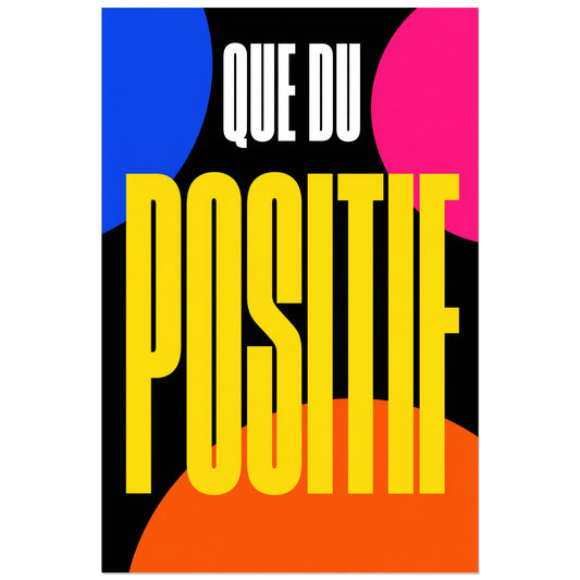
Affiche Que du positif – Énergie pop
Vendor:Art VirtuosoRegular price From 39,90 €Regular priceUnit price per -
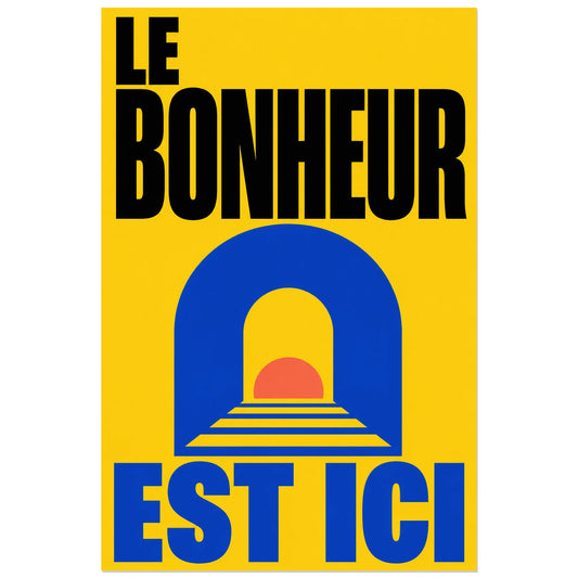
Affiche Le bonheur est ici – Arche solaire
Vendor:Art VirtuosoRegular price From 39,90 €Regular priceUnit price per -
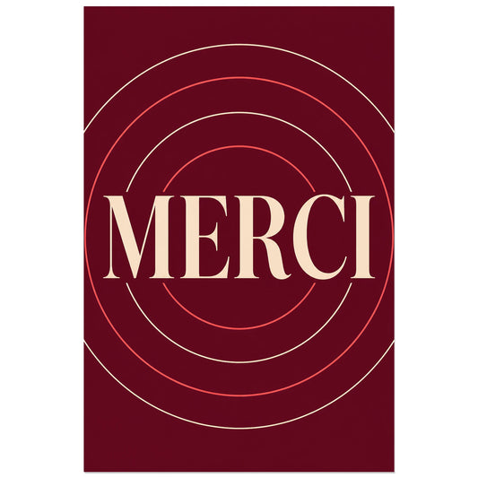
Affiche Merci – Cercles de gratitude
Vendor:Art VirtuosoRegular price From 39,90 €Regular priceUnit price per -
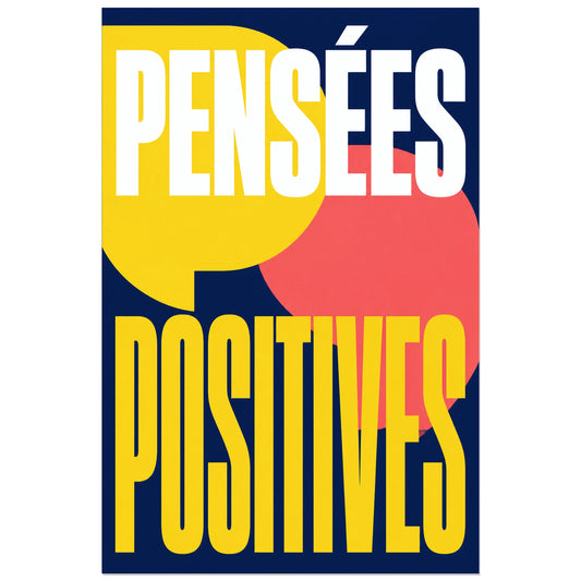
Affiche Pensées positives – Bulles de couleur
Vendor:Art VirtuosoRegular price From 39,90 €Regular priceUnit price per -
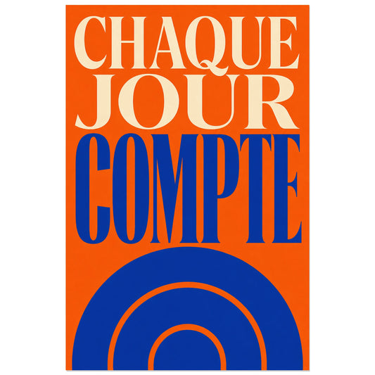
Affiche Chaque jour compte – Soleil en mouvement
Vendor:Art VirtuosoRegular price From 39,90 €Regular priceUnit price per -
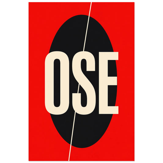
Affiche Ose – Audace minimaliste
Vendor:Art VirtuosoRegular price From 39,90 €Regular priceUnit price per -
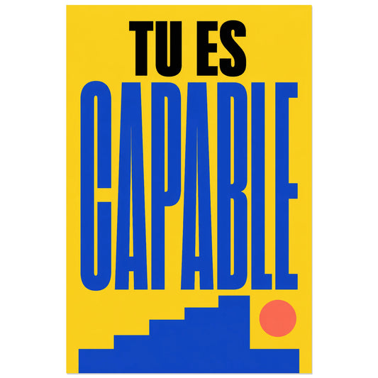
Affiche Tu es capable – Marche vers le succès
Vendor:Art VirtuosoRegular price From 39,90 €Regular priceUnit price per -
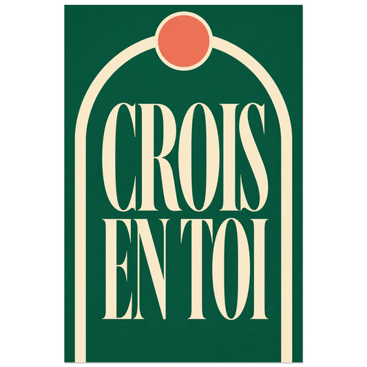
Affiche Crois en toi – Arche de confiance
Vendor:Art VirtuosoRegular price From 39,90 €Regular priceUnit price per -
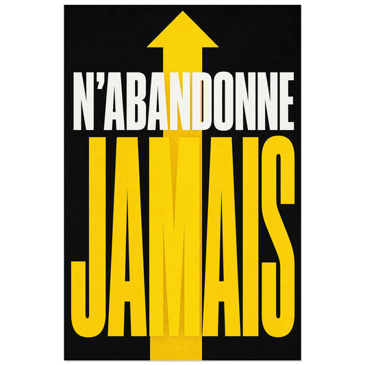
Affiche N’abandonne jamais – Flèche ascendante
Vendor:Art VirtuosoRegular price From 39,90 €Regular priceUnit price per -
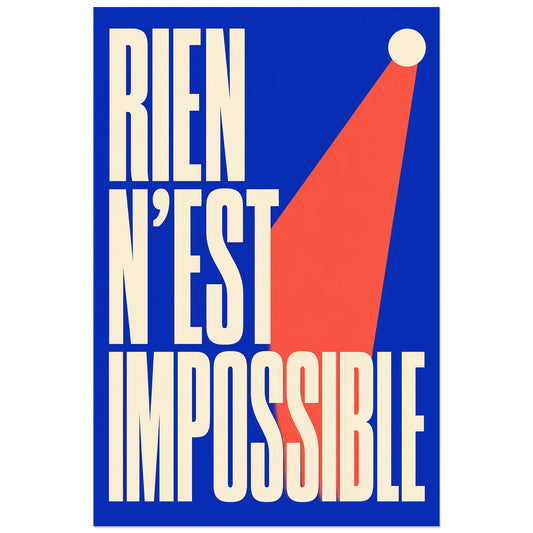
Affiche Rien n’est impossible – Élan vers le sommet
Vendor:Art VirtuosoRegular price From 39,90 €Regular priceUnit price per -
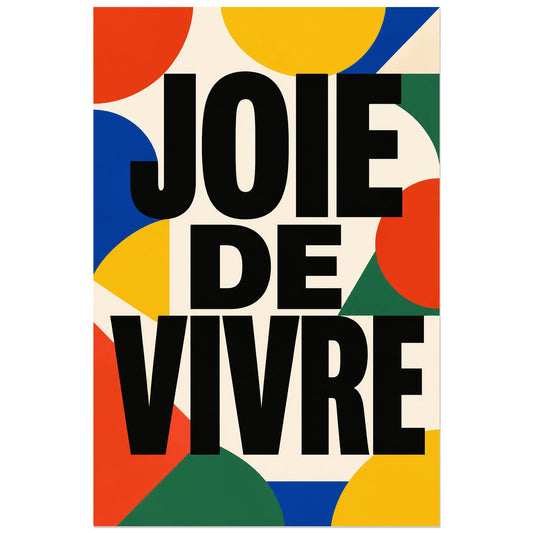
Affiche Joie de vivre – Géométrie colorée
Vendor:Art VirtuosoRegular price From 39,90 €Regular priceUnit price per -
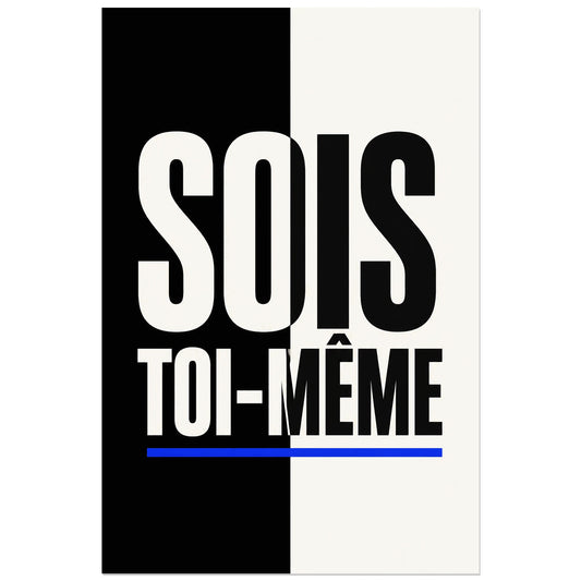
Affiche Sois toi-même – Contraste graphique
Vendor:Art VirtuosoRegular price From 39,90 €Regular priceUnit price per -
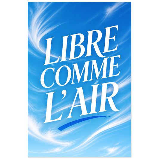
Affiche Libre comme l’air – Ciel en mouvement
Vendor:Art VirtuosoRegular price From 39,90 €Regular priceUnit price per -
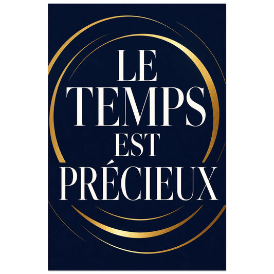
Affiche Le temps est précieux – Cercles dorés
Vendor:Art VirtuosoRegular price From 39,90 €Regular priceUnit price per -
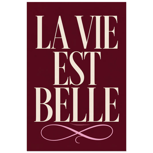
Affiche La vie est belle – Élégance française
Vendor:Art VirtuosoRegular price From 39,90 €Regular priceUnit price per -
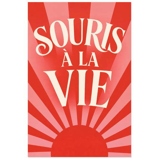
Affiche Souris à la vie – Soleil optimiste
Vendor:Art VirtuosoRegular price From 39,90 €Regular priceUnit price per -
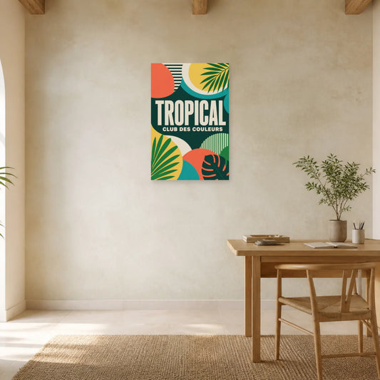
Affiche Tropical – Club des couleurs
Vendor:Art VirtuosoRegular price From 39,90 €Regular priceUnit price per