Pop Art Posters
-
Affiche Pop art Bouche sourire framboise
Vendor:Art VirtuosoRegular price From 39,90 €Regular priceUnit price per -
Affiche Pop art Typographie oh là là
Vendor:Art VirtuosoRegular price From 39,90 €Regular priceUnit price per -
Affiche Pop art Appareil photo clic
Vendor:Art VirtuosoRegular price From 39,90 €Regular priceUnit price per -
Affiche Pop art Onomatopée boum
Vendor:Art VirtuosoRegular price From 39,90 €Regular priceUnit price per -
Affiche Pop art Réveil dix heures dix
Vendor:Art VirtuosoRegular price From 39,90 €Regular priceUnit price per -
Affiche Pop art Rouge à lèvres évidemment
Vendor:Art VirtuosoRegular price From 39,90 €Regular priceUnit price per -
Affiche Pop art Patin quatre roues
Vendor:Art VirtuosoRegular price From 39,90 €Regular priceUnit price per -
Affiche Pop art Téléphone on se rappelle
Vendor:Art VirtuosoRegular price From 39,90 €Regular priceUnit price per -
Affiche Pop art Burger bouchée de bonheur
Vendor:Art VirtuosoRegular price From 39,90 €Regular priceUnit price per -
Affiche Pop art Citron du peps
Vendor:Art VirtuosoRegular price From 39,90 €Regular priceUnit price per -
Affiche Pop art Cerises duo électrique
Vendor:Art VirtuosoRegular price From 39,90 €Regular priceUnit price per -
Affiche Pop art Glace la vie fond doucement
Vendor:Art VirtuosoRegular price From 39,90 €Regular priceUnit price per -
Affiche Pop art Vache aux lunettes rouges
Vendor:Art VirtuosoRegular price From 39,90 €Regular priceUnit price per -
Affiche Pop art Bulldog au casque audio
Vendor:Art VirtuosoRegular price From 39,90 €Regular priceUnit price per -
Affiche Pop art Panda éclats colorés
Vendor:Art VirtuosoRegular price From 39,90 €Regular priceUnit price per -
Affiche Pop art Girafes à notre hauteur
Vendor:Art VirtuosoRegular price From 39,90 €Regular priceUnit price per -
Affiche Pop art Portrait quatre couleurs
Vendor:Art VirtuosoRegular price From 39,90 €Regular priceUnit price per -
Affiche Pop art Portrait à la larme ça passera
Vendor:Art VirtuosoRegular price From 39,90 €Regular priceUnit price per -
Affiche Pop art Femme au téléphone j'écoute
Vendor:Art VirtuosoRegular price From 39,90 €Regular priceUnit price per -
Affiche Pop art Femme à lunettes et alors
Vendor:Art VirtuosoRegular price From 39,90 €Regular priceUnit price per -
Affiche Alphabet pop, énergie primaire
Vendor:Art VirtuosoRegular price From 39,90 €Regular priceUnit price per -
Affiche Portrait pop, regard électrique
Vendor:Art VirtuosoRegular price From 39,90 €Regular priceUnit price per -
Affiche Poivron Pop – Couleurs à Croquer
Vendor:Art VirtuosoRegular price From 39,90 €Regular priceUnit price per -
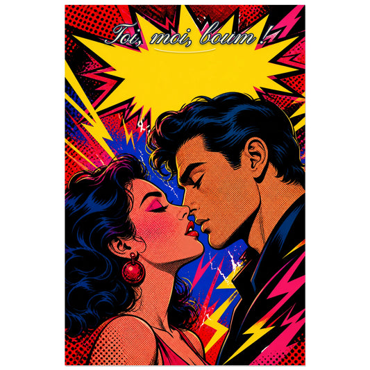
Affiche Toi, moi, boum ! - Couple pop art
Vendor:Art VirtuosoRegular price From 39,90 €Regular priceUnit price per -
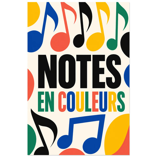
Affiche Notes de musique - En couleurs
Vendor:Art VirtuosoRegular price From 39,90 €Regular priceUnit price per