Brittany Posters
-
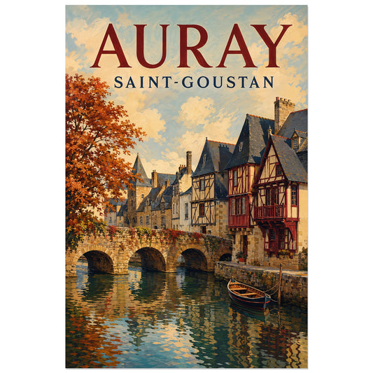
Affiche Auray - Port de Saint-Goustan
Vendor:Art VirtuosoRegular price From 39,90 €Regular priceUnit price per -
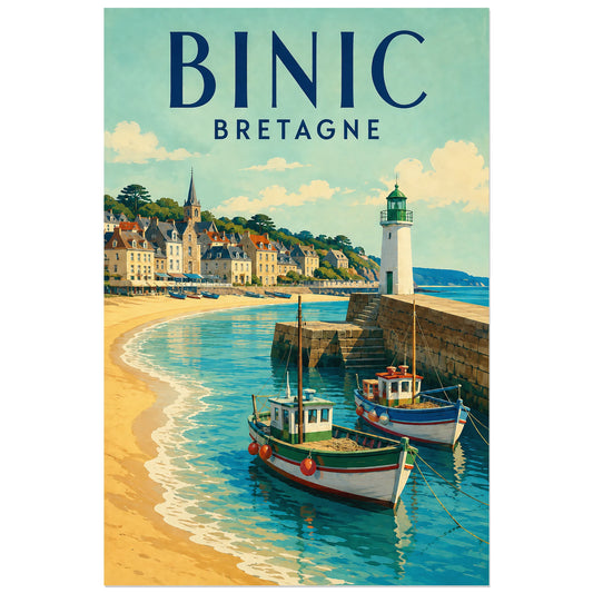
Affiche Binic - Le port et la jetée
Vendor:Art VirtuosoRegular price From 39,90 €Regular priceUnit price per -
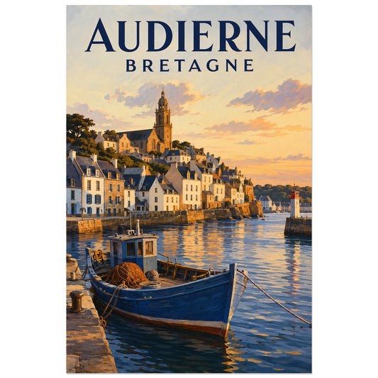
Affiche Audierne - Les quais du Goyen
Vendor:Art VirtuosoRegular price From 39,90 €Regular priceUnit price per -
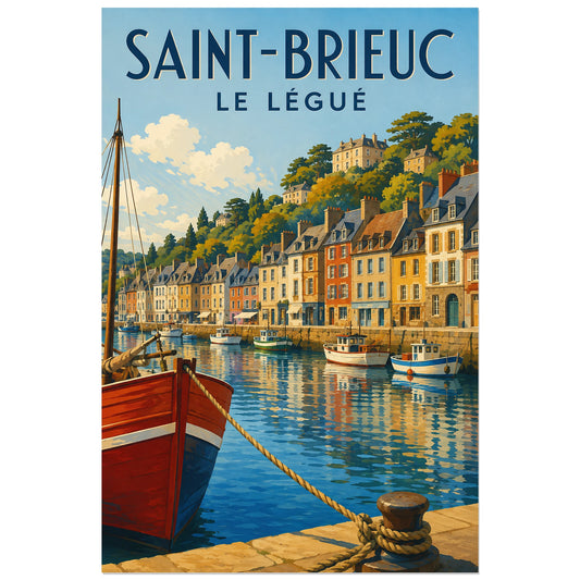
Affiche Saint-Brieuc - Port du Légué
Vendor:Art VirtuosoRegular price From 39,90 €Regular priceUnit price per -
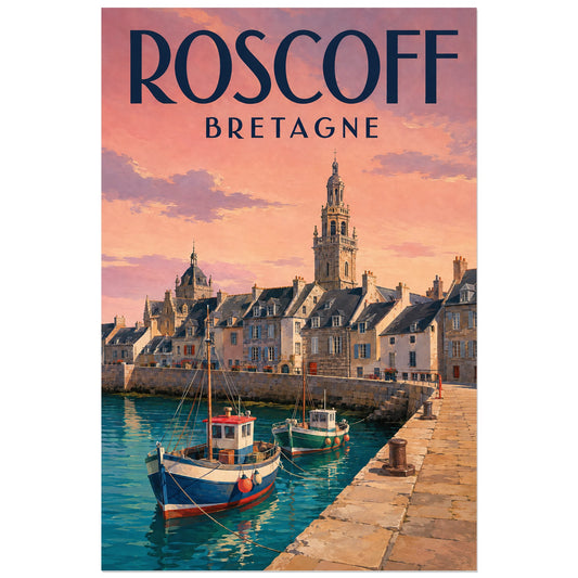
Affiche Roscoff - Vieux port
Vendor:Art VirtuosoRegular price From 39,90 €Regular priceUnit price per -
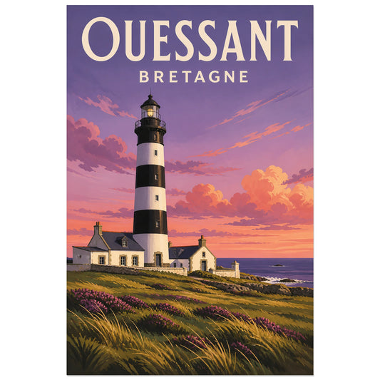
Affiche Ouessant - Phare du Creach
Vendor:Art VirtuosoRegular price From 39,90 €Regular priceUnit price per -
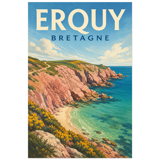
Affiche Erquy - Cap sauvage
Vendor:Art VirtuosoRegular price From 39,90 €Regular priceUnit price per -
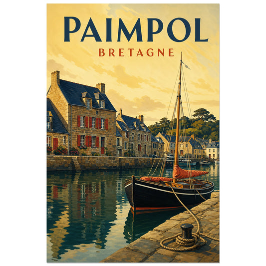
Affiche Paimpol - Le port
Vendor:Art VirtuosoRegular price From 39,90 €Regular priceUnit price per -
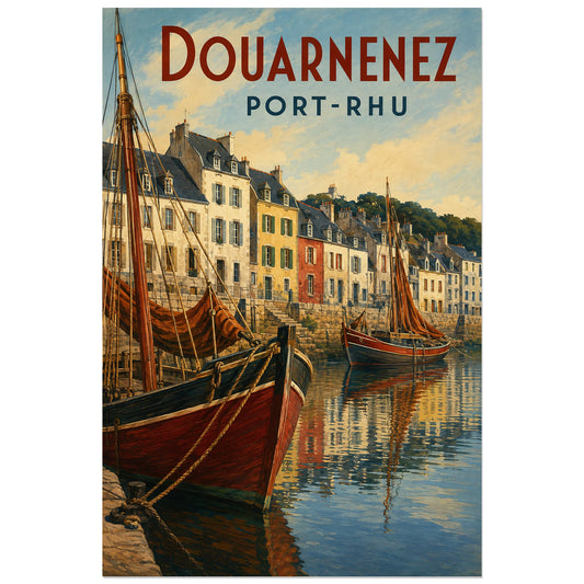
Affiche Douarnenez - Port-Rhu
Vendor:Art VirtuosoRegular price From 39,90 €Regular priceUnit price per -
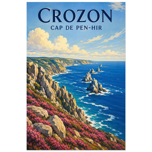
Affiche Crozon - Cap de Pen-Hir
Vendor:Art VirtuosoRegular price From 39,90 €Regular priceUnit price per -
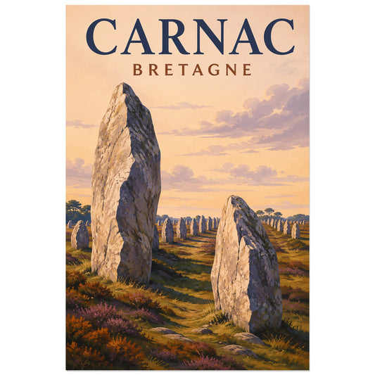
Affiche Carnac - Alignements de menhirs
Vendor:Art VirtuosoRegular price From 39,90 €Regular priceUnit price per -
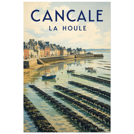
Affiche Cancale - Port de la Houle
Vendor:Art VirtuosoRegular price From 39,90 €Regular priceUnit price per -
Affiche Quimper - Rue Kéréon
Vendor:Art VirtuosoRegular price From 39,90 €Regular priceUnit price per -
Affiche Concarneau - Ville Close
Vendor:Art VirtuosoRegular price From 39,90 €Regular priceUnit price per -
Affiche Vannes - Maisons à pans de bois
Vendor:Art VirtuosoRegular price From 39,90 €Regular priceUnit price per -
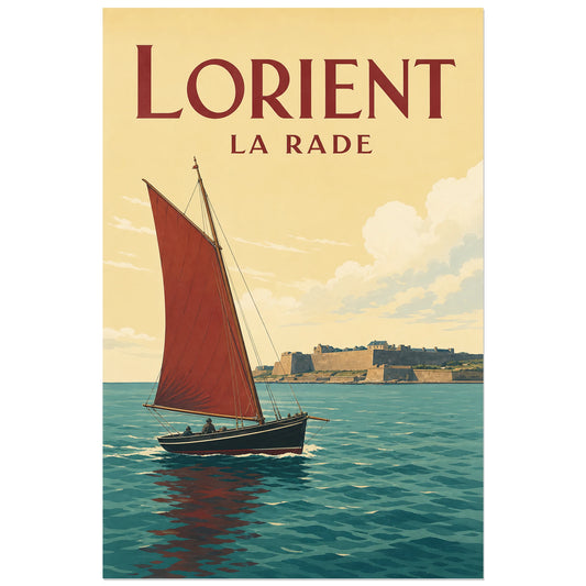
Affiche Lorient - La rade
Vendor:Art VirtuosoRegular price From 39,90 €Regular priceUnit price per -
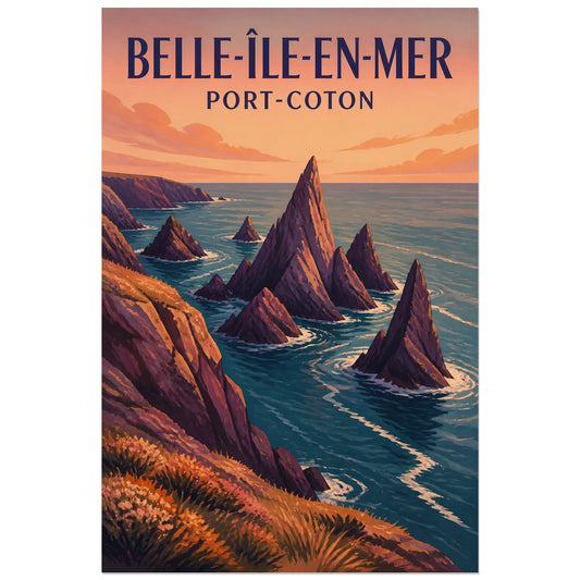
Affiche Belle-Île-en-Mer - Port-Coton
Vendor:Art VirtuosoRegular price From 39,90 €Regular priceUnit price per -
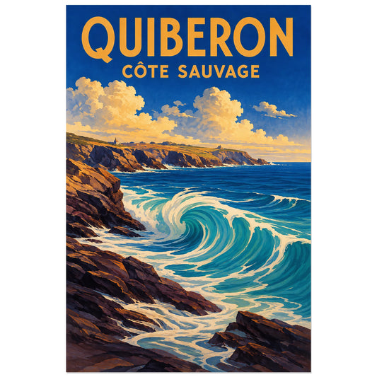
Affiche Quiberon - Côte sauvage
Vendor:Art VirtuosoRegular price From 39,90 €Regular priceUnit price per -
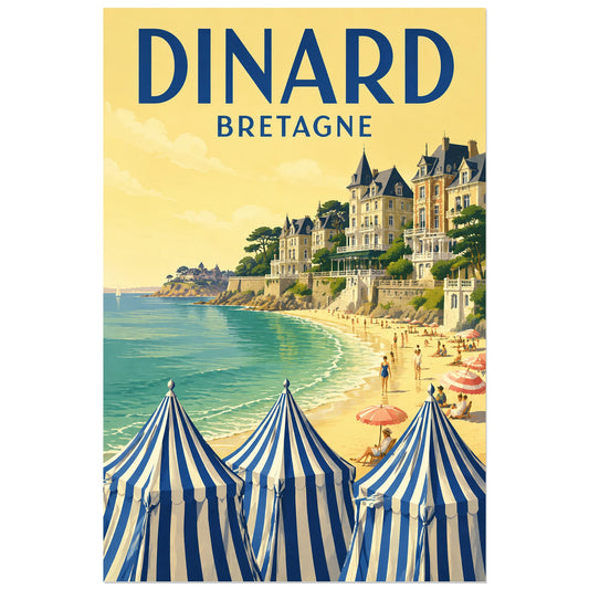
Affiche Dinard - Plage de l’Écluse
Vendor:Art VirtuosoRegular price From 39,90 €Regular priceUnit price per -
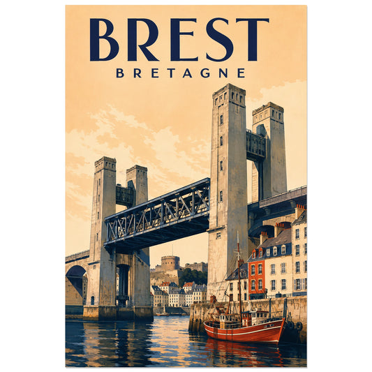
Affiche Brest - Pont de Recouvrance
Vendor:Art VirtuosoRegular price From 39,90 €Regular priceUnit price per -
Affiche Lac de Guerlédan – Méandres boisés
Vendor:Art VirtuosoRegular price From 39,90 €Regular priceUnit price per -
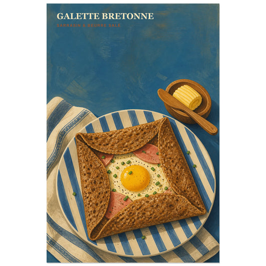
Affiche Galette Bretonne – Sarrasin & Beurre Salé
Vendor:Art VirtuosoRegular price From 39,90 €Regular priceUnit price per -
Puffin on a Brittany Cliff Poster
Vendor:Art VirtuosoRegular price From 39,90 €Regular priceUnit price per -
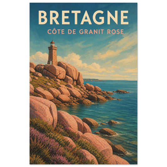
Affiche Bretagne – Côte de Granit Rose
Vendor:Art VirtuosoRegular price From 39,90 €Regular priceUnit price per -
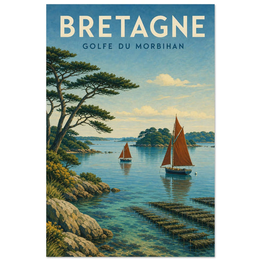
Affiche Bretagne – Golfe du Morbihan
Vendor:Art VirtuosoRegular price From 39,90 €Regular priceUnit price per -
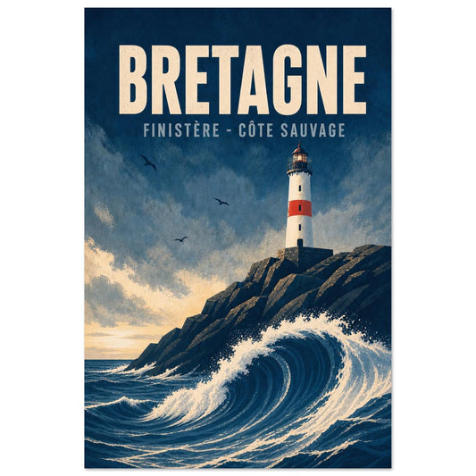
Affiche Bretagne – Finistère – Côte Sauvage
Vendor:Art VirtuosoRegular price From 39,90 €Regular priceUnit price per -
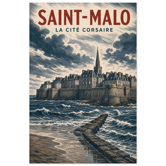
Affiche Saint-Malo – La Cité Corsaire
Vendor:Art VirtuosoRegular price From 39,90 €Regular priceUnit price per