Bauhaus and Mid-Century Posters
-
Affiche Mid-century - Formes au quotidien
Vendor:Art VirtuosoRegular price From 39,90 €Regular priceUnit price per -
Affiche Mid-century - Le soir est doux
Vendor:Art VirtuosoRegular price From 39,90 €Regular priceUnit price per -
Affiche Mid-century - Graines atomiques
Vendor:Art VirtuosoRegular price From 39,90 €Regular priceUnit price per -
Affiche Mid-century - Mobile de feuilles suspendues
Vendor:Art VirtuosoRegular price From 39,90 €Regular priceUnit price per -
Affiche Bauhaus - Formes perforées
Vendor:Art VirtuosoRegular price From 39,90 €Regular priceUnit price per -
Affiche Bauhaus - Diagonales jaunes
Vendor:Art VirtuosoRegular price From 39,90 €Regular priceUnit price per -
Affiche Bauhaus vert - Construction en porte-à-faux
Vendor:Art VirtuosoRegular price From 39,90 €Regular priceUnit price per -
Affiche Bauhaus architecture - Atelier de lumière
Vendor:Art VirtuosoRegular price From 39,90 €Regular priceUnit price per -
Affiche Bauhaus rose - Plis en accordéon
Vendor:Art VirtuosoRegular price From 39,90 €Regular priceUnit price per -
Affiche Bauhaus bleu - Contreformes entrelacées
Vendor:Art VirtuosoRegular price From 39,90 €Regular priceUnit price per -
Affiche Bauhaus noir et blanc - Moulins optiques
Vendor:Art VirtuosoRegular price From 39,90 €Regular priceUnit price per -
Affiche Bauhaus orange - Tressage oblique
Vendor:Art VirtuosoRegular price From 39,90 €Regular priceUnit price per -
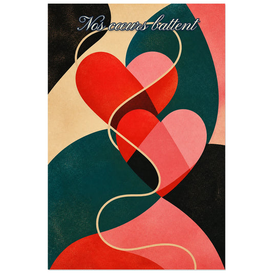
Affiche Nos cœurs battent - Cœur graphique
Vendor:Art VirtuosoRegular price From 39,90 €Regular priceUnit price per -
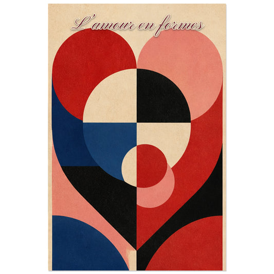
Affiche L’amour en formes - Cœur géométrique moderne
Vendor:Art VirtuosoRegular price From 39,90 €Regular priceUnit price per -
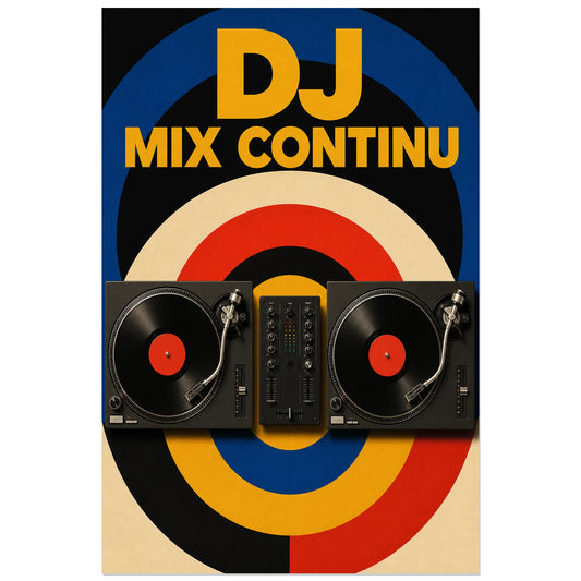
Affiche DJ - Mix continu
Vendor:Art VirtuosoRegular price From 39,90 €Regular priceUnit price per -
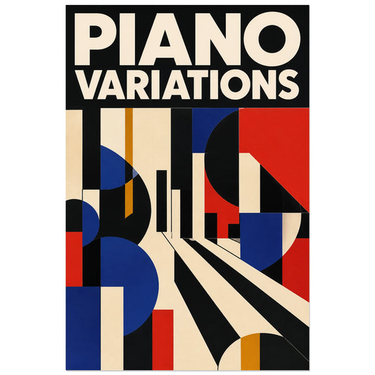
Affiche Piano abstrait - Variations
Vendor:Art VirtuosoRegular price From 39,90 €Regular priceUnit price per -
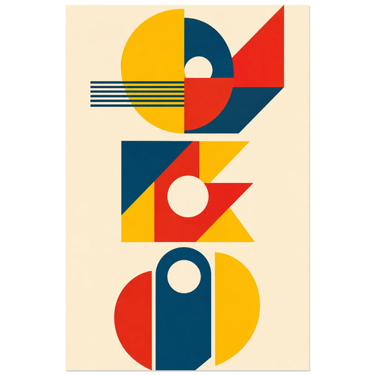
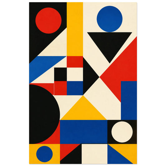
Abstract Poster - Geometric Trio
Vendor:Art VirtuosoRegular price From 39,90 €Regular priceUnit price per -
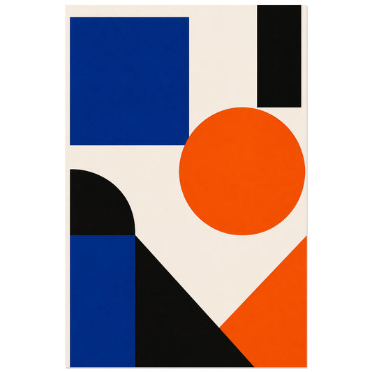
Abstract Poster - Blue and Orange
Vendor:Art VirtuosoRegular price From 39,90 €Regular priceUnit price per -
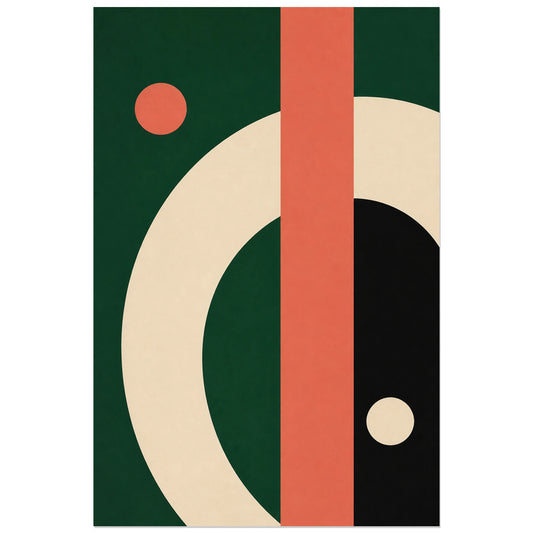
Abstract Poster - Arc and Bar
Vendor:Art VirtuosoRegular price From 39,90 €Regular priceUnit price per -
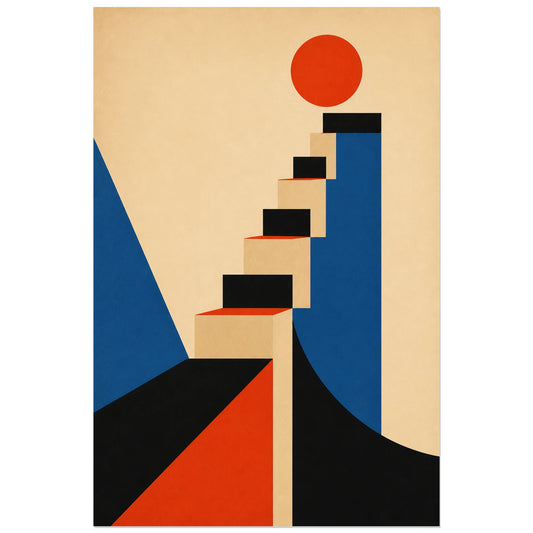
Abstract Poster - Graphic Staircase
Vendor:Art VirtuosoRegular price From 39,90 €Regular priceUnit price per -
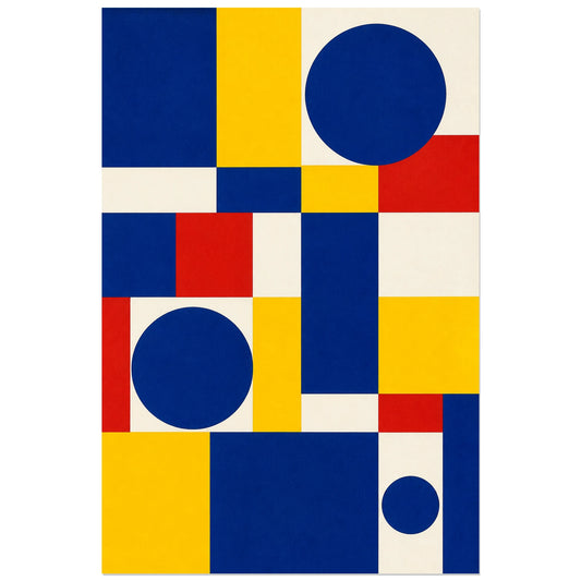
Abstract Poster - Primary Modules
Vendor:Art VirtuosoRegular price From 39,90 €Regular priceUnit price per -
Abstract Poster - Cobalt Grid
Vendor:Art VirtuosoRegular price From 39,90 €Regular priceUnit price per -
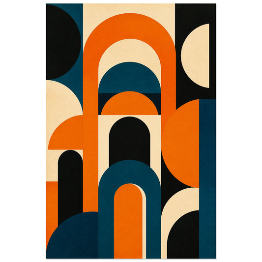
Abstract Poster - Orange Arches
Vendor:Art VirtuosoRegular price From 39,90 €Regular priceUnit price per -
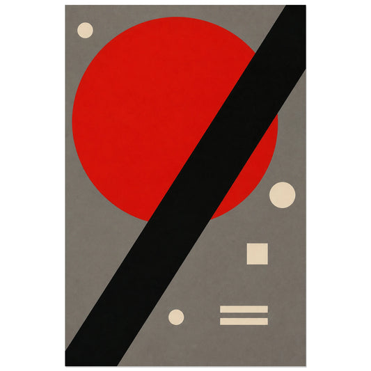
Abstract Poster - Red Circle and Black Bar
Vendor:Art VirtuosoRegular price From 39,90 €Regular priceUnit price per