Watercolour Posters
-
Affiche Aquarelle Jardin sous la pluie
Vendor:Art VirtuosoRegular price From 39,90 €Regular priceUnit price per -
Affiche Aquarelle Delphiniums au vase cobalt
Vendor:Art VirtuosoRegular price From 39,90 €Regular priceUnit price per -
Affiche Aquarelle Abstraite ocre et indigo
Vendor:Art VirtuosoRegular price From 39,90 €Regular priceUnit price per -
Affiche Aquarelle Abstraite fuchsia et pétrole
Vendor:Art VirtuosoRegular price From 39,90 €Regular priceUnit price per -
Affiche Aquarelle Archipel de brumes
Vendor:Art VirtuosoRegular price From 39,90 €Regular priceUnit price per -
Affiche Aquarelle Galaxie en lavis violet
Vendor:Art VirtuosoRegular price From 39,90 €Regular priceUnit price per -
Affiche Aquarelle Vague lumière intérieure
Vendor:Art VirtuosoRegular price From 39,90 €Regular priceUnit price per -
Affiche Aquarelle Koï sous les nymphéas
Vendor:Art VirtuosoRegular price From 39,90 €Regular priceUnit price per -
Affiche Aquarelle Flamant ailes ouvertes
Vendor:Art VirtuosoRegular price From 39,90 €Regular priceUnit price per -
Affiche Aquarelle Montgolfière avant l'envol
Vendor:Art VirtuosoRegular price From 39,90 €Regular priceUnit price per -
Affiche Aquarelle Danseuse au repos
Vendor:Art VirtuosoRegular price From 39,90 €Regular priceUnit price per -
Affiche Aquarelle Femme au chapeau sous l'averse
Vendor:Art VirtuosoRegular price From 39,90 €Regular priceUnit price per -
Affiche Aquarelle Eucalyptus et verre ambré
Vendor:Art VirtuosoRegular price From 39,90 €Regular priceUnit price per -
Affiche Aquarelle Grenade et artichaut
Vendor:Art VirtuosoRegular price From 39,90 €Regular priceUnit price per -
Affiche Aquarelle Roses et carafe de lumière
Vendor:Art VirtuosoRegular price From 39,90 €Regular priceUnit price per -
Affiche Aquarelle Pivoines sur l'eau
Vendor:Art VirtuosoRegular price From 39,90 €Regular priceUnit price per -
Affiche Aquarelle Gui perles d'hiver
Vendor:Art VirtuosoRegular price From 39,90 €Regular priceUnit price per -
Affiche Aquarelle Amaryllis vermilion
Vendor:Art VirtuosoRegular price From 39,90 €Regular priceUnit price per -
Affiche Saveurs à l’Aquarelle – Légumes du Jardin
Vendor:Art VirtuosoRegular price From 39,90 €Regular priceUnit price per -
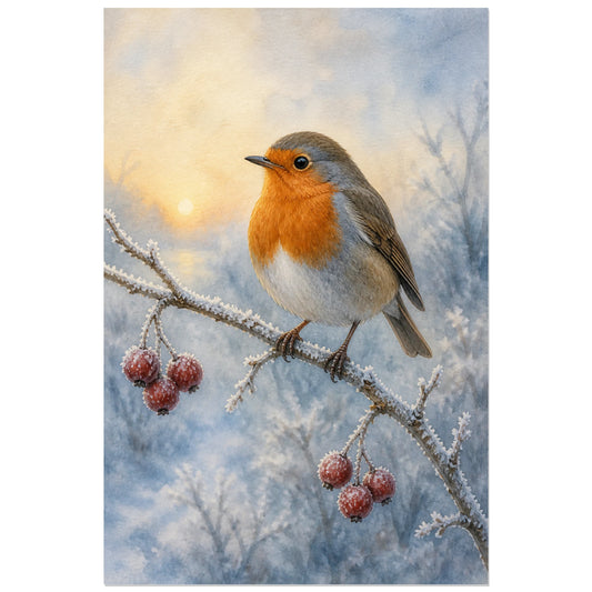
Watercolour Robin – Winter Morning Poster
Vendor:Art VirtuosoRegular price From 39,90 €Regular priceUnit price per -
Affiche Aimer sans mesure - Aquarelle abstraite
Vendor:Art VirtuosoRegular price From 39,90 €Regular priceUnit price per -
Affiche Mon refuge - Couple aquarelle
Vendor:Art VirtuosoRegular price From 39,90 €Regular priceUnit price per -
Affiche Main dans la main - Gestes amoureux
Vendor:Art VirtuosoRegular price From 39,90 €Regular priceUnit price per -
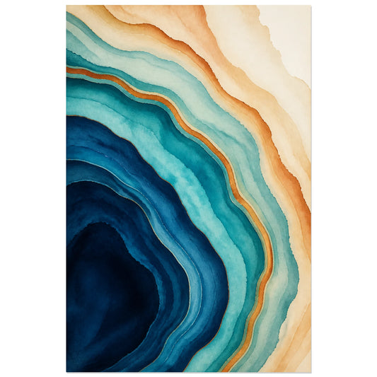
Abstract Poster - Agate Veins
Vendor:Art VirtuosoRegular price From 39,90 €Regular priceUnit price per -
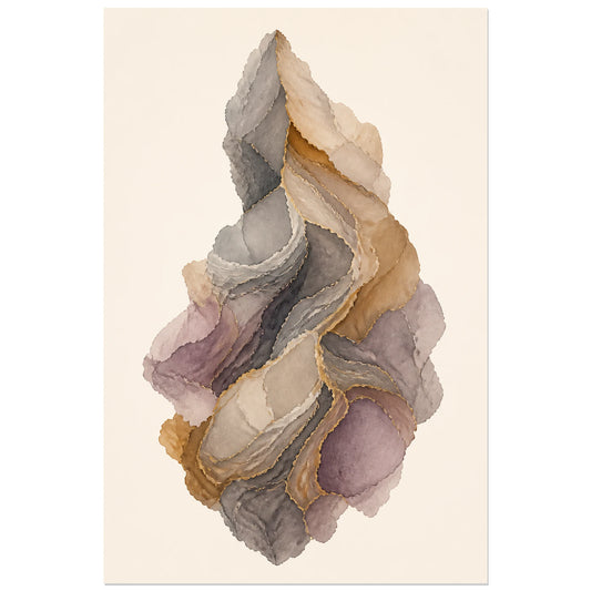
Abstract Poster - Mineral Cloud
Vendor:Art VirtuosoRegular price From 39,90 €Regular priceUnit price per -
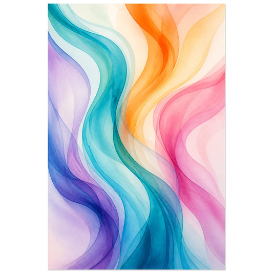
Abstract Poster - Transparent Current
Vendor:Art VirtuosoRegular price From 39,90 €Regular priceUnit price per -
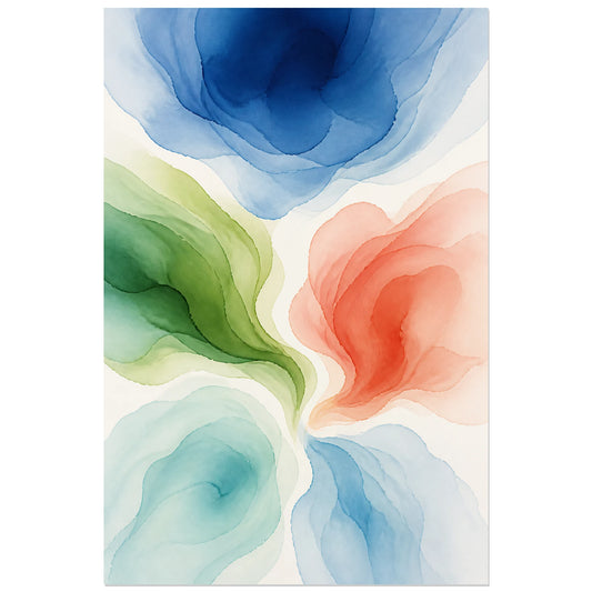
Abstract Poster - Water Bloom
Vendor:Art VirtuosoRegular price From 39,90 €Regular priceUnit price per -
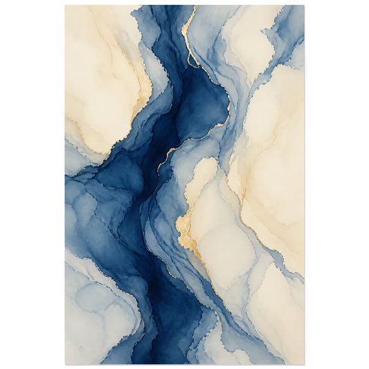
Abstract Poster - Indigo Marbling
Vendor:Art VirtuosoRegular price From 39,90 €Regular priceUnit price per -
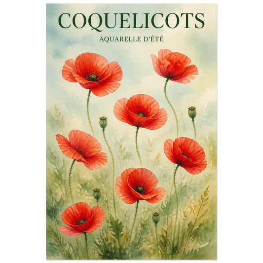
Affiche Coquelicots – Aquarelle d’Été
Vendor:Art VirtuosoRegular price From 39,90 €Regular priceUnit price per -
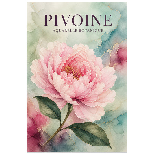
Affiche Pivoine – Aquarelle Botanique
Vendor:Art VirtuosoRegular price From 39,90 €Regular priceUnit price per -
Affiche Annecy – Le Palais de l'Île
Vendor:Art VirtuosoRegular price From 39,90 €Regular priceUnit price per