


Art Deco: Luxury, Geometry and Innovation
Art Deco is instantly recognisable, yet difficult to reduce to a single formula. Its stepped silhouettes, strong symmetry, polished surfaces and stylised ornament appeared across architecture, furniture, jewellery, fashion, posters and ocean liners. The style combined the precision of the machine age with a taste for luxury, turning modern life into a visual language of rhythm, speed and controlled splendour.
This guide follows Art Deco from its early twentieth-century roots to its international expansion. It also separates it from Art Nouveau, introduces the designers who shaped it and explains why its codes remain useful when reading a building, an object or a contemporary interior.
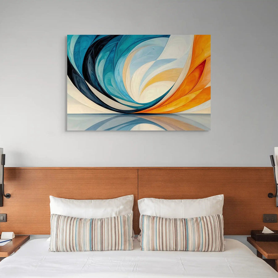
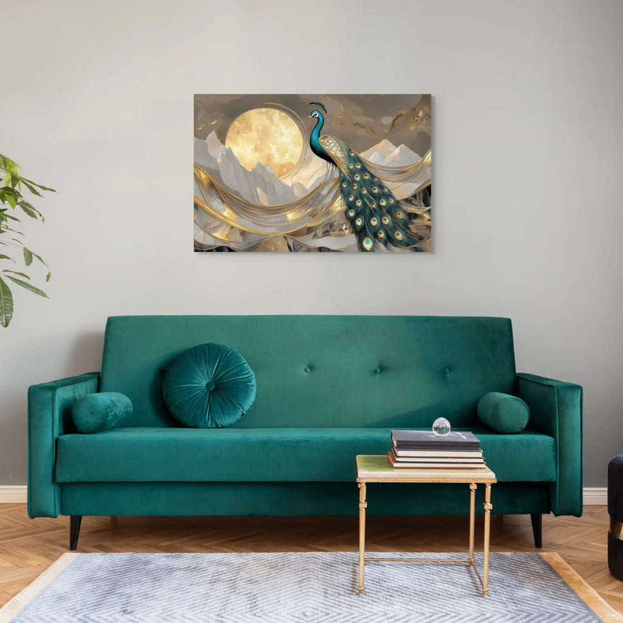
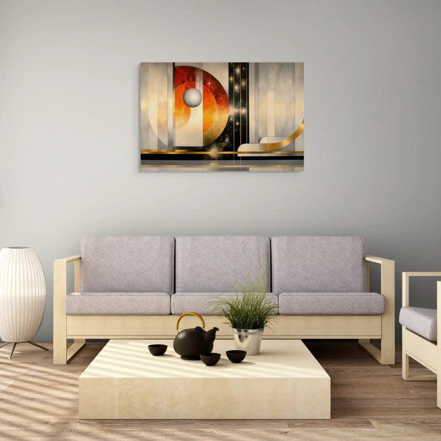
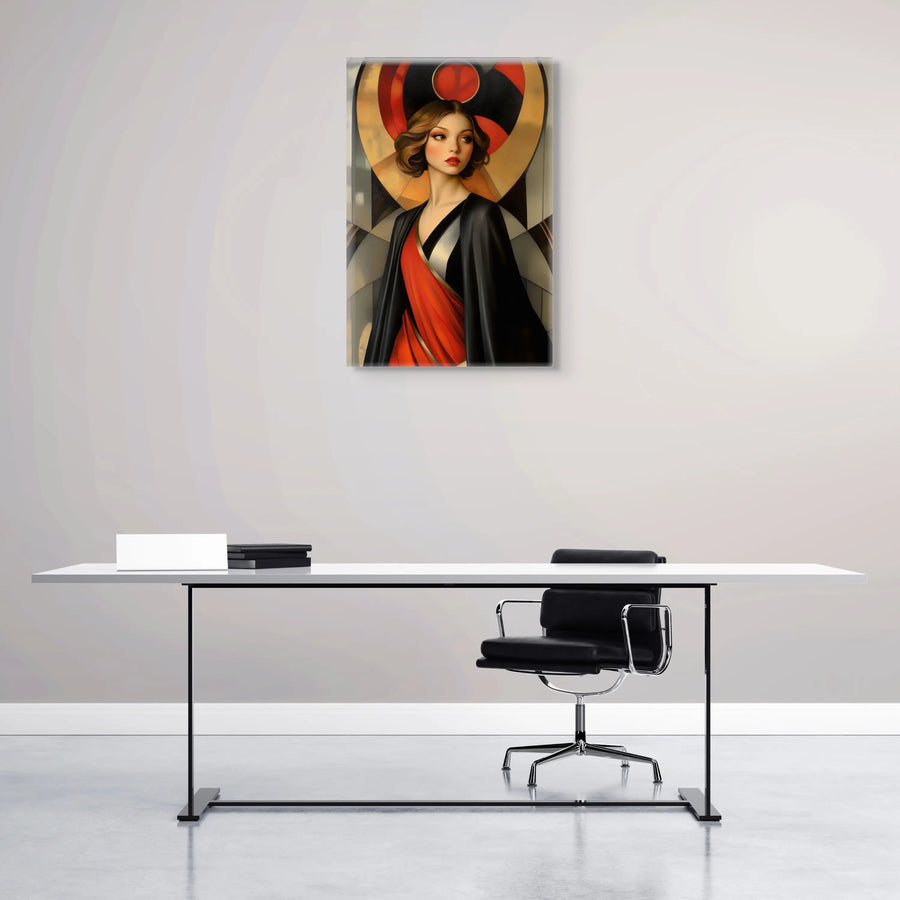
If those codes appeal to you, begin with one focal point rather than a fully themed room. A carefully chosen work from our Art Deco wall art collection can introduce geometry, contrast and metallic warmth while leaving the surrounding furniture quiet.
 Geometry, architecture and decorative arts in an Art Deco-inspired wall art collection.
From Art Nouveau to Art Deco

Art Deco did not simply replace Art Nouveau overnight. Before 1914, designers were already simplifying the whiplash curve, studying classical proportion and exploring the expressive possibilities of new materials. After the First World War, the desire for order, reconstruction and a forward-looking modernity accelerated that change. Organic movement gave way to repeated angles, sunbursts, zigzags and more disciplined silhouettes.
 Organic curves and asymmetry on one side; geometry, symmetry and machine-age energy on the other.
The Exposition Internationale des Arts Décoratifs et Industriels Modernes, held in Paris in 1925, did not invent the style, but it gave an already mature decorative language exceptional visibility. Pavilions, rooms, textiles, furniture and small objects presented craftsmanship and industry as partners. This was a luxurious branch of modern art and design, not a rejection of decoration.
French Art Deco often privileged costly woods, lacquer, ivory, shagreen, glass and metalwork. At the same time, reinforced concrete, stainless steel and serial production opened other paths. The result was never one uniform look: a cabinet by Jacques-Émile Ruhlmann, a theatre façade by Auguste Perret and a streamlined train could all express modernity through different balances of craft, geometry and technology.
 From the first breaks before 1914 to Paris 1925, Streamline Moderne and today’s reinterpretations.
The movement’s social meaning was equally complex. Its refined interiors could project exclusivity, while department stores, cinemas and transport architecture brought its motifs to a much broader public. Art Deco therefore sits between elite craftsmanship and mass culture. That tension helps explain both its visual richness and its rapid international circulation during the 1920s and 1930s.
Seen in this context, the 1925 exhibition becomes a landmark rather than a convenient starting gun. It crystallised a new confidence in decorative modernity and helped spread it through architecture, fashion and graphic design. The name “Art Deco” itself only became widely established later, but the exhibition supplied the historical shorthand by which the movement is now remembered.
The Architectural and Decorative Language of Art Deco

Geometry is the most visible part of the Art Deco vocabulary: stepped profiles, chevrons, fans, concentric circles and vertical bands organise the eye. Contrary to a common simplification, the style did not reject right angles. It used both sharp geometry and sweeping curves, choosing whichever produced the clearest rhythm. Symmetry was frequent, but designers also used asymmetrical arrangements when movement or speed mattered more than monumentality.
Materials were part of the composition, not a decorative afterthought. Dark veneers such as ebony or rosewood could be set against pale upholstery, lacquer, mirror, chrome or gilt bronze. In architecture, stone and concrete gained energy from metal grilles, coloured glass and shallow reliefs. The contrast between matte and reflective surfaces made even a restrained palette feel layered and theatrical.

Ornament remained essential, but it was compressed and stylised. Flowers became fans; animals became emblems; rays, fountains and clouds became repeatable patterns. These motifs could be carved, etched, woven, printed or cast. Their purpose was not simply to add richness: they linked an object to its silhouette and helped a façade or interior establish a coherent visual tempo.
The strongest Art Deco spaces control emphasis. A monumental entrance may lead to a calmer room; a dark cabinet may be animated by one strip of brass; a poster may rely on only three tones and a diagonal. This discipline explains why the style can still feel contemporary. Its lesson is not “add more ornament”, but “make every line, material and contrast support the same idea”.
An International Style with Local Variations

Art Deco travelled through exhibitions, magazines, cinema, tourism, migration and international commissions. It changed as it moved. In France it could remain closely tied to luxury craftsmanship; in the United States it became inseparable from skyscrapers, theatres and commercial architecture; elsewhere it absorbed local materials, climates and decorative traditions. The result was a family of related modernisms rather than a fixed export style.
Its relationship with the Bauhaus is best understood through contrast and overlap. Both engaged with geometry, modern materials and new ways of living, but their priorities often differed. Bauhaus teaching increasingly emphasised functional systems and reproducibility, whereas luxury Art Deco could celebrate rare materials and virtuoso craftsmanship. Designers nonetheless worked within the same modern world and sometimes borrowed from the same sources.
Miami Beach shows how climate and leisure reshaped the style. During the 1930s, hotels and apartment buildings adopted pastel colours, nautical motifs, rounded corners, eyebrows over windows and neon signage. This tropical version, often associated with Streamline Moderne, feels lighter than the dark woods and gilded interiors of Paris while preserving the movement’s love of rhythm and carefully staged façades.

In New York, William Van Alen’s Chrysler Building turned automotive imagery and stainless steel into a vertical emblem. Its crown, triangular windows and radiating arches make the top of the skyscraper appear to accelerate into the sky. The building demonstrates how Art Deco could translate industrial references into ornament without losing architectural clarity.
From Paris to Shanghai, Mumbai, Casablanca, Melbourne and Mexico City, Art Deco adapted to local ambitions. It served hotels, cinemas, offices, railway stations and domestic buildings because its vocabulary was flexible: a few stepped forms, a strong entrance and a controlled decorative scheme could signal modernity at many scales and budgets.
Architects, Designers and Landmark Works

Art Deco was shaped by networks rather than a handful of isolated geniuses. Architects, interior designers, cabinetmakers, glassmakers, metalworkers, illustrators and fashion creators collaborated on complete environments. Robert Mallet-Stevens brought geometric clarity to houses and film sets; Eileen Gray and Jean-Michel Frank developed highly individual interiors; René Lalique used glass to turn light itself into ornament. Even the movement’s use of blue varied from deep lacquer to luminous architectural glass.
Tamara de Lempicka gave painting one of the movement’s most recognisable faces. Her sharply modelled figures, smooth surfaces and cinematic cropping suit the glamour of the period, yet her portraits remain psychologically poised rather than merely decorative. They show how Art Deco could shape an image through volume, finish and attitude as much as through motif.

The movement also lives in smaller objects: a Lalique vase, a Jean Dunand lacquer panel, a Raymond Templier jewel or a geometric light fitting can contain the same principles as a building. Our Art Deco artworks draw on this scale of detail, where a fan, arc or stepped border can organise an entire composition.
Department stores and specialist galleries were crucial intermediaries. They presented furniture, textiles, ceramics and lighting as coordinated lifestyles rather than separate purchases. Parisian houses and large stores commissioned pavilions for the 1925 exhibition, while magazines circulated photographs and drawings far beyond the clients who could afford the original rooms.
The most lasting works avoid the idea that luxury means visual excess. Ruhlmann’s furniture often depends on immaculate proportion and finish; Mallet-Stevens uses planar walls and controlled openings; Lalique lets repeated relief catch the light. Their sophistication comes from the relationship between structure and surface, not from decoration applied without hierarchy.
That distinction matters when Art Deco is used today. A room does not need a black-and-gold scheme from floor to ceiling. One geometric artwork, one fluted surface or one sculptural lamp can establish the reference. Our practical guide to styling Art Deco wall art without clutter explains how to balance scale, colour and negative space around a single focal point.
Why Art Deco Still Matters Today

Art Deco remains visible because its core devices are easy to reinterpret. Symmetry can create calm, stepped forms can frame a doorway or artwork, and metallic accents can direct light. Contemporary designers often reduce the historical palette and keep only the underlying rhythm, allowing the reference to register without turning the interior into a period set.
Its geometric logic also meets geometric abstraction. Both can use repetition, axis and contrast, but their aims differ: Art Deco usually connects those devices to an object, building or decorative programme, whereas abstraction may make the visual relationships themselves the subject.
When choosing art for a contemporary room, treat the wall, frame and nearby furniture as one composition. A dark piece can anchor pale walls; a vertical format can echo fluted joinery; a circular motif can soften a room dominated by straight lines. The same principles in our guide to choosing an abstract painting apply here: decide first whether the work should blend, echo or contrast.
Popular culture has amplified a spectacular version of Art Deco through films, television, fashion and games. That imagery is powerful, but it often compresses several decades into one fantasy of jazz-age glamour. Looking at original buildings and objects restores the movement’s diversity, from restrained French furniture to tropical hotels and streamlined transport.
“Scandinavian Art Deco” is sometimes used loosely for Nordic interiors that combine classical symmetry, fine materials and a quieter modernism. It is more precise to speak of regional exchanges than of a single Scandinavian branch. Designers across Europe adapted international motifs to local craft traditions, and the boundaries between Art Deco, Nordic Classicism and functionalism were often porous.
The movement also invites a critical reading. Some luxury materials were tied to colonial trade, and international exhibitions often presented cultures through unequal or exoticising frameworks. Admiring the workmanship does not require ignoring that context. On the contrary, it helps us understand how modern design was shaped by commerce, power and selective ideas of the “exotic”.

Art Deco endures because it offers a method as much as a look: simplify a motif, establish an axis, repeat a rhythm and let material or colour create emphasis. Used with restraint, those principles can bring order and energy to a contemporary space without copying a historical room.
Its affinity with transport, metalwork and strong silhouettes also explains why Art Deco works naturally beside industrial wall art. The two styles share an interest in modern materials, but Art Deco adds polish, symmetry and decorative rhythm where industrial design often foregrounds structure and patina.