



Piet Mondrian: Abstract Art and the Making of Neo-Plasticism
Piet Mondrian did not arrive at the black grid and primary colours in a single leap. Born in Amersfoort in 1872, the Dutch painter began with landscapes, trees, farms and flowers before progressively dismantling the visible world. His career is one of the clearest ways to follow the development of abstract art from observation to a radically reduced visual language.
With Theo van Doesburg and other artists associated with De Stijl, Mondrian helped formulate Neo-Plasticism: an art of horizontal and vertical relationships, primary colours and neutral tones. Yet his paintings are not mechanical diagrams. Their unequal fields, changing line widths and carefully adjusted edges reveal a slow, intuitive search for balance.
From Dutch landscapes to abstraction

Mondrian trained at the Rijksakademie in Amsterdam and initially worked within recognisable Dutch traditions. Farms along the River Gein, windmills, dunes and solitary trees gave him motifs through which to study structure. Even when the subject remains legible, the horizon, trunk or reflection often organises the surface into firm directional forces.
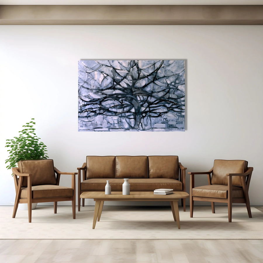
During the first decade of the twentieth century, his palette became more intense. Works such as The Red Tree and Mill in Sunlight do not simply imitate nature: colour and rhythm begin to operate independently. The Grey Tree of 1911 compresses branches and space into an interlocking network, while Flowering Apple Tree of 1912 pushes the motif closer to Cubist fragmentation.
Paris accelerated that transformation. After seeing paintings by Picasso and Braque in 1911, Mondrian moved there in January 1912. He absorbed Cubism’s faceted construction and muted palette, but he gradually removed the residual volume and centralised object that still anchored many Cubist pictures.
The decisive point is not that Mondrian suddenly stopped looking at nature. He learned to translate what he saw into increasingly autonomous relations of line, plane and colour.
Cubism, De Stijl and the birth of Neo-Plasticism
When the First World War prevented Mondrian from returning to Paris, he remained in the Netherlands and met artists including Theo van Doesburg and Bart van der Leck. In 1917, the journal De Stijl became a platform for a broader movement that connected painting with architecture, furniture and graphic design.
Neo-Plasticism sought a universal visual order through horizontal and vertical lines, red, yellow and blue, and the neutral values white, grey and black. These elements were a working discipline, not a decorative formula.
Mondrian’s grids therefore deserve patient attention. The rectangles are rarely distributed symmetrically, the black bars do not all carry the same weight, and colour occupies only selected areas. A small blue plane can counterbalance a much larger white field; a line that reaches the edge can make the composition appear to continue beyond the canvas.
Official museum studies also caution against reading these works as mathematical exercises. Unfinished paintings and studio photographs show repeated adjustments, strips of painted paper and coloured tape. Mondrian constructed equilibrium by looking, testing and revising. The apparent certainty of the finished surface was earned through an intuitive process.
Key works: a route through Mondrian’s transformation

| Work | Date | Why it matters |
|---|---|---|
| Mill in Sunlight | 1908 | An early landscape in which heightened colour begins to outweigh naturalistic description. |
| The Red Tree | 1908–1910 | The tree remains recognisable, but colour and branching rhythm become expressive structures. |
| The Grey Tree | 1911 | A pivotal reduction of trunk and branches into a shallow, increasingly Cubist network. |
| Flowering Apple Tree | 1912 | The motif nearly dissolves into intersecting arcs and planes after Mondrian’s move to Paris. |
| Composition No. IV | 1914 | Cubist fragmentation gives way to a more autonomous field of short lines and muted colour. |
| Composition No. 3 with Colour Planes | 1917 | Independent rectangles float on a pale ground as representation disappears. |
| Composition with Grid 3 | 1918 | A dense modular grid tests how repeated units can create rhythm without a depicted subject. |
| Tableau | 1921 | An early Neo-Plastic composition whose coloured planes are still more nuanced than the later pure primaries. |
| Composition with Red, Blue and Yellow | 1930 | A spare, asymmetric balance of black lines, white fields and three carefully weighted colours. |
| New York City I | 1941 | Coloured bands replace the earlier black framework and make the grid lighter and more mobile. |
| Broadway Boogie Woogie | 1942–1943 | Broken bands of colour evoke the pulse of Manhattan and the syncopation of boogie-woogie. |
| Victory Boogie Woogie | 1942–1944 | Mondrian’s unfinished final painting preserves the visible energy of experiment and revision. |
What is Mondrian’s most famous painting?
There is no single uncontested answer. Composition with Red, Blue and Yellow from 1930 has become an emblem of Neo-Plasticism, while Broadway Boogie Woogie is often the best-known late painting. The first concentrates balance into a few unequal fields; the second turns the grid into a flickering urban rhythm.
The familiar visual vocabulary—straight lines, primary colours and white space—can look simple enough to reproduce. What distinguishes Mondrian is the exact relationship between those parts. Look at where a line stops, how close a coloured plane sits to an edge, and how much empty space one accent must hold in balance.
That sensitivity explains why a room full of geometric pictures does not automatically become Mondrian. His work belongs within a longer reflection on reduction, which also illuminates our collections of abstract wall art and our guide to minimalism.
In 1940, at the age of 68, Mondrian reached New York. The city’s gridded streets, electric lights and musical life offered a new model of movement. His late paintings abandoned continuous black bars, scattering small units of red, yellow, blue and grey across coloured bands.
New York, boogie-woogie and a grid set in motion

Broadway Boogie Woogie connects sight and sound without illustrating a particular song. Its segmented lines suggest traffic, illuminated blocks and syncopated beats. The title also points to a musical culture shaped by Black musicians and the African diaspora, which Mondrian encountered in New York venues such as Café Society.
- Architecture and interiors: De Stijl’s exchange between painting and space encouraged designers to think in independent planes and colours.
- Graphic design: the clear contrast and modular rhythm of the grid became a lasting visual reference, including in conversations around the Bauhaus.
- Fashion: Yves Saint Laurent’s autumn–winter 1965 dresses translated Mondrian’s visual language into carefully assembled garments rather than simply printing a painting on fabric.
Mondrian’s legacy is strongest when artists and designers understand the underlying tension between order and movement, instead of treating the grid as a ready-made motif.
Where can you see works by Mondrian?
Collections and displays change, so consult each museum’s current programme before travelling. Three institutions provide especially useful routes into Mondrian’s work:
- Kunstmuseum Den Haag holds more than 300 works, the world’s largest Mondrian collection, spanning early landscapes through the unfinished Victory Boogie Woogie.
- The Museum of Modern Art in New York holds Broadway Boogie Woogie and documents the importance of Mondrian’s final New York years.
- Kunsthaus Zürich holds Composition with Red, Blue and Yellow of 1930, a compact painting whose 45-by-45-centimetre format rewards close viewing.
Other major public collections, including the Metropolitan Museum of Art and Centre Pompidou, also hold works by Mondrian. “In the collection” does not always mean “on display”: check the object page and gallery information for the date of your visit.
How to look at Mondrian beyond the coloured squares

Begin at the edges. Do the black or coloured lines appear to continue beyond the frame? Then compare the weight of the coloured fields with the surrounding whites. The image is static, but the eye keeps renegotiating its balance. This sustained movement is one reason Mondrian remains central to twentieth-century art.
Next, compare periods rather than isolating the famous grid. The Grey Tree, the 1917 colour-plane compositions and Broadway Boogie Woogie reveal that abstraction was a sequence of problems, not a brand identity. The artist repeatedly changed the rules he had established.
Mondrian and Wassily Kandinsky both moved beyond direct representation, but by different routes. Comparing them helps replace the myth of one inventor of abstraction with a richer history of simultaneous experiments across Europe.
Finally, resist the idea that reduction means coldness. Mondrian sought intensity through limitation. New York released even more rhythm into that disciplined vocabulary, demonstrating that order and vitality could occupy the same surface.
Bring Mondrian’s geometric rhythm into your interior
To explore the contrast between Mondrian’s early landscapes and mature abstraction, discover these canvas reproductions:
- Broadway Boogie Woogie — a vertical interpretation of the late New York rhythm.
- Composition 4 — a measured dialogue between line, white space and primary colour.
- Farm near Duivendrecht — a reminder that Mondrian’s abstraction grew from attentive landscape painting.
Browse the complete Piet Mondrian collection to choose the period and visual rhythm that best suits your space.